
Table of Contents
Have you ever wondered why certain brands seem to leap off the shelf at you, while others blend into the background? The answer might lie in the power of color psychology and the strategic use of a well-crafted brand palette. But first, let’s agree on one thing: in today’s visually saturated world, standing out is not just an advantage, it’s a necessity. Now, let’s promise you this: by the end of this article, you’ll have a solid understanding of how to harness the psychological impact of color to create a compelling visual identity for your brand.Did you know that consumers take mere 50 milliseconds to form an initial impression of a website, and that 90% of that assessment is based on color and design alone? (Source: MIT study, 2018) This begs the question: are you ready to make that crucial first impression count? Let’s dive into the fascinating world of color psychology and branding, and explore how to choose the perfect palette for your brand.
Imagine, if you will, the iconic red of Coca-Cola, the bold blue of IBM, or the playful yellow of IKEA. Each of these brands has carefully curated their color schemes to evoke specific emotions, convey particular values, and ultimately, to sell more products. But how do they do it? And more importantly, how can you do it too?
In this comprehensive guide, we’ll first delve into the science behind color psychology, exploring how different hues, shades, and tones can influence human behavior, emotions, and perceptions. We’ll then translate these insights into practical tips for creating a brand palette that truly resonates with your target audience. From understanding color theory to identifying your brand’s personality, and from selecting your primary and secondary colors to ensuring consistency across all touchpoints, we’ll leave no stone unturned in our quest to help you create a powerful visual identity.
But remember, choosing the perfect brand palette is not just about picking your favorite colors. It’s about understanding your audience, aligning with your brand values, and standing out in a crowded market. It’s about telling your brand’s story, one color at a time. So, are you ready to make color work for you? Let’s get started!
Unveiling the Science Behind Colors in Branding
In the vibrant tapestry of branding, colors are not merely aesthetic choices; they are powerful tools that tap into the science of human perception and psychology. The science behind colors in branding is a fascinating interplay of physics, biology, and sociology. At its core, color is the result of light’s wavelength, which our eyes and brain interpret to create a visual experience. Different colors evoke distinct emotions and responses, a phenomenon known as color psychology. For instance, blue, with its long wavelength, is associated with calmness and trust, making it a favorite among corporate giants like Facebook and IBM. On the other hand, red, with its short wavelength, stimulates the senses and is often used to grab attention, as seen in brands like Coca-Cola and Netflix. But the science doesn’t stop at individual colors. Color combinations and contrast also play a significant role. The color wheel, a tool developed by Sir Isaac Newton, helps brands create harmonious or contrasting color schemes that can influence consumer behavior. For example, complementary colors (opposite each other on the wheel) can create a sense of tension and excitement, while analogous colors (side by side) evoke a feeling of balance and harmony. Moreover, cultural factors also influence the science of colors in branding. What resonates in one culture might not in another, highlighting the importance of understanding local color symbolism. In essence, the science behind colors in branding is a complex, multifaceted field that blends art and science to create visual identities that connect with consumers on a deep, subconscious level.

The Power of Color Psychology
Welcome to a vibrant journey into the captivating realm of color psychology, where hues and shades hold the power to sway our emotions, shape our perceptions, and even influence our behavior. This fascinating field delves into the profound impact colors have on the human psyche, a relationship that has been evolving since time immemorial.
The historical and cultural significance of colors is a rich tapestry woven with threads of symbolism and meaning. In ancient Egypt, for instance, the color blue was associated with the divine and the heavens, often used in religious art and architecture. Meanwhile, in many African cultures, the color red symbolizes life, vitality, and courage. These cultural associations continue to shape our responses to colors today, creating a global palette of shared understanding and appreciation.
But how do colors exert this influence? The answer lies in a complex interplay of physiological and psychological factors. Our brains process color through the retina, which then sends signals to the visual cortex, where color is perceived. This process triggers a cascade of responses, including the release of hormones and neurotransmitters that can affect our mood, energy levels, and even our physical health.
Let’s explore this further with a simple experiment. Consider the colors red and blue. Red, with its warm undertones and vibrant energy, is often associated with passion, excitement, and urgency. It’s no surprise that it’s a favorite among fast food chains and emergency services. On the other hand, blue, with its cool, calming hues, evokes feelings of tranquility, trust, and stability. It’s a popular choice for corporate branding and healthcare facilities. This is not mere coincidence; it’s the power of color psychology at play.
Now, you might be wondering how you can harness the power of color psychology in your own life. The first step is to understand the basic color wheel and its associations. Warm colors like red, orange, and yellow tend to evoke feelings of energy and excitement, while cool colors like blue, green, and purple are more calming and soothing. Next, consider the context and culture in which you’re using these colors. What do they mean to you and to those around you? Finally, don’t be afraid to experiment and have fun with color. After all, the power of color psychology is not about rigid rules, but about understanding and appreciating the rich, dynamic relationship between humans and the world of color.

Color Symbolism Across Cultures
Colors, like language, transcend borders yet speak differently in diverse cultures. They evoke emotions, convey messages, and influence perceptions, making color symbolism a fascinating study in cultural anthropology. Let’s embark on a global journey to explore the universal and culture-specific meanings of colors, and how brands can navigate these differences in global marketing.
The color red, universally associated with passion, love, and excitement, takes on unique hues across cultures. In China, it symbolizes luck and prosperity, while in South Africa, it represents mourning. Brands like Coca-Cola have mastered this cultural sensitivity, maintaining their iconic red hue worldwide while adapting their marketing strategies to resonate with local customs.
Green, the color of nature and growth, also varies in significance. In the Middle East, it signifies fertility and abundance, but in some African cultures, it’s associated with death and mourning. Brands must tread carefully here, ensuring their green initiatives align with local interpretations.
Blue, often linked with calmness and trust, has striking contrasts too. In Western cultures, it’s associated with sadness, while in Egypt, it symbolizes happiness and immortality. Brands like IBM have successfully adapted their blue logo, using it as a universal symbol of trust while tailoring their marketing to suit local color interpretations.
To navigate these cultural differences, brands can follow these steps:
- Research local color symbolism and its historical context.
- Adapt marketing strategies to align with local interpretations.
- Use color universally where possible, but be prepared to adapt.
- Test and refine strategies based on local feedback.
In conclusion, understanding and respecting color symbolism across cultures is not just about aesthetics; it’s about connecting with consumers on a deeper level. By doing so, brands can create meaningful, resonant, and successful global marketing campaigns.

The Impact of Color on Brand Recognition
Colors are often the first thing we notice about a brand, and they play a pivotal role in shaping our perception and memory of it. This phenomenon is encapsulated in the concept of ‘color psychology,’ which explores how colors influence our thoughts, feelings, and behaviors. When it comes to brand recognition, color is a powerful tool that can significantly enhance recall and create a lasting impression.
The impact of color on brand recognition is evident in some of the world’s most iconic logos. Take Coca-Cola, for instance. The company’s iconic red script is instantly recognizable, and it’s no coincidence that this color choice aligns with the brand’s energetic and bold personality. Red is often associated with excitement, urgency, and appetite stimulation, all of which resonate with Coca-Cola’s product and brand message.
Similarly, think of Tiffany & Co.’s signature robin’s egg blue. This color is so synonymous with the luxury jewelry brand that it has become a registered trademark. The color blue is often associated with trust, stability, and intelligence, all qualities that Tiffany & Co. wants to evoke in its branding.
But how do these colors become so deeply linked with their respective brands? It’s a process that involves consistent use, repetition, and reinforcement over time. Here are some steps that illustrate this process:
- Consistent Use: Brands must consistently use their chosen color(s) across all touchpoints, from logos and packaging to advertising and marketing materials.
- Repetition: The more a brand’s color is seen, the more it becomes familiar and recognizable.
- Reinforcement: Brands should associate their colors with positive experiences and emotions, reinforcing the link between the color and the brand in consumers’ minds.
In conclusion, the impact of color on brand recognition is undeniable. It’s a powerful tool that, when used strategically and consistently, can help brands stand out, be remembered, and ultimately, succeed.
Choosing Colors that Reflect Your Brand Personality
Choosing colors that reflect your brand personality is a critical step in creating a cohesive and recognizable brand identity. Colors have the power to evoke emotions, convey messages, and shape perceptions, making them an essential tool in communicating your brand’s personality to your audience.
To begin, identify the key personality traits you want your brand to embody. Is your brand playful and energetic, like a child’s birthday party? Or perhaps it’s sophisticated and elegant, like a high-end fashion label? Once you’ve established your brand’s desired personality, you can start exploring color palettes that align with these traits.
For instance, consider the brand ‘Crayola’. Their vibrant and playful color palette perfectly reflects their brand personality, which is all about creativity and fun. Each box of Crayola crayons is a burst of color, instantly communicating the brand’s energetic and imaginative spirit.
On the other hand, think about the brand ‘Chanel’. Their color palette is dominated by blacks, whites, and neutrals, with occasional pops of classic, sophisticated colors like red or gold. This color scheme aligns perfectly with their brand personality, which is all about luxury, elegance, and timeless sophistication.
When choosing colors for your brand, consider the following steps:
- Understand your brand’s desired personality traits.
- Research color psychology to understand the emotions and perceptions associated with different colors.
- Create a color palette that reflects your brand’s personality and resonates with your target audience.
- Test your color palette with a small focus group or online survey to gather feedback and make adjustments as needed.
Remember, your brand’s color palette should be consistent across all touchpoints, from your logo and website to your packaging and marketing materials. Consistency is key in building brand recognition and reinforcing your brand’s personality. So, take your time, choose wisely, and let your brand’s colors tell its story.
Understanding Color Harmony in Branding
In the vibrant world of branding, color harmony plays a pivotal role in creating visually appealing and cohesive brand palettes. Understanding the principles of color harmony allows designers to craft color schemes that not only catch the eye but also convey a brand’s personality and values. Let’s delve into the fascinating realm of color harmony and explore how it can be applied to create harmonious brand color combinations.
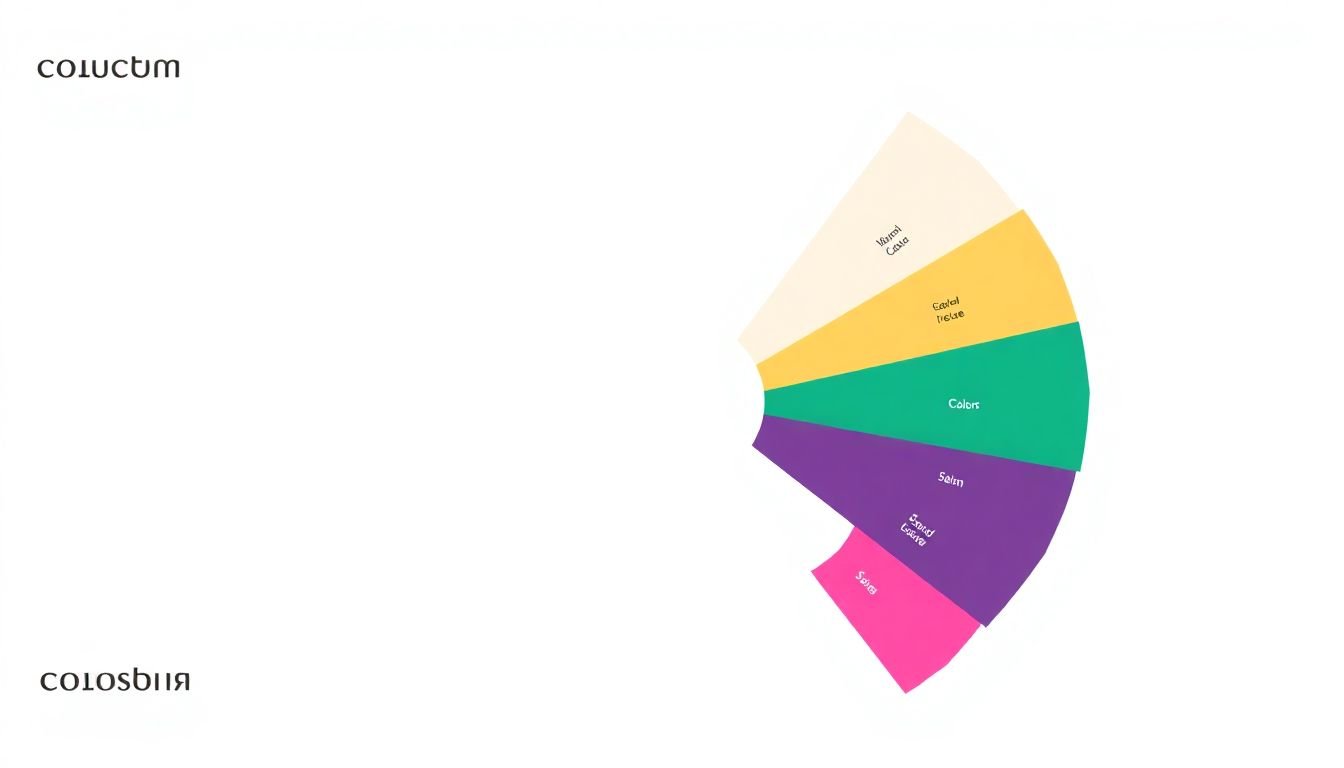
The foundation of color harmony lies in the color wheel, a visual representation of colors arranged according to their chromatic relationship. The color wheel is a powerful tool that helps us understand how colors interact with one another. It consists of primary colors (red, blue, and yellow), secondary colors (created by mixing two primary colors), and tertiary colors (created by mixing a primary and a secondary color).
One of the most fundamental principles of color harmony is the use of analogous colors. Analogous colors are those that are adjacent to each other on the color wheel. For instance, blue, green, and purple are analogous colors. Using analogous colors in a brand palette creates a sense of harmony and balance, as these colors naturally complement one another. A great example of this is the brand palette of The North Face, which predominantly uses analogous colors like blues, greens, and purples to evoke a sense of adventure and outdoor exploration.
Another principle of color harmony is the use of complementary colors. Complementary colors are those that are directly opposite each other on the color wheel, such as red and green, or blue and orange. Using complementary colors can create a striking contrast that draws the eye and adds visual interest. However, it’s essential to use complementary colors judiciously, as too much contrast can be overwhelming. A harmonious use of complementary colors can be seen in the brand palette of Coca-Cola, which uses red and green in a balanced way to create a bold and recognizable identity.
In addition to color schemes, understanding tints, shades, and tones is crucial in creating harmonious brand palettes. Tints are created by adding white to a color, shades by adding black, and tones by adding gray. By manipulating these elements, designers can create a range of colors that maintain a consistent feel while providing visual variety. For example, the brand palette of Airbnb uses a range of blue tints and shades to create a sense of consistency and trustworthiness.
In conclusion, understanding the principles of color harmony is key to creating visually appealing and cohesive brand palettes. By utilizing color schemes, tints, shades, and tones, designers can craft brand identities that are not only eye-catching but also convey a brand’s unique personality and values. Whether you’re working with analogous, complementary, or other color harmonies, the key is to strike a balance between visual interest and brand consistency.
The Role of Color in Accessibility and Inclusivity
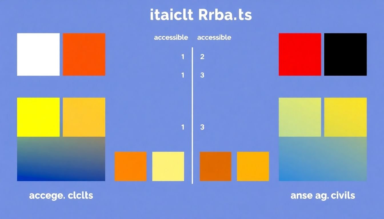
The role of color in accessibility and inclusivity is often overlooked, yet it’s a critical aspect that can significantly impact user experience, especially for individuals with visual impairments. Color blindness, for instance, affects approximately 1 in 12 men and 1 in 200 women, making it a substantial consideration in design. Other visual impairments, such as low vision or age-related macular degeneration, can also hinder color perception. Therefore, creating accessible color palettes is not just a best practice, but a necessity for inclusivity. To design with accessibility in mind, there are several guidelines to follow. Firstly, ensure sufficient contrast between text and background colors. This helps users with low vision or color blindness to distinguish content. The Web Content Accessibility Guidelines (WCAG) recommend a contrast ratio of at least 4.5:1 for normal text and 3:1 for large text. Secondly, avoid using color as the sole means of conveying information. For example, instead of saying ‘Click the red button’, say ‘Click the button labeled ‘Submit”. Lastly, consider the cultural significance of colors. What may be a positive color in one culture might have negative connotations in another. Therefore, it’s essential to research and understand the cultural implications of the colors used. Brands that have successfully implemented accessible color palettes include Microsoft and Apple. Microsoft’s high-contrast themes in Windows cater to users with visual impairments, while Apple’s iOS has a ‘Smart Invert’ feature that inverts colors on the screen, making it easier for users with color blindness to read. By following these guidelines, brands can create visually appealing designs that are also accessible and inclusive to all users.

Trends in Brand Color Palettes
In the ever-evolving landscape of branding, one of the most dynamic elements is the color palette. Color trends in branding are as cyclical as fashion, with hues waxing and waning in popularity. Currently, we’re witnessing a shift towards earthy, natural tones, a trend that began during the pandemic and is likely to continue as consumers seek comfort and authenticity. Think rich greens, warm browns, and soft terracotta. Simultaneously, there’s a resurgence of vibrant, bold colors, a reaction to the muted tones of recent years. Brands like Burger King and Airbnb have recently embraced this trend, with striking neon and primary color schemes.
However, the challenge for brands is to stay relevant without compromising their core identity. A brand’s color palette is a powerful tool for recognition and communication, and changing it can be a risky endeavor. The key is to evolve gradually, rather than attempting a complete overhaul. This could mean introducing new colors alongside existing ones, or using them in different ways. For instance, Netflix recently updated its logo to a more vibrant red, but maintained the same basic design.
Another strategy is to look at color trends through the lens of your brand’s values and target audience. A sustainable brand might lean into the earthy tones trend, while a tech brand could embrace the bold, vibrant hues. It’s also important to consider cultural and regional differences in color perception and preference.
Ultimately, the goal is to find a balance between staying relevant and staying true to your brand. It’s a delicate dance, but with careful consideration and a deep understanding of your brand’s identity and audience, it’s a dance that can be mastered.
Case Studies: Successful Brand Rebrands with Color
In the dynamic world of branding, a strategic color change can be a powerful tool to rejuvenate a brand’s image and appeal. Let’s delve into two compelling case studies of successful brand rebrands that significantly altered their color palettes, and explore the motivations and impacts of these transformations.
Airbnb: From Earthy to Airy
Founded in 2008, Airbnb initially operated with a logo that reflected its humble beginnings as a platform for air mattresses (hence the name). The earthy green and orange color scheme was replaced in 2014 with a vibrant, bold logo featuring a stylized ‘A’ in a gradient of colors. This change was driven by the desire to create a more iconic, recognizable symbol that could stand alone and be easily adapted for various mediums. The new logo, dubbed the ‘Bélo,’ was designed to evoke feelings of belonging, and its diverse color palette aimed to represent the global community that Airbnb serves. The rebrand was a resounding success, with the Bélo becoming one of the most recognized logos in the world and contributing to Airbnb’s meteoric rise as a hospitality giant.
Mastercard: From Text-Heavy to Iconic
Established in 1966, Mastercard underwent a significant rebrand in 2019, moving away from its text-heavy logo to a sleek, minimalist design. The new logo features two overlapping circles in a bold, red and yellow color scheme, with the brand name reduced to a simple, sans-serif font. The motivation behind this change was to create a more flexible, adaptable logo that could work seamlessly across digital platforms and various languages. The red and yellow color scheme was chosen to evoke feelings of confidence, optimism, and energy, reflecting Mastercard’s commitment to connecting people and empowering them to do more. The rebrand has been widely praised for its simplicity and effectiveness, with Mastercard’s brand value increasing by 25% in the year following the change, according to Forbes.
In both cases, the strategic use of color played a crucial role in these successful rebrands. By understanding the power of color to evoke emotions and convey brand values, Airbnb and Mastercard were able to transform their visual identities and drive significant business growth.
Testing and Refining Your Brand Palette
Crafting a compelling brand identity is a multifaceted process, with color palette selection playing a pivotal role. Colors are powerful communicators, evoking emotions, and influencing perceptions. Therefore, testing and refining your brand’s color palette is not just an afterthought, but a critical step in ensuring your brand resonates with your target audience.
Market research is the first step in this process. Understand your audience’s preferences, cultural sensitivities, and industry trends. For instance, blue is universally associated with trust and stability, making it a popular choice for financial institutions. However, it might not be the best choice for a vibrant, youthful brand.
Once you have a preliminary palette, A/B testing can help you make data-driven decisions. This involves presenting two color options to a sample of your target audience and measuring their response. Tools like Google Optimize or Unbounce can help you set up these tests. Consider metrics like click-through rates, time spent on page, and conversions to evaluate which color performs better.
User feedback is another invaluable resource. Surveys, interviews, or social media polls can provide insights into how your audience perceives your brand’s colors. They might offer unexpected perspectives, helping you refine your palette further.
Here are some tips for making data-driven decisions about color choices:
- Consider the context: Different colors can evoke different emotions depending on the context. A color that works well for a playful, casual brand might not work for a luxury, high-end one.
- Test with your target audience: Always test your color choices with a representative sample of your target audience. What works for one demographic might not work for another.
- Iterate and refine: Branding is an ongoing process. Don’t be afraid to refine your color palette based on new data or changing market trends.
FAQ
What is color psychology and how does it apply to branding?
How do different colors influence consumers’ purchasing decisions?
What are some cultural considerations when choosing a brand palette?
How can I ensure my brand palette is accessible to all users?
- Use sufficient color contrast to make text and other visual elements easily readable for users with visual impairments.
- Avoid using color as the sole means of conveying information, as this can be challenging for colorblind users.
- Test your palette with real users, including those with color vision deficiencies, to ensure it’s accessible and appealing to all.