Table of Contents
Ever wondered why some landing pages seem to magnetize conversions, while others struggle to generate even a single lead? The difference lies in the art and science of crafting high-converting landing pages. Welcome to our comprehensive guide, ‘Crafting High-Converting Landing Pages: 7 Essential Elements for Success’, where we delve into the world of landing page optimization to help you boost your conversion rates and generate more leads.
Agree with us when we say that a well-designed landing page can make or break your digital marketing campaign. According to a study by Unbounce, a 10% improvement in conversion rates can increase your revenue by 100%! Now, imagine what a 50% or even 100% improvement could do for your business. That’s the power we’re talking about.
In this article, we promise to demystify the process of creating high-converting landing pages. We’ll walk you through seven essential elements that, when combined, can transform your landing pages into powerful lead generation machines. From understanding your audience to optimizing your call-to-action, we’ve left no stone unturned. By the end of this guide, you’ll have a clear roadmap to crafting landing pages that not only look great but also drive results.
But before we dive in, let’s address a common pain point. Are you tired of spending hours creating landing pages that fail to deliver the desired results? Do you find yourself asking, ‘Why aren’t my visitors converting?’ If you’ve answered yes to either of these questions, you’re not alone. However, it’s time to turn that frown upside down. By the time you finish reading this article, you’ll have the tools and knowledge to create landing pages that convert.
So, are you ready to revolutionize your landing pages and watch your conversion rates soar? Let’s get started!
Boost Your Conversion Rate and Lead Generation with These Proven Strategies
In the dynamic world of digital marketing, boosting your conversion rate and lead generation is akin to finding the holy grail. It’s not just about driving traffic to your website; it’s about turning those visitors into customers. Imagine your website as a bustling marketplace, and each visitor as a potential customer. You want to create an environment that’s welcoming, engaging, and persuasive, guiding them seamlessly from browsers to buyers. Here’s where proven strategies come into play. Think of them as your secret sales team, working tirelessly behind the scenes to turn the tide in your favor. From crafting compelling calls-to-action to leveraging the power of social proof, each strategy is a tool designed to nudge your visitors closer to that all-important conversion. It’s about understanding your audience, anticipating their needs, and providing them with a seamless, satisfying journey. So, let’s roll up our sleeves, dive into these proven strategies, and watch as your conversion rate and lead generation soar to new heights. After all, every click, every sign-up, every purchase is a testament to your success. Let’s make your online presence not just visible, but victorious.

Understanding Your Audience: The Foundation of Effective Landing Pages
Understanding your audience is the cornerstone of creating high-converting landing pages. It’s like having a secret decoder ring for your visitors’ minds, enabling you to speak their language and address their needs directly. By knowing who you’re talking to, you can craft a message that resonates, guiding them seamlessly through the sales funnel. So, how do you unlock this secret? Let’s dive in.
The first step is conducting audience research. This is your deep dive into the psyche of your potential customers. It’s like going undercover, gathering intel from various sources like Google Analytics, social media, and online forums. You’re looking for patterns, preferences, and pain points. What makes them tick? What keeps them up at night? The more you know, the better equipped you’ll be to create a landing page that speaks to their soul.
Once you’ve gathered your intel, it’s time to create buyer personas. These are fictional representations of your ideal customers, based on your research. They have names, faces, jobs, and dreams. They’re not just ‘visitors’ anymore; they’re ‘Sally the Small Business Owner’ or ‘Tech-Savvy Tom’. Having these personas makes your marketing more personal, more relatable. It’s like inviting your visitors to a party where they already know the host.
Now, here’s where the magic happens: tailoring your landing page content to resonate with your visitors. This is where you put on your persona’s shoes and start writing. Use language that they use. Address their problems directly. Show them how your product or service is the solution they’ve been looking for. It’s not about you; it’s about them. And that’s the beauty of it. By understanding your audience, you’re not just creating a landing page; you’re creating a connection.

The Power of a Compelling Headline: Grab Attention and Encourage Engagement
The power of a compelling headline cannot be overstated, especially in the realm of landing page optimization. It’s the first point of contact between your audience and your message, acting as a digital handshake that either draws them in or sends them packing. A well-crafted headline can significantly boost engagement, clearly communicate your offer, and evoke emotions that resonate with your visitors.
Think of your headline as a mini-story that sets the stage for the rest of your content. It should be a concise, captivating snapshot of what’s to come. To craft such a headline, consider the following tips:
- Be Clear and Concise: Your headline should immediately communicate what your page is about. Avoid jargon and keep it simple. For instance, instead of ‘Revolutionize Your Marketing Strategy with Our AI-Driven Platform’, try ‘Boost Marketing Results with AI’.
- Evoke Emotion: Tap into your audience’s emotions to make your headline more compelling. This could be excitement, curiosity, fear of missing out, or even a sense of belonging. For example, ‘Join a Community of Thriving Entrepreneurs’ plays on the desire for connection and success.
- Use Active Language: Active language makes your headline more engaging and encourages visitors to take action. Instead of ‘Our Services Can Help You’, try ‘Transform Your Business with Our Expert Services’.
- Consider the ‘Four U’s’: Your headline should be Unique, Ultra-specific, Urgent, and Useful. This ensures it stands out, provides value, and creates a sense of immediacy. For instance, ‘Unlock Hidden Sales with Our Exclusive, Data-Driven Approach’.
Remember, your headline is not just about grabbing attention; it’s about setting the right expectations and enticing visitors to continue exploring your page. So, make it count!

The Anatomy of a High-Converting Call-to-Action: Encourage Visitors to Take Action
In the digital landscape, a well-crafted call-to-action (CTA) is not just a button, but a powerful catalyst that propels visitors towards conversion. A clear and persuasive CTA is the linchpin that transforms casual browsers into engaged customers. Let’s delve into the anatomy of a high-converting CTA, exploring its placement, design, and copywriting techniques that can significantly boost your conversion rate.
The first step in CTA optimization is understanding its placement. A CTA should be strategically positioned where it’s most likely to be seen and clicked. This often means placing it ‘above the fold’, within the first screen of content, or using multiple CTAs throughout your page to guide visitors. However, avoid overwhelming visitors with too many CTAs, as this can dilute their impact.
The design of your CTA button is equally important. It should stand out from the rest of your page, drawing the eye like a beacon. Use contrasting colors, ample white space, and a size that’s large enough to be noticed but not so large that it’s overwhelming. Don’t forget to make it mobile-friendly, as a significant portion of your traffic may be coming from mobile devices.
Now, let’s talk about copywriting. The words you use on your CTA button can make or break its effectiveness. Here are a few tips:
- Be clear and specific. Vague CTAs like ‘Click Here’ or ‘Submit’ don’t tell visitors what to expect. Instead, use action-oriented verbs and describe the benefit of clicking, such as ‘Start Your Free Trial’ or ‘Download Your Ebook Now’.
- Create a sense of urgency. Words like ‘Now’, ‘Today’, or ‘Limited Time Offer’ can encourage visitors to act immediately.
- Use social proof. If others have taken the action, say so. ‘Join 10,000 Satisfied Customers’ can make your CTA more appealing.
Remember, the goal of a CTA is to guide visitors towards the next step in their journey. By optimizing your CTA’s placement, design, and copy, you’re making that journey as smooth and compelling as possible.

Leveraging Social Proof: Build Trust and Credibility with Testimonials and Reviews
In the digital landscape, building trust and credibility is paramount, and social proof plays a pivotal role in this endeavor. Social proof, a psychological phenomenon, refers to the influence that people have on each other’s behavior, attitudes, and opinions. When it comes to landing page optimization, leveraging social proof can significantly enhance your conversion rates. One of the most effective ways to harness this power is by incorporating testimonials, reviews, and ratings.
The human brain is wired to seek validation from others. By displaying positive feedback from satisfied customers, you’re essentially providing that validation. This not only builds trust but also instills confidence in your offer. Here’s how you can effectively incorporate these elements into your landing page:
- Use High-Quality Testimonials: Opt for testimonials from satisfied customers that highlight the benefits and results of your product or service. The more specific and relevant, the better.
- Display Ratings and Reviews: Numerical ratings and reviews provide a quick and easy way for visitors to gauge the quality of your offer. They also add a layer of authenticity to your testimonials.
- Showcase Trust Badges: Logos of reputable organizations you’ve worked with, or badges indicating secure payment processes, can also serve as social proof and boost credibility.
- Include Customer Photos or Videos: When possible, pair testimonials with photos or videos of the customers. This adds a personal touch and makes the testimonials more relatable.
- Place Them Strategically: Position your testimonials and reviews where they’ll have the most impact. Typically, this is just above the call-to-action button.
Remember, the goal is to create a sense of community around your brand, to show that others have had success with your offer, and to build trust. By effectively leveraging social proof, you’re not just optimizing your landing page, you’re optimizing the customer’s journey towards making a decision.

Optimizing Your Landing Page Form: Streamline the Conversion Process
Crafting an effective landing page form is a delicate balance between gathering valuable information and minimizing friction for your visitors. After all, a form that’s too lengthy can deter users from completing it, while one that’s too short might not provide the data you need. So, let’s dive into some best practices to optimize your landing page forms and streamline the conversion process.
Firstly, consider the form length. The golden rule is: keep it as short as possible. Only ask for information that’s absolutely necessary. For instance, if you’re offering a free eBook, you might only need the user’s name and email address. Long forms can be intimidating and may cause users to abandon the process.
Next, think about the field types. Use dropdown menus or radio buttons for choices, and auto-fill or auto-complete features where possible. These can significantly speed up the form-filling process. Also, consider using conditional logic to show or hide fields based on the user’s previous responses. This can make the form feel less overwhelming.
The placement of your form is also crucial. Above the fold (the area visible without scrolling) is typically best, as it’s the first thing visitors see. However, if your content above the fold is compelling, placing the form further down can also work. Just ensure it’s easily accessible and stands out.
Lastly, reduce friction by using clear calls-to-action (CTAs), reassuring users with trust badges, and providing instant feedback when errors occur. Also, consider using multi-step forms, which can make the process feel less daunting by breaking it down into smaller, manageable steps.
In conclusion, optimizing your landing page form is about making the user experience as smooth and painless as possible. By following these best practices, you can significantly improve your lead generation efforts and watch those conversion rates soar.

The Impact of Page Load Speed and Mobile Optimization on Conversions
In the digital landscape, where user attention is a precious commodity, the impact of page load speed and mobile optimization on conversions cannot be overstated. A slow-loading page can drive users away, with studies showing that 40% of users abandon a website that takes more than three seconds to load. This is where page load speed comes into play. Ensuring your landing page is optimized for speed can significantly improve user experience and boost conversions.
The mobile optimization aspect is equally crucial, given the surge in mobile traffic. A mobile-friendly website ensures a seamless user experience across devices, reducing bounce rates and enhancing conversion rates. Here are some tips to improve your page speed and mobile responsiveness:
- Optimize Images: Compress images to reduce their file size without compromising quality. Tools like TinyPNG or Squoosh can help with this.
- Minify Code: Minifying CSS, JavaScript, and HTML can reduce their sizes, making your pages load faster.
- Enable Browser Caching: This allows users’ browsers to store static files, reducing the need to reload them on subsequent visits.
- Use a Content Delivery Network (CDN): CDNs distribute your content across multiple servers, reducing the distance data has to travel and improving load times.
- Optimize Your Hosting: Consider upgrading your hosting plan or switching to a faster hosting provider.
For mobile optimization, consider the following:
- Responsive Design: Ensure your website adjusts its layout to fit different screen sizes.
- Mobile-First Design: Design your website with mobile users in mind first, then scale up for larger screens.
- Test on Multiple Devices: Use tools like Google’s Mobile-Friendly Test or BrowserStack to ensure your website works well on various mobile devices and screen sizes.
By implementing these tips, you can create a fast, mobile-friendly landing page that provides a seamless user experience, ultimately driving more conversions.

A/B Testing and Continuous Improvement: The Key to Long-Term Success
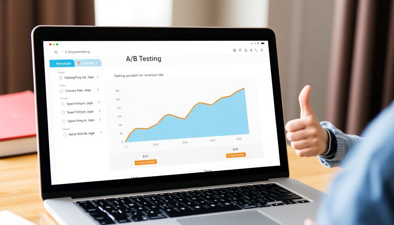
In the dynamic world of digital marketing, a well-crafted landing page can be the difference between a successful campaign and a missed opportunity. This is where A/B testing, also known as split testing, comes into play. A/B testing is not just a tool for landing page optimization; it’s a philosophy of continuous improvement that can significantly enhance your conversion rates and lead generation over the long term.
At its core, A/B testing involves creating two versions of a landing page
- Version A (the original) and Version B (the variation)
- and directing half of your traffic to each. By comparing the performance of these two versions, you can gain valuable insights into what resonates with your audience and what doesn’t.
Creating effective A/B tests requires a strategic approach. First, identify the key elements of your landing page that you want to test. This could be anything from the headline and call-to-action (CTA) button to the layout, images, or form fields. Next, create a variation that differs significantly from the original. Remember, the goal is to measure the impact of a single change, so keep other elements constant.
Once your test is live, it’s crucial to interpret the results accurately. Look at the conversion rates of both versions, but also consider other metrics like bounce rate, time on page, and click-through rate. A higher conversion rate on Version B might seem like a clear winner, but if it’s accompanied by a significantly higher bounce rate, it could indicate that while the variation is enticing users to click, it’s not engaging them once they arrive.
Finally, use your findings to continuously improve your landing pages. If Version B outperforms Version A, make the changes permanent. If not, don’t be discouraged
- every test is a learning opportunity. Use what you’ve learned to inform your next test, gradually refining your landing page until you’ve achieved the highest possible conversion rate.
In essence, A/B testing is not just about making one-off improvements; it’s about embedding a culture of continuous improvement into your marketing strategy. It’s about listening to your audience, learning from their behavior, and using that knowledge to create landing pages that truly resonate. So, embrace the power of A/B testing, and watch as your conversion rates and lead generation soar over time.
FAQ
What is a landing page and why is it crucial for lead generation and conversion rate optimization?
How does landing page optimization impact my conversion rate?
What are the 7 essential elements of a high-converting landing page?
- Compelling Headline: Clearly communicate the offer and grab the visitor’s attention.
- Engaging Visuals: Use high-quality images or videos that support your offer and evoke emotion.
- Concise Copy: Write persuasive, scannable copy that highlights the benefits and addresses pain points.
- Clear Call-to-Action (CTA): Use a prominent, contrasting button that tells visitors exactly what to do next.
- Social Proof: Include testimonials, reviews, or trust badges to build credibility and confidence.
- Simple Form: Keep the form short and simple, only asking for essential information to minimize friction.
- Mobile Optimization: Ensure your landing page is responsive and provides a seamless experience on all devices.
How can I create a compelling headline for my landing page?
- Keep it concise and easy to understand.
- Highlight the main benefit or unique selling proposition.
- Use active language and create a sense of urgency.
- Consider using subheadings or supporting text to reinforce your message.
What role do visuals play in landing page optimization, and how can I use them effectively?
- Choose high-quality, relevant images or videos that complement your offer.
- Use visuals to tell a story or illustrate the benefits of your product/service.
- Place visuals strategically, ensuring they don’t distract from the main offer or CTA.
- Test different visuals to see which ones resonate best with your audience.
How can I optimize my landing page form to improve conversion rates?
- Keep the form short and only ask for essential information.
- Use clear, concise labels and placeholder text to guide visitors.
- Apply inline form validation to provide real-time feedback and reduce errors.
- Make the form visually distinct from the rest of the page to draw attention.
- Consider using multi-step forms or progress indicators to make the process feel less daunting.
How can I effectively test and optimize my landing pages for better performance?
- Identify areas for improvement based on data, user feedback, or best practices.
- Create variations of your landing page, focusing on one element at a time (e.g., headline, CTA, visuals).
- Use A/B testing tools like Google Optimize, Optimizely, or Unbounce to run experiments.
- Set clear goals and metrics to track (e.g., conversion rate, click-through rate, time on page).
- Allow the test to run for a sufficient duration to gather statistically significant data.
- Analyze the results, and implement the winning variation on your landing page.
- Repeat the process to continually improve your landing page’s performance.