Table of Contents
In the digital age, data is the new gold, and businesses are scrambling to strike the mother lode. But what good is a treasure trove of data if you can’t make sense of it? This is where data visualization techniques come into play, transforming complex datasets into actionable business strategies. But the question remains: how many valuable insights are your business missing out on due to data that’s stuck in spreadsheets, or worse, lost in the digital abyss?
According to a study by IBM, we create 2.5 quintillion bytes of data every day. That’s a staggering amount, and it’s growing at an exponential rate. But here’s the catch
- only a tiny fraction of this data is ever analyzed or used to drive business decisions. The rest is left to gather digital dust, a silent witness to opportunities missed.
This article, ‘Data Visualization Mastery: Transforming Complex Datasets into Actionable Business Strategies’, is here to change that. We agree that data visualization is not just about making data look pretty. It’s about unlocking the power of data to drive business growth, improve decision-making, and gain a competitive edge. We promise to take you on a journey through the world of visual analytics, exploring the latest data visualization techniques and showing you how to create business intelligence dashboards that tell a story
- your story.
By the end of this article, you will gain a comprehensive understanding of data visualization, its importance in today’s business landscape, and practical skills to apply these techniques in your own organization. We’ll demystify complex data sets, simplify the process of creating insightful visualizations, and guide you through the process of building dashboards that drive action. So, are you ready to turn your data into a strategic asset? Let’s dive in!
Unlocking Insights: From Raw Data to Strategic Decisions
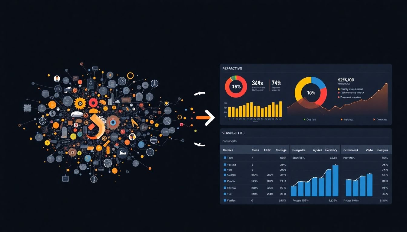
In the digital age, data has become the new gold, and those who can unlock its insights are the modern-day alchemists. The journey from raw data to strategic decisions is a transformative process that combines the precision of science, the creativity of art, and the wisdom of experience. Imagine a vast, uncharted ocean of data, teeming with hidden treasures of knowledge, waiting to be discovered. The first step is to navigate this ocean, using sophisticated tools and algorithms to collect, clean, and organize the raw data into a coherent form. This is akin to a treasure hunter meticulously sifting through sand to find the glint of a hidden gem. Once the data is refined, it’s time to explore its depths, using statistical models and machine learning techniques to uncover patterns, trends, and correlations. This is where the art comes in, as analysts must interpret these findings, drawing connections and making sense of the data’s story. But the real magic happens when these insights are translated into actionable strategies. It’s like turning the gem into a crown jewel, a symbol of power and wisdom that guides decision-making. This final step requires a deep understanding of the business context, a keen eye for opportunity, and the courage to make bold moves based on data-driven intuition. Unlocking insights from raw data is not just about numbers and algorithms; it’s about transforming information into intelligence, and intelligence into strategy. It’s about turning data into destiny.
The Power of Visual Analytics
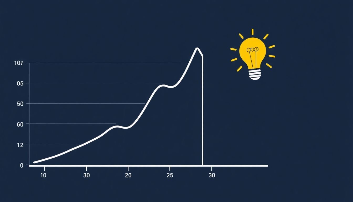
In the vast ocean of data that we navigate today, visual analytics serves as our lighthouse, guiding us towards insights and understanding. It’s not just about seeing data, but understanding it in a way that’s intuitive, engaging, and actionable. Visual analytics transforms raw data into meaningful, visual content, making it accessible to both data scientists and everyday users.
The power of visual analytics lies in its ability to reveal patterns, trends, and outliers that might otherwise remain hidden in spreadsheets or databases. It’s like having a detective on your team, constantly scanning for anomalies and connections that could solve your data mystery. For instance, a simple line graph can illustrate a trend over time, while a heat map can highlight hotspots or cold spots in your data.
Real-world applications of visual analytics are myriad and impactful. In healthcare, visual analytics helps doctors identify disease patterns and track patient progress. In business, it aids in predicting market trends and optimizing resources. In cybersecurity, it aids in detecting anomalies that could indicate a breach. For example, the COVID-19 pandemic has seen widespread use of visual analytics in tracking cases, understanding hotspots, and predicting future trends.
Moreover, visual analytics is not just about seeing data, but communicating it effectively. It bridges the gap between data and decision-making. It’s like having a storyteller who can weave complex data narratives into compelling visual tales that everyone can understand and act upon. In essence, visual analytics is not just a tool, but a language that speaks to both the left and right brains, enabling us to see, understand, and communicate data in powerful new ways.
Understanding Data Visualization Techniques
Data visualization, a cornerstone of data analysis and communication, transforms complex data into understandable and engaging visuals. Let’s delve into various data visualization techniques, their uses, and best practices.
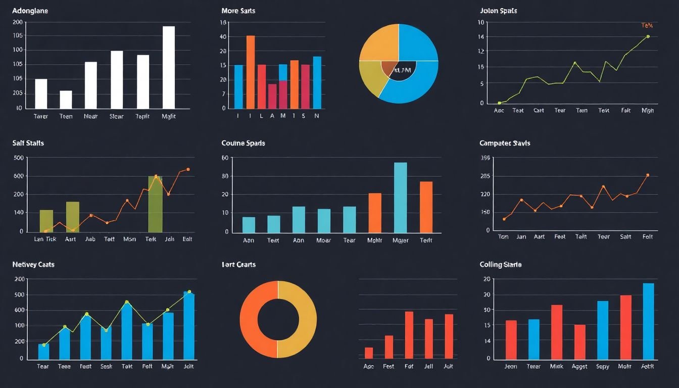
The choice of visualization technique depends on the type of data and the story you want to tell. For instance, charts and graphs are excellent for comparing data points, identifying trends, and spotting outliers. Bar charts, line graphs, and pie charts are common choices, each serving a unique purpose. Bar charts are great for comparing discrete categories, line graphs are ideal for showing trends over time, and pie charts are useful for displaying proportional data.
Scatter plots, on the other hand, are perfect for exploring relationships between two variables. They allow you to identify correlations, clusters, and outliers at a glance. Heatmaps are another powerful tool, used to display density distribution of data, often in a two-dimensional space. They’re particularly useful in showing spatial or temporal patterns.
Maps are indispensable when location is a key factor. They can display geographical data, such as population density, weather patterns, or disease outbreaks. Other visual elements like histograms, box plots, and candlestick charts also serve specific purposes in data visualization.
Best practices in data visualization include keeping it simple and uncluttered, using clear and concise labels, and ensuring the visuals accurately represent the data. Always consider your audience and tailor your visuals to their level of understanding. Remember, the goal is not just to present data, but to communicate insights effectively.
In conclusion, understanding and effectively using data visualization techniques can transform raw data into compelling stories that engage, inform, and inspire action.
Data Cleaning and Preparation
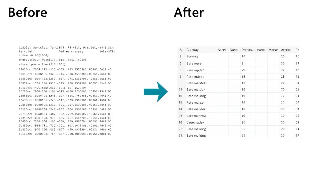
Data cleaning and preparation is the cornerstone of effective data visualization, often the unsung hero that ensures the story told by your data is accurate and insightful. Imagine data as a canvas, and visualization as the paintbrush; without a clean canvas, your painting will be flawed, no matter how skilled your brushwork.
Data, when collected from various sources, can be messy, inconsistent, and riddled with errors. These issues, if left unaddressed, can lead to misleading visualizations and incorrect insights. Common data issues include missing values, duplicates, inconsistencies in data formats, and outliers.
Missing values, for instance, can skew your results if not handled properly. A simple approach is to remove these rows or columns, but this might lead to loss of valuable data. A better strategy is to impute these missing values with suitable substitutes, like mean, median, or mode, depending on the nature of the data.
Duplicates can inflate your results, making your data seem more significant than it actually is. To address this, you can use unique identifiers or hash functions to remove duplicates.
Inconsistencies in data formats, like different spellings for the same city or varying date formats, can confuse your analysis. Standardizing these formats can help. For example, converting all city names to uppercase and using a consistent date format can clean up your data.
Outliers, data points that are significantly different from the rest, can distort your visualizations. They can be addressed by capping or flooring them, or by removing them altogether if they’re clear errors.
Data cleaning processes often involve a combination of these steps. For example, you might start by removing duplicates, then handle missing values, standardize formats, and finally, address outliers. Each step builds on the previous one, gradually transforming your raw data into a clean, reliable dataset ready for visualization.
Choosing the Right Tool for the Job
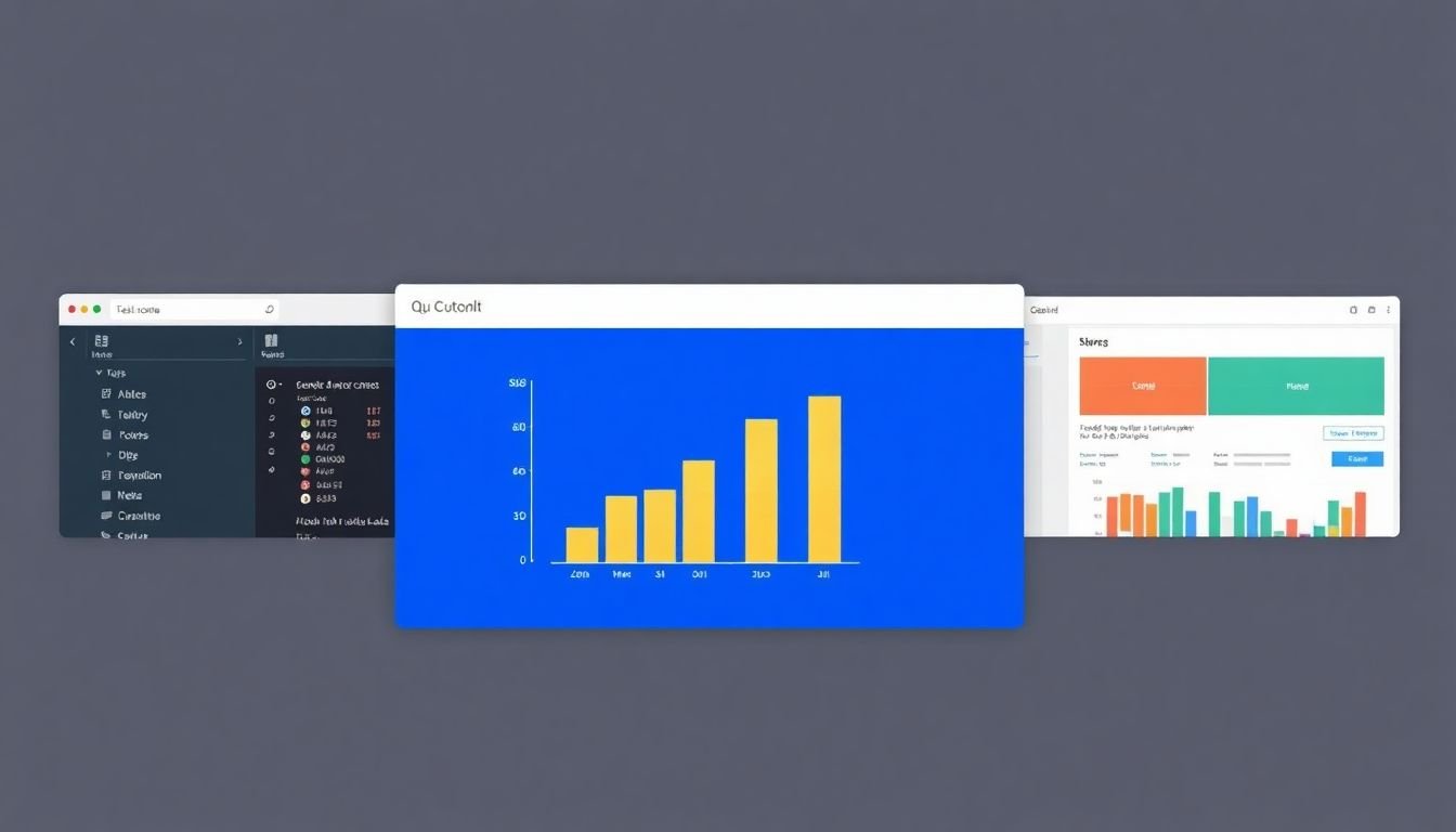
Choosing the right data visualization tool is akin to selecting the perfect paintbrush for an artist. Each tool has its unique features, strengths, and weaknesses, catering to different skill levels and project requirements. Let’s compare and contrast three popular data visualization tools: Tableau, Power BI, and D3.js.
Tableau, a robust and user-friendly tool, is renowned for its drag-and-drop interface, making it an excellent choice for beginners and non-programmers. It offers a wide range of visualizations, from charts and maps to complex dashboards. Tableau’s strengths lie in its ease of use, extensive data connectivity, and powerful analytics capabilities. However, it comes at a premium price, which might be a barrier for some. It’s ideal for businesses seeking quick insights and easy-to-use dashboards.
Power BI, Microsoft’s data visualization tool, is a strong contender, offering a free version with basic features and a paid version with advanced capabilities. It integrates seamlessly with other Microsoft products and provides real-time data refreshes. Power BI’s strength is its accessibility and affordability, making it a popular choice for businesses already invested in the Microsoft ecosystem. However, it may lack some of the advanced features and customization options found in Tableau. It’s perfect for those looking for a balance between functionality and cost.
D3.js, on the other hand, is a JavaScript library for producing dynamic and interactive data visualizations in web browsers. It’s highly customizable and ideal for those with programming skills seeking to create unique, complex visualizations. D3.js’s strength lies in its flexibility and power, but it has a steep learning curve and requires programming knowledge. It’s best suited for web developers and data scientists looking to create custom, interactive visualizations.
Now, let’s create a simple bar chart using Tableau as a brief tutorial. First, connect your data source. Then, drag the ‘Measure’ field (e.g., sales) to the ‘Columns’ shelf. Next, drag the ‘Category’ field (e.g., region) to the ‘Rows’ shelf. Finally, right-click on the ‘Marks’ card and select ‘Bar’ to create your bar chart. Tableau’s intuitive interface makes this process straightforward, demonstrating its user-friendly nature.
Designing Effective Business Intelligence Dashboards
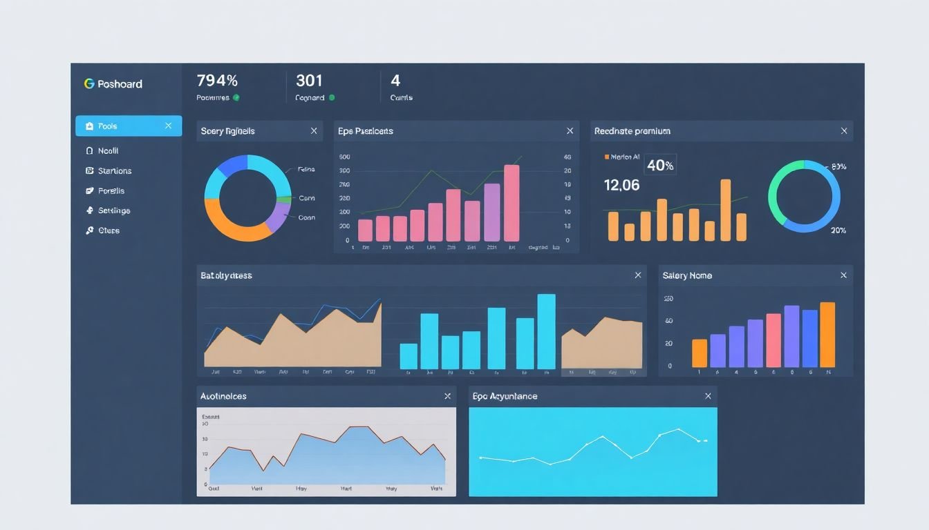
Designing effective business intelligence dashboards is a critical task that can significantly enhance decision-making processes. An effective dashboard should be intuitive, informative, and actionable, providing users with a clear and concise overview of key performance indicators (KPIs) and enabling them to take data-driven decisions. Here are some key elements to consider when designing such dashboards.
The first step is to understand your audience and their information needs. Different users may require different types of data, so it’s essential to tailor your dashboard to their specific needs. For instance, a sales manager might need real-time sales performance data, while a marketing manager might be more interested in customer engagement metrics.
Once you’ve identified the key metrics, it’s time to design the dashboard layout. A well-designed dashboard should be clean and uncluttered, with a clear hierarchy of information. Use a grid system to organize your data, and ensure that the most important metrics are prominently displayed. Consider using visualizations like charts and graphs to make your data more engaging and easier to understand.
Here are some best practices for designing intuitive, informative, and actionable dashboards:
- Keep it simple: Use a minimalistic design approach to avoid overwhelming users with too much information.
- Use color effectively: Color can be used to highlight important data points or to differentiate between different types of data.
- Make it interactive: Allow users to drill down into the data, filter results, and perform other interactive functions to gain deeper insights.
- Provide context: Include benchmarks, targets, or historical data to help users understand the significance of the metrics they’re viewing.
For example, a well-designed sales dashboard might include a bar chart showing monthly sales performance, with a line graph showing year-over-year growth, and a table displaying top-performing products. By providing this information in an easy-to-understand format, the dashboard enables users to quickly identify trends, spot anomalies, and take action based on the data.
In conclusion, designing effective business intelligence dashboards requires a combination of data analysis, user understanding, and design principles. By following best practices and continually refining your dashboards based on user feedback, you can create powerful tools that drive data-driven decision-making and improve business outcomes.
Storytelling with Data Visualization
Storytelling with data visualization is an art that transforms raw data into compelling narratives, making complex information accessible and engaging. It’s not just about creating charts and graphs; it’s about weaving a tale that resonates with your audience. Here’s how you can use data visualization to tell a compelling story.
First, understand that context is king. Before you start plotting data points, ensure you know your audience and what they need to understand. This context will guide your choice of data, the type of visualization, and the narrative you’ll build around it. For instance, if you’re telling a story about climate change, your data might include global temperature anomalies, sea-level rise, and carbon emissions. Your audience, whether it’s a scientific conference or a school assembly, will dictate how you present this data.
Next, craft a narrative. Data storytelling is like any other form of storytelling; it needs a beginning, middle, and end. Start with a hook, a piece of data or a fact that grabs your audience’s attention. Then, guide them through the data, showing trends, comparisons, and changes over time. The narrative should flow logically, with each visualization building on the last. For example, you might start with a map showing global temperature increases, then move to a line graph showing the rise in sea levels, and finally, a bar chart comparing carbon emissions from different countries.
Lastly, don’t forget to evoke emotion. Data can be cold and unfeeling, but a good storyteller knows how to bring it to life. Use color, shape, and size to create contrast and emphasis. Consider using animations or interactive elements to engage your audience. And always remember, the goal is not just to inform, but to inspire, to provoke thought, or to drive action. A compelling data story should leave your audience feeling something.
Take, for instance, the story of ‘The Battle Against Ebola’ told by The New York Times. They used interactive maps, timelines, and infographics to show the spread of the disease, the response from healthcare workers, and the impact on communities. The story was not just about numbers; it was about people, about heroes, about hope. That’s the power of data storytelling.
In conclusion, data visualization is more than just a tool for presenting information. It’s a medium for telling stories, for connecting with people, for driving change. So, the next time you’re working with data, don’t just show your audience what happened. Tell them a story.
Interactive Visualizations and Drill-Downs
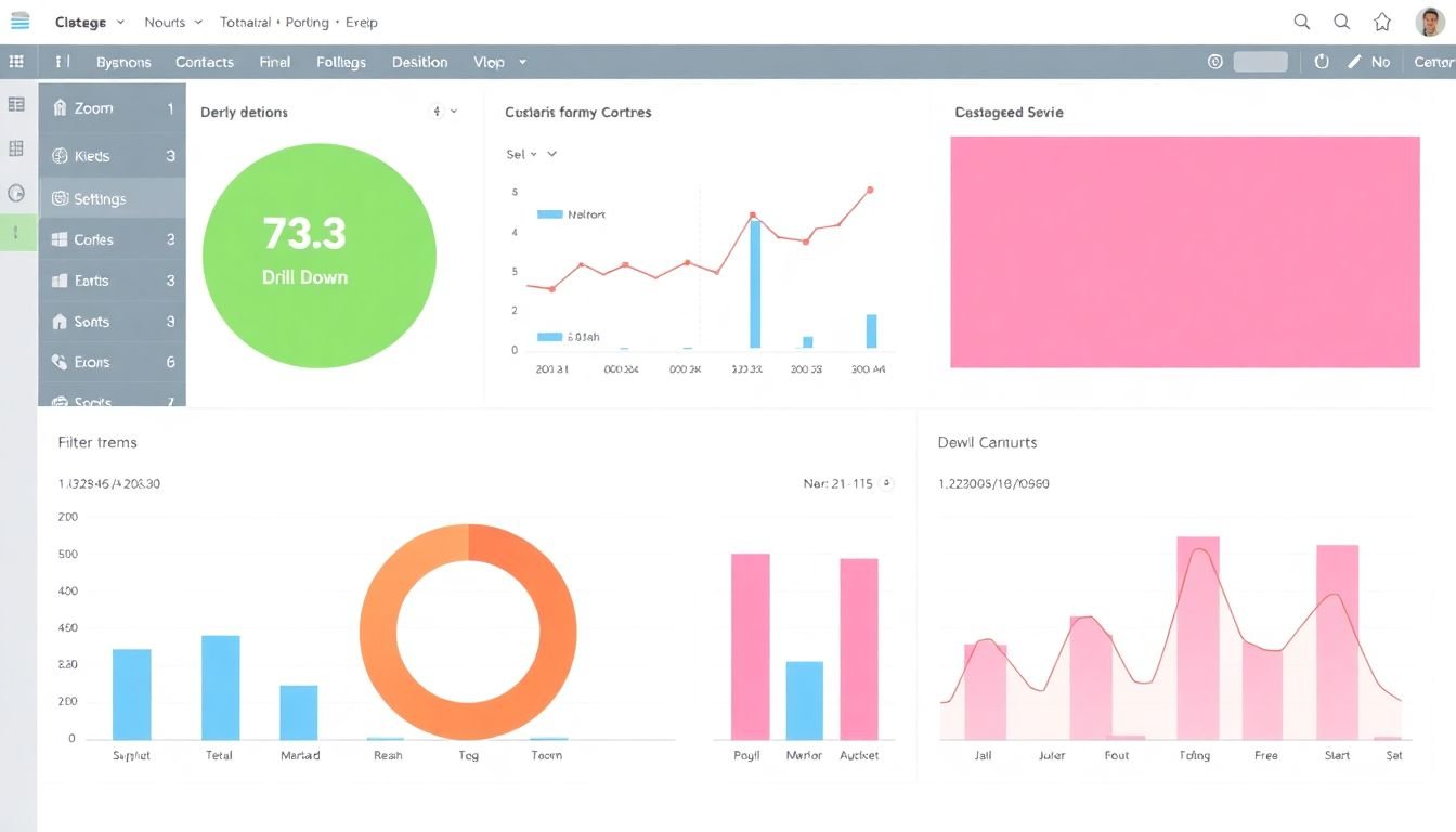
Interactive visualizations and drill-downs have emerged as powerful tools in data analysis and presentation, offering a myriad of benefits that enhance user engagement, understanding, and decision-making. Unlike static visualizations, interactive ones allow users to manipulate and explore data, revealing insights that might otherwise remain hidden. This interactivity fosters a deeper understanding of data trends, outliers, and correlations, enabling users to ask and answer their own questions. To create interactive visualizations, one can follow these steps:
- Identify Key Data Points: Start by understanding the data and identifying the most important aspects to visualize.
- Choose the Right Visualization: Select a visualization type that best represents your data. This could be a bar chart, line graph, scatter plot, map, or even a complex network graph, depending on your data’s nature.
- Make it Interactive: Use tools like D3.js, Tableau, or Power BI to add interactivity. This could be as simple as adding tooltips for data points or as complex as allowing users to filter, sort, or drill down into the data.
- Test and Refine: Iterate on your visualization based on user feedback. Ensure it’s intuitive and easy to use.
Examples of interactive dashboards and visualizations abound. The New York Times’ ‘The Upshot’ uses interactive charts to explore complex topics like politics, economics, and health. Their ‘How America Eats Now’ visualization, for instance, allows users to explore food consumption trends across the U.S. by adjusting sliders for different demographic factors. Another excellent example is Airbnb’s ‘Night at the Gallery’ experience, which uses interactive 3D visualizations to showcase their listings. Users can explore different cities, neighborhoods, and types of accommodations, providing a unique and engaging way to browse listings. In conclusion, interactive visualizations and drill-downs are not just about making data look pretty; they’re about making data work for us. They allow us to ask questions, find answers, and gain insights in a way that’s intuitive, engaging, and often even fun.
Data Visualization for Specific Industries
Data visualization, a powerful tool in data analysis, can be tailored to meet the unique needs and challenges of various industries. Let’s explore how it’s applied in finance, healthcare, and retail.
Finance: In the finance industry, data visualization is crucial for understanding market trends, risk management, and investment decisions. One notable example is Bloomberg’s terminal, which uses interactive charts, graphs, and dashboards to display real-time financial data. It allows users to customize visualizations, enabling them to gain insights specific to their investment strategies. For instance, a fund manager might use it to compare the performance of different stocks or sectors, or to monitor economic indicators that could impact their portfolio.
Healthcare: In healthcare, data visualization aids in understanding patient data, disease trends, and the effectiveness of treatments. For example, the U.S. Centers for Disease Control and Prevention (CDC) uses data visualization to track and communicate disease outbreaks. Their ‘Outbreak’ tool uses maps, charts, and graphs to display real-time data, helping public health officials make informed decisions and communicate risks effectively to the public. Another application is in hospitals, where data visualizations can help monitor patient flow, resource allocation, and staff productivity.
Retail: In retail, data visualization helps in understanding customer behavior, sales trends, and inventory management. Amazon, for instance, uses data visualization extensively to understand customer preferences and optimize its product recommendations. Their ‘Amazon Retail Analytics’ tool provides visualizations of sales data, customer demographics, and product performance, helping retailers make data-driven decisions. Similarly, Walmart uses data visualization to monitor and optimize its supply chain, reducing waste and improving efficiency.
In conclusion, data visualization is not a one-size-fits-all tool. It’s adaptable, and its effectiveness lies in its ability to be tailored to the specific needs and context of each industry. By transforming raw data into meaningful, easily understandable visuals, it empowers industries to make informed decisions, optimize processes, and drive growth.

Best Practices for Accessibility in Data Visualization
Accessibility in data visualization is not just a nice-to-have feature, but a crucial aspect that ensures all users, regardless of their abilities, can engage with and understand the data. According to the World Health Organization, more than 1 billion people worldwide live with some form of disability. By making our visualizations accessible, we’re opening up our data to a broader audience and fostering a more inclusive data culture.
The Web Content Accessibility Guidelines (WCAG) provide a comprehensive set of guidelines for making web content more accessible. Here are some best practices for data visualization that align with these guidelines:
- Provide Alternative Text for Charts: Screen readers can’t interpret images, so providing alternative text (alt text) is essential. This should describe the chart’s type, its purpose, and any key data points. For example, ‘A bar chart showing sales growth from 2015 to 2020, with the highest sales in 2020 at $500,000.’
- Use Color Wisely: Color should not be the only visual means of conveying information. Ensure that there’s enough contrast between colors and provide alternative visual cues. For instance, use patterns or shapes in addition to color to differentiate data points.
- Make Interactive Elements Keyboard Accessible: If your visualization is interactive, ensure that users can navigate and interact with it using only a keyboard. This includes hover effects and tooltips.
- Use Clear and Simple Labels: Labels should be concise, clear, and placed close to the data they refer to. Avoid using abbreviations or jargon that might not be familiar to all users.
- Test with Real Users: The best way to ensure your visualizations are accessible is to test them with users who have different abilities. This can help you identify and fix any accessibility issues you might have missed.
Here’s an example of an accessible visualization: A bar chart with clear, concise labels, sufficient color contrast, and alternative text. Each bar has a data label with the exact value, and the chart has a summary sentence below it, providing a quick overview of the data. The chart is also keyboard accessible, with tooltips that appear when a user tabs through the bars.
Data Visualization in the Age of Big Data
In the age of big data, we’ve entered a realm where data visualization is not just a tool for understanding, but a necessity for survival. The sheer volume, velocity, and variety of data we’re dealing with today present both challenges and opportunities for data visualization.
The primary challenge lies in handling large datasets. Traditional data visualization techniques often falter when faced with millions, or even billions, of data points. They can become cluttered, confusing, and lose their effectiveness. To tackle this, we need to embrace new strategies and tools. One approach is to use aggregation and sampling to reduce the dataset size while retaining key insights. Another is to employ techniques like binning or clustering to group similar data points together.
Consider, for instance, visualizing global temperature data over time. With billions of data points, a line graph would be useless. Instead, we might use a heat map to show temperature anomalies by region and year, or a time series chart with aggregated data points to show trends over decades.
Opportunities abound as well. Big data allows us to visualize complex relationships and patterns that were previously invisible. Interactive dashboards, for example, let users drill down into data, filter by different variables, and gain insights tailored to their needs. Machine learning algorithms can also help identify patterns and outliers, which can then be visualized for easier understanding.
Take, for instance, network visualizations. In the age of big data, we can now map out complex networks like social media connections, disease spread, or even the brain’s neural pathways. These visualizations can help us understand how information flows, how diseases spread, or how our brains process information.
In conclusion, data visualization in the age of big data is not just about creating pretty pictures. It’s about finding new ways to make sense of the world, to tell stories with data, and to empower people to make informed decisions. It’s about turning big data into big insights.

The Future of Data Visualization
In the dynamic landscape of data visualization, the future is not just about flat screens and static graphs. It’s about immersive experiences, intelligent insights, and the convergence of technology and creativity. One of the most exciting trends is the integration of augmented reality (AR) and virtual reality (VR). Imagine walking into a data visualization, exploring it from all angles, and interacting with it in real-time. This isn’t science fiction; it’s the promise of AR and VR. Tools like Microsoft’s Power BI and Google’s Tilt Brush are already paving the way, making data visualization more engaging and intuitive.
Another trend that’s reshaping the field is the application of artificial intelligence (AI) and machine learning (ML). AI-driven visualizations can learn from data, identify patterns, and even generate visualizations autonomously. This isn’t just about efficiency; it’s about unlocking insights that humans might miss. For instance, AI can help create visualizations that are not only informative but also aesthetically pleasing, a concept known as ‘aesthetic computing’.
But how will these trends shape the future? Firstly, they’ll democratize data visualization. With AR and VR, data won’t be confined to screens; it’ll be accessible to everyone, regardless of their location or physical abilities. Secondly, AI will make data visualization more intuitive and accessible. It’ll help non-experts understand complex data, making data-driven decision-making more widespread. Lastly, these trends will blur the lines between art and data. Data visualization will no longer be just about function; it’ll be about form, about creating experiences that inform and inspire. The future of data visualization is about more than just seeing data; it’s about immersing ourselves in it.
FAQ
What is the role of data visualization in transforming complex datasets into actionable business strategies?
What are some key data visualization techniques for effective storytelling?
- Using charts and graphs that best represent the type of data (e.g., bar charts for comparisons, line graphs for trends, scatter plots for correlations)
- Employing color, size, and shape to highlight important data points or categories
- Ensuring simplicity and minimalism to avoid overwhelming viewers with too much information
- Incorporating interactivity, such as tooltips or filters, to allow viewers to explore the data
- Providing context with annotations, labels, and clear titles
How can I choose the right chart type for my data?
- For comparing categorical data, use bar charts or pie charts
- For showing trends over time, use line graphs
- For exploring correlations between two continuous variables, use scatter plots
- For displaying hierarchical data, use treemaps or sunbursts
- For complex, multi-dimensional data, consider 3D charts or advanced visualizations like heatmaps or network graphs
Always consider your audience and what will best communicate your message.
What are some best practices for designing business intelligence dashboards?
- Understand your audience and their information needs
- Keep it simple and uncluttered, focusing on key performance indicators (KPIs) and important trends
- Use consistent color schemes, fonts, and layouts for easy navigation
- Make it interactive, allowing users to filter, sort, and drill down into data
- Provide context with tooltips, labels, and clear titles
- Regularly update and maintain the dashboard to ensure data accuracy and relevance
- Test the dashboard with users to gather feedback and make improvements
How can visual analytics help in predictive modeling?
- Explore and understand data distributions, outliers, and correlations
- Identify patterns and trends that might influence model performance
- Visualize and compare model results, such as residuals and predicted values
- Evaluate model performance using visual metrics like confusion matrices, ROC curves, or lift charts
- Communicate findings and insights to stakeholders in an engaging and intuitive way
By integrating visual analytics into the predictive modeling process, teams can make more informed decisions and build better-performing models.
What are some common pitfalls to avoid in data visualization?
- Data dumps: Avoid overwhelming viewers with too much data or irrelevant information
- Misleading visuals: Be cautious of 3D effects, pie charts with too many slices, or exaggerated scales that can distort perceptions
- Lack of context: Ensure data is properly labeled, titled, and annotated to provide necessary context
- Ignoring the audience: Tailor visualizations to the intended audience, considering their level of data literacy and specific information needs
- Over-reliance on automation: While tools can be helpful, it’s essential to understand the data and manually verify visualizations
By being aware of these pitfalls, you can create more accurate, engaging, and insightful visualizations.