
Table of Contents
Did you know that approximately 15% of the world’s population lives with some form of disability, according to the World Health Organization? This includes visual, auditory, physical, speech, cognitive, and neurological disabilities. Yet, when it comes to infographics, a powerful tool for visual communication, many are designed without considering this significant portion of the population. The result? A wealth of information that’s inaccessible to a large number of people. But what if we could change that? What if we could create infographics that not only look great but are also accessible to everyone? That’s exactly what we’re going to explore in this article.
Agree with me when I say that everyone deserves to understand and engage with the stories and data that infographics tell. But here’s the thing: creating accessible infographics isn’t just about checking off a list of requirements. It’s about understanding and embracing inclusive design principles that make your visual content more engaging and effective for all audiences. It’s about asking, ‘How can I make this infographic work for everyone, regardless of their abilities?’
So, what can you expect to gain from this article? By the end of it, you’ll have a solid understanding of what makes an infographic accessible, along with practical design tips that you can start implementing right away. We’ll delve into the importance of color contrast, clear typography, and concise language. We’ll explore how to use alt text and captions to make your infographics screen reader-friendly. And we’ll discuss the role of simplicity and consistency in inclusive design. But most importantly, we’ll show you how to create infographics that tell your story in a way that’s inclusive, engaging, and accessible to all.
So, are you ready to revolutionize the way you design infographics? Let’s dive in and create visual content that truly speaks to everyone. Because everyone deserves to be seen, heard, and understood. And that’s exactly what accessible infographics allow us to do.
Unlocking Visual Communication for Everyone: A Comprehensive Guide to Accessible Infographics
In the digital age, information is abundant, but accessibility isn’t always guaranteed. This is where the power of infographics comes into play. They transform complex data into engaging, easy-to-understand visuals, making them an invaluable tool for everyone, regardless of their learning style or ability. However, not all infographics are created equal. To truly unlock visual communication for everyone, we must ensure our infographics are accessible. This comprehensive guide is here to help you navigate that journey. We’ll delve into the importance of accessibility, explore best practices for creating inclusive infographics, and provide practical tips for ensuring your visuals reach and engage all audiences. From color contrast to alt text, from simple language to interactive elements, we’ll cover it all. So, let’s embark on this visual adventure, making infographics not just appealing, but accessible to everyone.

The Importance of Accessibility in Infographics
In the digital age, infographics have become a ubiquitous tool for communicating complex information in an engaging and digestible manner. However, the power of infographics can be significantly diminished if they are not designed with accessibility in mind. Accessibility, in this context, refers to the practice of creating infographics that can be understood and navigated by as many people as possible, regardless of their abilities or disabilities.
The importance of accessible infographics cannot be overstated. According to the World Health Organization, more than 1 billion people worldwide live with some form of disability, with visual and cognitive impairments being among the most common. By ignoring accessibility, we risk excluding a significant portion of our audience, which is not only unfair but also unethical.
Moreover, there are legal implications to consider. In many countries, including the United States and those in the European Union, it is a legal requirement for websites and digital content to be accessible to all users, including those with disabilities. This includes infographics. Failure to comply with these laws can result in hefty fines and damage to an organization’s reputation.
So, what does accessible infographic design entail? Here are some key steps:
- Use alt text for images to provide a textual description for screen readers.
- Ensure sufficient color contrast to make text and graphics readable for users with visual impairments.
- Provide text alternatives for charts and graphs, such as data tables.
- Use clear, simple language and avoid jargon to cater to users with cognitive impairments.
- Make sure infographics can be navigated using only a keyboard for users with motor impairments.
By following these steps, we can create infographics that are not just visually appealing, but also inclusive and accessible to all users. After all, good design is about more than just aesthetics; it’s about creating something that works for everyone.

Understanding Your Audience: Diverse Needs, Diverse Solutions
Understanding your audience is a crucial step in creating inclusive and accessible infographics. The diversity of human abilities and disabilities can significantly impact how individuals interact with visual content. Let’s delve into some of these challenges and explore how they can affect understanding and engagement with infographics.
One of the most common challenges is visual impairments, which can range from mild to severe. For instance, someone with low vision might struggle to discern details in an infographic, while a person who is blind would be unable to access visual information at all. To accommodate these users, it’s essential to provide alternative text for images and use high-contrast colors to make text and graphics more visible.
Color blindness, which affects approximately 1 in 12 men and 1 in 200 women, can also pose challenges. People with color blindness may not be able to distinguish between certain colors, making it difficult for them to understand color-coded information in an infographic. To address this, consider using patterns or textures alongside colors, or provide a key that explains the color-coding.
Cognitive disabilities, such as learning difficulties or attention disorders, can also impact how people process and understand infographics. For these users, it’s important to keep the design simple and uncluttered, use clear and concise labels, and provide additional context or explanations for complex concepts.
Motor impairments can make it difficult for individuals to interact with infographics, especially if they rely on touchscreens or require precise mouse movements. To ensure accessibility, make sure your infographic can be navigated using a keyboard, and provide sufficient space around clickable elements.
By understanding and addressing these diverse needs, we can create infographics that are not only visually appealing but also accessible and engaging for all users.

Color and Contrast: The Building Blocks of Visibility
Color and contrast are not merely aesthetic elements in infographics; they are the building blocks of visibility, accessibility, and effective communication. Understanding and leveraging these principles is crucial for creating inclusive and user-friendly visual content. Color contrast, the difference in lightness between the foreground and background colors, is vital for ensuring readability and accessibility. For users with normal vision, sufficient contrast helps distinguish text from its background, making it easier to read and understand. For those with low vision, high contrast is not just beneficial, but often necessary. The Web Content Accessibility Guidelines (WCAG) recommend a contrast ratio of at least 4.5:1 for normal text and 3:1 for large text to ensure readability for users with low vision. To ensure sufficient contrast, start by choosing a light background color and a dark text color, or vice versa. Tools like color contrast checkers can help you verify if your chosen colors meet the recommended contrast ratios. Remember, it’s not just about text; ensure that all important elements, such as icons and buttons, have enough contrast against their background. Color is also a powerful tool for conveying information in infographics. Different colors can represent different categories, trends, or data points, making complex information more digestible. However, it’s essential to provide alternative visual cues for users who are colorblind or have difficulty distinguishing colors. This could be in the form of patterns, textures, or additional text labels. Here are some steps to ensure your infographic is accessible to all users:
- Choose a color palette that provides high contrast between text and background.
- Use color checkers to verify that your chosen colors meet the recommended contrast ratios.
- Provide alternative visual cues for users who may not be able to distinguish colors.
- Consider using tools like WAVE (Web Accessibility Evaluation Tool) to test your infographic’s accessibility.
By following these steps, you can create infographics that are not only visually appealing but also accessible and inclusive, ensuring that your message reaches the widest possible audience.

Typography: Clear and Concise Communication
Typography, the art and technique of arranging type, plays a pivotal role in infographics, ensuring clear and concise communication. The choice of font size, style, and spacing can significantly impact the readability and accessibility of visual content. Let’s delve into these aspects to create infographics that cater to a wide audience.
Firstly, font size is a crucial factor in determining readability. Larger fonts grab attention and are easier to read, especially for users with visual impairments or those viewing infographics on smaller screens. Conversely, smaller fonts can be used to provide detailed information, but ensure they’re not so tiny that they become illegible.
Font style, or typeface, also influences readability and the overall tone of the infographic. Sans-serif fonts like Arial or Helvetica are often used for body text due to their clean, modern look and high readability. Serif fonts, such as Times New Roman, can add a touch of elegance and are great for headings or when a more formal tone is desired.
Spacing, both between letters (tracking) and lines (leading), affects readability and the visual hierarchy of the infographic. Adequate spacing makes text easier to read and navigate, while strategic use of space can draw attention to key points.
However, even the most carefully crafted typography can pose barriers for some users. To ensure accessibility, it’s essential to provide text alternatives for visual content. This includes using alt text for images and providing captions or transcripts for any audio or video content.
Lastly, using clear, concise language is paramount in infographics. Avoid jargon and overly complex sentences. Break down information into simple, digestible chunks, and use bullet points or numbered lists to present data or steps. This not only improves readability but also makes the infographic more engaging and user-friendly.
In conclusion, mastering typography in infographics is about more than just making things look good. It’s about creating clear, concise, and accessible communication that reaches and resonates with all users.
Simplify and Organize: The Power of Structure
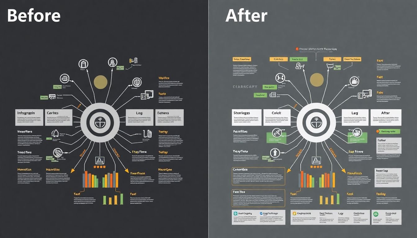
In the vast expanse of data we navigate daily, complexity often reigns supreme, leaving us drowning in a sea of information. But fear not, for there’s a lifeboat in the form of simplification and organization. The power of structure, when harnessed, can transform even the most daunting data into a beacon of clarity.
First, let’s consider the art of simplification. Complex data, much like a tangled ball of yarn, needs to be unraveled. Start by identifying the core elements, the essential yarns that hold the data together. These are your key points, your main ideas. Once you’ve untangled these, the rest will follow suit.
Now, let’s introduce hierarchy. Imagine a well-organized library. Books are categorized into sections, and within those sections, they’re further divided into subcategories. This is hierarchy at work. In the context of data, it’s about prioritizing information. The most important data should be the ‘best-seller’ at the front, while supporting details can be the ‘classics’ tucked away in the corners.
Layout is the architect of your data. It’s the blueprint that guides the eye through the information. A good layout is like a well-planned city
- easy to navigate, with clear paths leading from one point of interest to another. Use visual cues like size, color, and position to guide your audience through the data.
Lastly, let’s not forget the power of white space. It’s the unsung hero of design, the silent guardian of readability. White space is the pause between musical notes, the comma in a sentence, the breath we take before speaking. It gives the eye a place to rest, allowing it to absorb the information it’s just taken in.
In essence, simplifying and organizing complex data is an exercise in clarity. It’s about stripping away the unnecessary, highlighting the important, and presenting it in a way that’s easy to understand. And with the right use of hierarchy, layout, and white space, you’ll find that even the most complex data can be made to dance to your tune.

Alternative Text and Descriptions: Reaching the Visually Impaired
In the digital age, infographics have become a powerful tool for communicating complex information. However, these visual aids can pose a challenge for individuals with visual impairments or those using screen readers. This is where alternative text and descriptions come into play, acting as a bridge to make infographics accessible to all.
Alternative text, or ‘alt text’, is a brief description of an image that’s inserted into the image’s HTML code. It’s not just a courtesy for visually impaired users; it’s also crucial for search engine optimization and when images fail to load. For instance, instead of leaving an image of a cat as ‘cat.jpg’, describe it as ‘A fluffy, gray cat sitting on a windowsill’.
Describing charts and graphs is a bit more complex. It’s not enough to say ‘bar graph’ or ‘pie chart’. Instead, provide a summary of the data being presented. For example, ‘A bar graph showing the increase in global temperatures over the past decade, with the highest rise occurring in the last five years’.
Here are some steps to create effective alternative text and descriptions:
- Be concise and accurate. Don’t use full sentences or be overly poetic.
- Use the word ‘graph’ or ‘chart’ sparingly. Instead, describe the data.
- If the image is purely decorative, use an empty alt attribute (alt=

Multimodal Design: Engaging Multiple Senses
In the ever-evolving landscape of design, one approach stands out for its ability to engage and include a broader audience: multimodal design. This innovative concept harmonizes visual, auditory, and tactile elements to create infographics that are not only aesthetically pleasing but also accessible and interactive. By combining these sensory inputs, multimodal design transcends the traditional boundaries of visual communication, making information more engaging and inclusive.
The integration of audio descriptions is a prime example of this. Imagine an infographic about climate change. While the visuals might depict melting ice caps and rising sea levels, an audio description could provide additional context, such as the scientific causes behind these phenomena or the impact on local ecosystems. This not only benefits visually impaired individuals but also caters to those who prefer auditory learning styles.
Interactive elements are another key aspect of multimodal design. These could range from hover effects that reveal additional data to clickable areas that lead to more in-depth information. For instance, in an infographic about a historical event, interactive elements could allow users to explore different perspectives, delve into personal stories, or access further reading. This interactivity fosters a more immersive and personalized learning experience.
Tactile graphics are another powerful tool in the multimodal designer’s toolkit. These graphics can be felt as well as seen, making them invaluable for visually impaired individuals. Consider a tactile map of a city. Raised lines could represent streets, while braille labels could identify key landmarks. This not only provides a sense of the city’s layout but also allows users to navigate it independently.
In essence, multimodal design is about creating experiences that engage multiple senses, cater to diverse learning styles, and foster inclusivity. It’s about understanding that everyone interacts with and interprets information differently, and that by embracing this diversity, we can create infographics that are not just visually appealing, but also accessible, interactive, and deeply engaging.

Testing and Iteration: Ensuring Accessibility
Ensuring accessibility in infographic design is not just a best practice, but a moral and legal obligation. Testing with real users, including those with disabilities, is crucial to identify and address potential barriers. This process, known as user testing, helps ensure that your infographics are inclusive and accessible to everyone.
To conduct user testing, start by identifying your target audience. Consider age, education level, and any potential disabilities that might affect how users interact with your infographic. Once you’ve identified your test group, here are some steps to follow:
- Provide clear instructions to your testers about what you’re testing and what you hope to achieve.
- Use a variety of testing methods. This could include one-on-one interviews, group discussions, or even remote testing using screen sharing tools.
- Observe and take notes on how users interact with your infographic. Pay special attention to any areas where users seem confused or struggle to understand the information.
- Ask open-ended questions to gather feedback. Questions like ‘What do you think this chart is showing?’ or ‘How would you explain this data to a friend?’ can provide valuable insights.
After testing, it’s time to iterate on your design based on the feedback you’ve received. This could involve anything from simplifying complex charts to adding alt text for images or using color contrast that’s accessible to those with visual impairments. Remember, the goal is to make your infographic as accessible as possible to the widest range of users.
Testing and iteration are not one-time events, but ongoing processes. As your audience changes and new technologies emerge, it’s important to continually review and update your infographics to ensure they remain accessible. By doing so, you’re not just creating better infographics, you’re creating a better, more inclusive user experience.
Tools and Resources: Streamlining the Accessibility Process
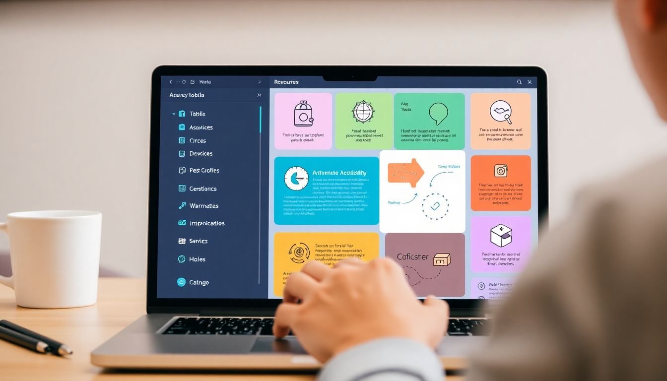
Ensuring the accessibility of infographics is a crucial step in inclusive design. To streamline this process, we’ve compiled a list of tools, resources, and guidelines that will help designers create infographics that are accessible to everyone.
The first step is to familiarize yourself with the Web Content Accessibility Guidelines (WCAG). The WCAG provides a comprehensive set of standards that cover a wide range of accessibility topics, including color contrast, text alternatives, and more. You can find these guidelines on the official WCAG website.
Once you’re familiar with the WCAG standards, it’s time to start designing. There are several tools available that can help you ensure your infographic meets these standards. For instance, color contrast checkers like WebAIM’s Contrast Checker or Adobe Color’s Accessibility tool can help you ensure that your text and non-text elements have sufficient contrast against their background.
Another useful tool is the aXe accessibility engine. This tool can be integrated into your design workflow and provides real-time feedback on the accessibility of your infographic. It checks for issues like missing alternative text, insufficient color contrast, and more.
For a more comprehensive evaluation, you can use tools like WAVE Web Accessibility Evaluation Tool or Lighthouse. These tools provide a detailed report on the accessibility of your infographic, highlighting any issues that need to be addressed.
Finally, it’s important to test your infographic with real users. This can help you identify any issues that you may have missed during the design process. There are several tools available that can help you conduct user testing, such as UsabilityHub and UserTesting.
By using these tools and resources, you can streamline the accessibility process and create infographics that are accessible to everyone.
FAQ
What makes an infographic accessible?
An accessible infographic is designed to be understood by as many people as possible, including those with disabilities. This involves using clear, concise language, providing alternative text for visuals, and ensuring sufficient color contrast. It’s about creating a visual communication that is inclusive and welcoming to all audiences.Why is inclusive design important in infographic creation?
Inclusive design ensures that your infographic reaches and resonates with a wider audience. It’s about understanding and accommodating the diverse needs of your viewers, whether they have visual, cognitive, or other types of disabilities. By embracing inclusive design, you’re not only improving accessibility but also enhancing the user experience for everyone.How can I ensure my infographic is accessible to visually impaired individuals?
To make your infographic accessible to visually impaired individuals, you should provide alternative text for all visuals. This can be done using the ‘alt’ attribute in HTML or by including a detailed description in the content itself. Also, ensure that your infographic can be understood when viewed with a screen reader, which reads aloud the content of the page.What is the importance of color contrast in accessible infographics?
Color contrast is crucial for accessibility as it helps viewers with low vision or color blindness distinguish between different elements in your infographic. The Web Content Accessibility Guidelines (WCAG) recommend a contrast ratio of at least 4.5:1 for normal text and 3:1 for large text. Tools like WebAIM’s Contrast Checker can help you verify your color choices.How can I make my infographic accessible to individuals with cognitive disabilities?
To make your infographic accessible to individuals with cognitive disabilities, use clear, simple language and avoid jargon. Break down complex information into smaller, manageable chunks. Use visuals to support your content, but ensure they add value and don’t just decorate the page. Consider providing a simplified or alternative version of your infographic for those who may find the original too complex.What role do headings play in accessible infographics?
Headings provide a roadmap for viewers, helping them understand the structure and content of your infographic. They are especially important for individuals using screen readers, as they use headings to navigate the content. Use clear, descriptive headings and ensure they are properly structured (e.g., use H1 for the main heading, H2 for subheadings, etc.).How can I test the accessibility of my infographic?
There are several tools and methods you can use to test the accessibility of your infographic. Automated tools like WAVE or aXe can help identify potential accessibility issues. Manual testing with real users, including those with disabilities, can provide valuable insights. Also, following the Web Content Accessibility Guidelines (WCAG) can help ensure your infographic meets accessibility standards.What are some common mistakes to avoid when creating accessible infographics?
One common mistake is relying too heavily on color to convey meaning. Another is using small font sizes or low color contrast, which can make text difficult to read. Avoid using images of text, as they cannot be resized or read by screen readers. Also, be mindful of using complex visuals that may not be understood by all viewers.How can I make my infographic accessible to individuals who are deaf or hard of hearing?
While infographics are primarily a visual medium, you can still make them accessible to individuals who are deaf or hard of hearing. If your infographic includes audio content, provide captions or transcripts. If it’s interactive, ensure all functionality can be accessed via keyboard. Also, consider providing a text-based alternative or summary of your infographic.