
Table of Contents
In the vast ocean of data that we swim in today, it’s not the quantity that matters, but how we navigate and understand it. This is where data visualization and infographic design come into play, acting as our lighthouses, guiding us safely to shore. But here’s the thing: not all lighthouses are created equal. Some are dull, unassuming structures, while others are architectural marvels that captivate and inspire. The same goes for data visualizations and infographics. They can be mere functional tools, or they can be compelling storytelling devices that simplify complex information and engage audiences. So, the question is: which kind of lighthouse do you want to build?
According to a study by MIT, the human brain processes visuals 60,000 times faster than text. This means that if you’re not leveraging the power of visuals to communicate your data, you’re missing out on a significant opportunity to connect with your audience. But here’s the catch: creating effective data visualizations and infographics is not as simple as throwing some charts and graphs onto a page. It requires a delicate balance of art and science, a keen eye for detail, and a deep understanding of your audience.
That’s where this article comes in. In ‘Data Visualization 101: How to Turn Complex Information into Compelling Infographics’, we’re going to demystify the process of data visualization and infographic design. We’ll start by agreeing on the importance of simplifying complex information in today’s data-driven world. Then, we’ll promise to equip you with the tools and techniques you need to create infographics that not only inform but also engage and inspire. Finally, we’ll give you a sneak peek into what you can expect to learn, from understanding your audience to choosing the right visualization type, and from designing for impact to telling compelling data stories.
So, whether you’re a seasoned data analyst looking to up your visualization game, or a marketer eager to engage your audience with compelling infographics, this article is for you. By the end of it, you’ll not only understand how to turn complex information into compelling infographics, but you’ll also be ready to build your own lighthouse, guiding your audience safely through the vast ocean of data.
Simplify, Engage, Inform: Your Guide to Effective Infographic Design
In the vast landscape of visual communication, infographics stand as powerful beacons, distilling complex data into digestible, engaging, and informative nuggets. To navigate this terrain effectively, let’s embark on a journey to simplify, engage, and inform through the art of infographic design. Imagine you’re a cartographer, mapping out intricate information in a way that’s not only easy to understand but also captivating to explore. The first step, simplification, is akin to reducing a sprawling cityscape to a concise map. It’s about identifying the core essence of your data and stripping away the clutter. Engaging with your audience is like designing a map that’s not just functional but also tells a story, evoking emotions, and drawing the viewer in. This could be achieved through vibrant colors, playful typography, or interactive elements. Lastly, informing is the compass that guides your design, ensuring that every visual choice serves the purpose of communicating your message clearly and accurately. Think of it as including landmarks and signposts on your map that provide valuable context and insights. So, let’s roll up our sleeves, grab our design tools, and set off on this adventure, one informed, engaging, and simplified infographic at a time.

Understanding Data Visualization
Data visualization, a powerful tool in the realm of data analysis and communication, is more than just presenting data; it’s about transforming raw data into a visual context that tells a story and reveals insights. Unlike simple data presentation, which merely displays facts and figures, data visualization uses visual elements like charts, graphs, and maps to communicate complex information in a clear, engaging, and often intuitive manner.
Imagine you’re trying to understand the growth of a company over the past decade. A simple data presentation might give you a table of numbers, showing revenue year by year. While this is informative, it’s not particularly engaging or easy to understand at a glance. Now, consider a line graph that plots these same numbers. Suddenly, you can see the trajectory of growth, spot trends and patterns, and even identify any significant drops or peaks. This is the power of data visualization.
Effective communication of complex information is at the heart of data visualization. It helps to simplify the complex, making it accessible to a wider audience, including those without extensive statistical knowledge. By using visual cues like color, shape, and position, data visualization can highlight important trends, outliers, and correlations that might otherwise go unnoticed. It also allows for interactive exploration, enabling users to drill down into the data, filter results, and gain deeper insights.
Moreover, data visualization plays a crucial role in storytelling with data. It can help to answer questions, challenge assumptions, and even inspire action. Whether it’s used in business reports, scientific research, or everyday decision-making, data visualization is an invaluable tool for making sense of the world around us.

The Art of Simplification
The art of simplification is a powerful tool that transforms intricate information into digestible, manageable pieces. It’s like turning a dense jungle into a well-tended garden, where every plant is visible and accessible. The process begins with identifying the key points, the main ‘trees’ in our jungle analogy, which are the core elements that hold the information together. These are the essentials that must be understood to grasp the whole.
Removing irrelevant data is akin to clearing the underbrush. It’s about recognizing what doesn’t serve the main purpose and gently setting it aside. This step requires a keen eye and a willingness to let go of details that, while interesting, don’t contribute to the core understanding. It’s about creating space for the essentials to breathe and stand out.
Breaking down complex concepts is like dividing the garden into smaller, manageable beds. It’s about taking a large, overwhelming idea and slicing it into smaller, digestible pieces. This technique allows us to understand and absorb information step by step, rather than being overwhelmed by the sheer size of the whole. It’s a strategy that respects our cognitive limits and works with them, rather than against them.
In essence, the art of simplification is about clarity and understanding. It’s about taking the complex and making it comprehensible, the overwhelming and making it manageable. It’s a skill that serves us in every aspect of life, from learning new subjects to navigating complex systems. And like any art, it improves with practice. So, let’s embrace the art of simplification, one step at a time.

Know Your Audience
Understanding your audience is the cornerstone of effective data visualization, much like how knowing your destination is crucial for a successful journey. In the realm of data storytelling, the audience is not a homogeneous entity; it’s a diverse tapestry of individuals with varying levels of technical acumen, interests, and expectations. Tailoring your infographics to suit this spectrum is not just an added advantage, but a necessity.
Imagine you’re presenting a complex dataset on climate change to two distinct groups: a room full of climate scientists and another filled with high school students. While the scientists would appreciate intricate details and complex models, the students might struggle with the same information. This is where understanding your audience comes into play. For the scientists, you might use advanced visualizations like Sankey diagrams or treemaps, while for the students, a simple line graph or a bar chart with clear annotations would be more appropriate.
To tailor your infographics effectively, consider the following steps:
- Research Your Audience: Understand their background, knowledge level, and interests. This could be as simple as a quick survey or a Google search.
- Keep It Simple: Break down complex data into digestible bits. Use clear, concise language and avoid jargon. Remember, the goal is to inform, not confuse.
- Use Appropriate Visuals: Different audiences respond to different visual cues. For tech-savvy audiences, you might use complex visualizations, but for laypeople, simple, intuitive visuals work best.
- Test and Refine: Show your infographic to a small group from your target audience and gather feedback. Refine your work based on their input.
In essence, knowing your audience is not just about creating visually appealing infographics; it’s about creating effective ones. It’s about ensuring that your data story resonates with your audience, inspires action, and leaves a lasting impact.

Choosing the Right Chart Type
Choosing the right chart type is akin to selecting the perfect paintbrush for an artist
- it’s all about matching the tool to the task at hand. In the vast landscape of data visualization, each chart type tells a unique story, and understanding when to use which one is key to effective communication. Let’s dive into some of the most common chart types and explore their best use cases.
Bar charts, for instance, are the workhorses of data visualization. They’re excellent for comparing discrete categories of data. Imagine you’re presenting sales figures for different regions. A bar chart would beautifully illustrate the contrast between, say, the towering sales in New York and the modest numbers in Kansas. But remember, bar charts are best suited for comparing individual data points, not for showing trends over time.
Line graphs, on the other hand, are the storytellers of the data visualization world. They’re perfect for displaying changes over time, such as stock prices, temperature fluctuations, or even your fitness progress. The smooth, continuous line allows viewers to see trends and patterns that might otherwise go unnoticed. However, they’re not ideal for comparing specific data points, as the eye can be tricked by the visual length of the line.
Pie charts are the classic choice for showing proportional data. They’re great for displaying market shares, percentages, or any situation where you want to show ‘parts of a whole’. But beware, pies are not the best choice for showing precise numerical data, as the human eye is not great at judging angles and sizes accurately.
And that’s not all! There are many more chart types, each with its own strengths and weaknesses. Scatter plots are fantastic for showing relationships between two variables, while heat maps can beautifully display density distributions. The key is to understand what story you want to tell and choose the chart type that tells it best.
In conclusion, choosing the right chart type is not just about aesthetics, but about effectively communicating your data. So, the next time you’re faced with a spreadsheet full of numbers, remember that the right chart can turn data into a compelling story.
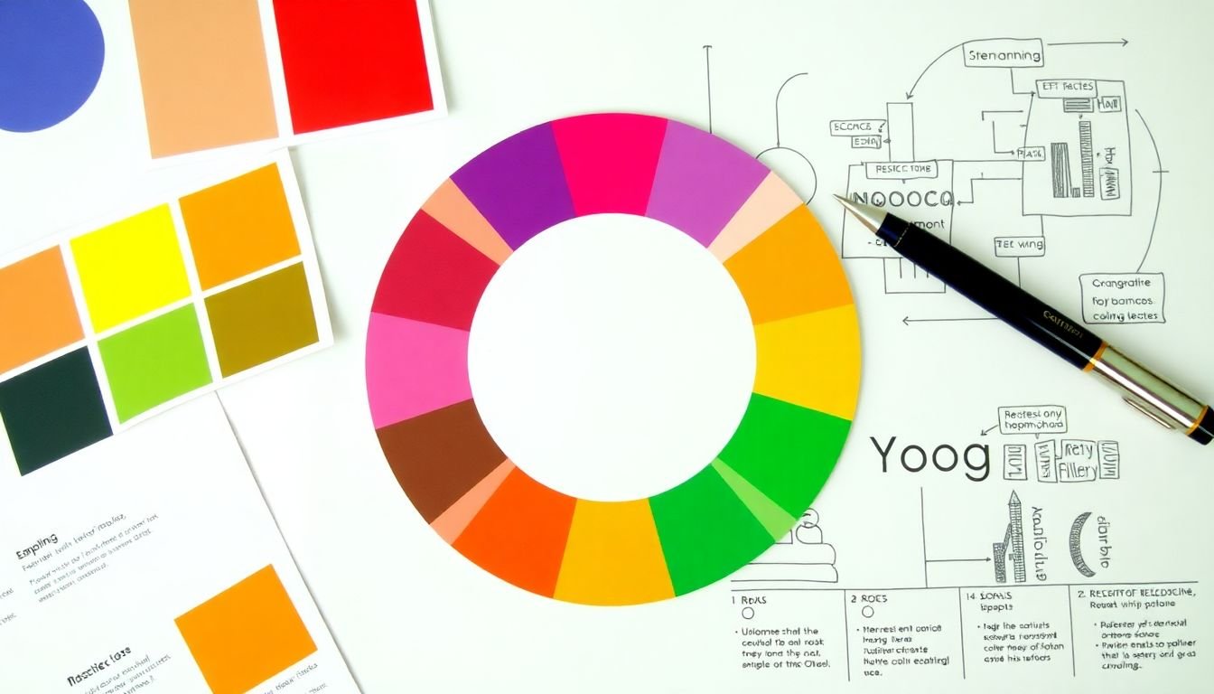
Design Principles for Infographics
Designing effective infographics is an art that combines aesthetics with functionality. At the heart of this process lie several key design principles that, when mastered, can transform complex data into engaging and easily digestible visual stories. Let’s delve into these principles, starting with color theory.
Color theory is the backbone of any visual design. In infographics, colors serve multiple purposes: they can highlight important information, create visual hierarchies, and evoke emotions. The first step in using color effectively is to understand the color wheel and its primary, secondary, and tertiary colors. Next, consider the color scheme you’ll use. Complementary, analogous, or monochromatic schemes can all work well, depending on the message you want to convey. Lastly, ensure that your color choices are accessible to all viewers, including those with color blindness.
Typography, the art of arranging text, is another crucial aspect of infographic design. The choice of font can significantly impact the readability and mood of your infographic. Sans-serif fonts are often preferred for their clean, modern look and excellent readability, making them ideal for body text. For headings, consider using serif fonts for a more formal or elegant feel, or display fonts for a bold, attention-grabbing effect. Consistency is key in typography; stick to two or three fonts throughout your design to avoid confusion.
White space, or negative space, is the area around and between design elements. It’s often overlooked, but it plays a vital role in infographic design. By using white space effectively, you can guide the viewer’s eye through the infographic, emphasize important elements, and create a sense of balance and harmony. To achieve this, use white space to separate sections, create hierarchy, and provide breathing room between elements.
Storytelling is the soul of any infographic. It’s the narrative that connects the data and turns information into a compelling story. To create an engaging narrative, start by identifying the key message you want to convey. Then, structure your content in a logical sequence, using a clear hierarchy of information. Use visuals to support your story, not overshadow it. And remember, less is often more; don’t cram your infographic with too much information. Instead, focus on the essentials and let your story shine.
In conclusion, mastering these design principles
- color theory, typography, white space, and storytelling
- is not just about creating visually appealing infographics. It’s about communicating complex ideas effectively, engaging viewers, and making data accessible. So, the next time you set out to design an infographic, keep these principles in mind. Your audience will thank you with their undivided attention and newfound understanding.

Storytelling with Data
Storytelling with data is an art that transforms raw numbers into compelling narratives, making complex information accessible and engaging. At its core, it’s about using data visualization to create a journey for your audience, much like a traditional story. This journey should have a clear beginning, middle, and end, following a narrative arc that guides viewers through your data’s key points.
The beginning of your data story sets the stage. It’s where you introduce your topic, provide context, and give your audience a reason to care. This could be a brief explanation of the problem you’re exploring, or a question you’re trying to answer. For instance, ‘Did you know that global coffee consumption has been steadily increasing over the past decade? Let’s explore this trend together.’
The middle is where the action happens. Here, you’ll present your data visualizations, each one building on the last to tell a coherent story. This is where you’d use charts, graphs, and maps to illustrate trends, comparisons, and patterns. Remember, each visualization should serve a purpose in advancing your narrative. They should be varied, but cohesive, guiding your audience through a logical sequence of ideas.
The end is your conclusion. It’s where you tie up your story, summing up your findings and providing a clear takeaway. This could be a surprising fact, a call to action, or a thought-provoking question. For example, ‘So, the next time you enjoy a cup of coffee, remember that you’re part of a global trend that’s been brewing for years.’
To create a compelling data story, consider the following steps:
- Identify your audience and tailor your story to their interests and knowledge level.
- Choose a clear and engaging topic that lends itself to data visualization.
- Collect and clean your data, ensuring it’s accurate and relevant.
- Select the right visualizations to tell your story, considering factors like simplicity, clarity, and aesthetics.
- Craft a narrative arc that guides your audience through your data, with a clear beginning, middle, and end.
- Test your story with a small audience and refine based on their feedback.
- Present your data story with confidence, enthusiasm, and a touch of playfulness.

Interactive and Dynamic Infographics
In the digital age, static infographics are no longer enough to captivate audiences. Interactive and dynamic infographics have emerged as powerful tools to engage users and convey complex data in an intuitive, immersive way. These visualizations transform passive viewers into active participants, allowing them to explore, manipulate, and draw their own insights from the data.
At the heart of creating engaging, user-driven infographics lies a blend of art and science. Tools like Tableau, Power BI, and D3.js enable data visualization experts to bring their creations to life. These platforms offer a range of interactive features, such as tooltips, filters, and sliders, that allow users to interact with the data in real-time.
To create compelling interactive infographics, consider the following steps:
- Understand your audience and their level of familiarity with the data. This will help you tailor the visualization to their needs and ensure it’s accessible and engaging.
- Simplify complex data by identifying key trends, patterns, and outliers. Focus on the story you want to tell and use data to support it.
- Choose the right chart type for your data. Different types of charts (bar, line, scatter, etc.) are best suited for different types of data and the insights you want to highlight.
- Design with user experience in mind. Make sure your interactive elements are intuitive and easy to use. Use clear labels, tooltips, and legends to guide users through the visualization.
- Test and refine. Gather feedback from users and make adjustments as needed. Iteration is key to creating a successful interactive infographic.
By mastering these techniques and tools, you can create dynamic infographics that inform, engage, and inspire your audience.

Case Studies: Learning from the Masters
In the vast landscape of data visualization, infographics have emerged as powerful tools for communicating complex information in engaging and accessible ways. To learn from the masters, let’s delve into three case studies of successful infographics, analyzing their effectiveness and extracting techniques that can be applied to other data sets.
The first masterpiece we’ll examine is ‘The History of the Web’ by The Guardian. This interactive infographic tells the story of the internet’s evolution through a beautifully designed timeline. It’s effective because it combines data with narrative, making it engaging and easy to understand. To apply this to other data sets, consider:
- Using a storytelling approach to structure your data.
- Incorporating interactive elements to enhance user engagement.
- Designing the infographic around a clear narrative arc.
Next, let’s look at ‘The World’s Tallest Buildings’ by The New York Times. This static infographic uses a simple, elegant design to compare the heights of the world’s tallest structures. Its effectiveness lies in its clarity and simplicity. Techniques to apply include:
- Using a consistent scale to compare data points.
- Emphasizing key data points with color or size.
- Keeping the design uncluttered to maintain focus on the data.
Lastly, we have ‘The Evolution of Video Games’ by The Washington Post. This animated infographic uses motion to illustrate the evolution of video games over time. Its effectiveness comes from its dynamic nature and ability to convey change over time. Techniques to apply include:
- Using animation or motion to illustrate change over time.
- Incorporating relevant visuals to enhance understanding.
- Designing the infographic around a clear temporal structure.
By studying these case studies and applying their techniques, we can create infographics that are not only informative but also engaging and effective. After all, as the saying goes, ‘Those who cannot remember the past are condemned to repeat it.’ In the world of data visualization, let’s learn from the past to create a better future.

Creating Your Own Infographic
Creating your own infographic is an exciting journey that combines data, design, and storytelling. Let’s embark on this process, step by step, from data collection to final design.
1. Data Collection and Research:
The first step in creating an infographic is gathering relevant data. This could be from reliable sources like government databases, research papers, or even your own surveys. Ensure the data is accurate, up-to-date, and supports the story you want to tell.
2. Define Your Story:
Once you have your data, it’s time to craft a compelling narrative. Identify the key points you want to communicate and arrange them in a logical sequence. Remember, an infographic should inform and engage, so make sure your story is interesting and easy to follow.
3. Sketch and Plan:
Before diving into design software, sketch your infographic on paper. This helps visualize the layout, placement of data, and overall flow. Consider using different shapes, sizes, and arrangements to keep the design dynamic.
4. Choose Your Design Software:
There are numerous tools available for creating infographics, from simple online platforms to complex design software. Some popular options include Canva, Piktochart, Adobe Illustrator, and Inkscape. Each has its own learning curve and features, so choose one that best fits your skill level and needs.
5. Design Basics:
Regardless of the software you choose, there are some design principles to keep in mind. Use a clean, legible font for text, and ensure there’s enough contrast between text and background. Use color strategically to highlight important points or create visual hierarchy.
6. Visualize Your Data:
This is where your infographic comes to life. Use charts, graphs, icons, or other visual elements to represent your data. Consider using interactive elements or animations to make your infographic more engaging.
7. Add Text and Labels:
Text should be concise and easy to read. Use labels to explain your data visualizations, and add a title that clearly communicates the topic of your infographic.
8. Review and Refine:
Once you’ve created your initial design, step back and review it. Check for any inconsistencies, typos, or areas that could be improved. Gather feedback from others and make revisions as needed.
9. Export and Share:
Once you’re satisfied with your infographic, export it in a suitable format (like PNG or PDF) and share it on your chosen platform. This could be your website, social media, or a presentation.
10. Monitor and Update:
After sharing, monitor the performance of your infographic. If new data becomes available or you spot any inaccuracies, don’t hesitate to update your infographic. Keeping it current ensures it remains a valuable resource.
Creating an infographic is a rewarding process that combines creativity and critical thinking. With these steps and a bit of practice, you’ll be designing engaging and informative infographics in no time!

Testing and Refining Your Infographic
Crafting an effective infographic is a journey, not a destination. The process of testing and refining is as crucial as the initial creation, ensuring your visual masterpiece communicates its message clearly and resonates with your audience. Think of it like a chef tasting their dish before serving – it’s the final touch that elevates your infographic from good to great.
First, gather your taste testers, or in this case, your focus group. They could be colleagues, friends, or even a small sample of your target audience. Their diverse perspectives will provide valuable insights into what works and what doesn’t.
When presenting your infographic, ask open-ended questions to encourage detailed feedback. Some prompts could be: ‘What’s the first thing that catches your eye?’, ‘Does the information flow logically?’, ‘Are there any confusing elements?’, or ‘How would you improve this?’.
Now, let’s talk about making those improvements. Here are some tips:
- Simplify and Clarify: If your focus group is struggling with the content, consider simplifying the language or breaking down complex ideas into smaller, digestible bits.
- Check Your Colors: Ensure your color scheme is accessible and doesn’t hinder readability. Tools like WebAIM can help you check your color contrast.
- Test on Different Devices: Infographics should be responsive, so test them on various devices and screen sizes to ensure they look good everywhere.
- Iterate, Iterate, Iterate: Don’t be afraid to make multiple revisions. Each round of testing and refining brings you one step closer to infographic perfection.
Remember, every change is an opportunity to improve. So, embrace the testing and refining process, and watch as your infographic evolves into a powerful visual story.
FAQ
What is data visualization and why is it important?
What makes a good infographic design?
How do I choose the right chart type for my data?
How can I simplify complex information for my infographic?
- Identify the main message or story you want to convey.
- Break down your data into smaller, manageable chunks.
- Use clear, concise language and avoid jargon.
- Prioritize information, using a hierarchy of importance.
- Use visuals to explain complex concepts, such as icons, diagrams, or maps.
What are some common mistakes to avoid in data visualization?
- Using too many colors or types of charts, which can confuse viewers.
- Including too much data, which can overwhelm viewers and obscure the main message.
- Ignoring the context of the data, which can lead to misinterpretation.
- Using 3D effects, gradients, or other visual clutter that distract from the data.
- Not checking the accuracy of your data or the integrity of your visualizations.
How can I make my infographic accessible to everyone?
- Use high-contrast colors to ensure text is easily readable.
- Provide alternative text for images to help visually impaired users.
- Use clear, simple language and avoid idioms or cultural references that might not be understood by all viewers.
- Provide a legend or key to explain any symbols or colors used.
- Test your infographic with a diverse group of users to ensure it’s accessible and understandable.
What tools can I use to create my infographic?
- Canva: A user-friendly, drag-and-drop design tool with a wide range of templates and design elements.
- Adobe Illustrator: A professional vector graphics editor for creating complex, high-quality designs.
- Tableau: A data visualization software that allows you to connect to data sources and create interactive dashboards.
- Google Data Studio: A free tool for creating interactive reports and dashboards using data from Google Analytics or other data sources.
How can I effectively present my infographic?
- Provide context: Explain what the infographic is about and why it’s important.
- Tell a story: Use the infographic to illustrate a narrative or argument.
- Keep it simple: Don’t overwhelm viewers with too much information at once.
- Engage your audience: Encourage viewers to interact with the infographic, ask questions, or share their thoughts.
- Use it as a starting point: An infographic should spark conversation and exploration, not provide all the answers.