In the digital age, where first impressions matter more than ever, crafting a cohesive visual identity is not just an aesthetic choice, but a strategic necessity. According to a study by MIT, people can identify a logo in just 100 milliseconds, and it takes about 50 milliseconds for the brain to make a first impression. So, the question is, what story is your brand’s visual identity telling in that blink of an eye?
Agreeably, maintaining brand consistency across all platforms, from your logo to your social media presence, is a challenge. A recent survey by Lucidpress revealed that inconsistent branding can result in a 23% loss in revenue. Yet, many businesses struggle with this, often due to a lack of understanding or resources. This article promises to demystify the process of designing a cohesive visual identity, guiding you from the creation of your logo to your social media branding.
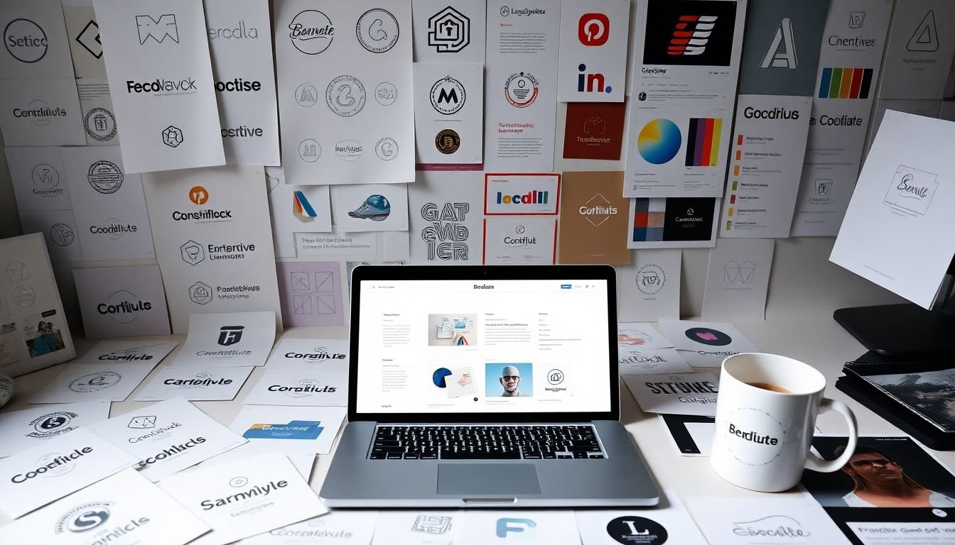
By the end of this article, you will be equipped with the knowledge to create a strong, consistent, and recognizable visual identity that will not only help you stand out but also build trust and credibility with your audience. We’ll delve into the importance of a well-designed logo, the role of color psychology, typography, and imagery in your brand’s visual language, and how to apply these elements consistently across various platforms, with a special focus on social media. To make this information more digestible, we’ve also included an infographic that provides a quick, visual guide to the process.
So, whether you’re a small business owner, a marketing professional, or a designer looking to upskill, this article is for you. Let’s embark on this visual journey and transform your brand into a recognizable, cohesive, and powerful entity in the digital landscape.
Mastering Brand Consistency Across All Platforms
In the digital age, where businesses thrive or falter based on their online presence, maintaining brand consistency across all platforms has become a critical success factor. Imagine your brand as a symphony, with each platform
- from your website to social media, email newsletters to advertising campaigns
- playing a unique instrument. Each note should resonate with the melody of your brand’s mission, values, and personality. Consistency ensures that your audience recognizes your brand instantly, fosters trust, and creates a cohesive customer experience. It’s like wearing a uniform that makes you easily identifiable in a crowded room. To master this, start by defining your brand’s DNA
- its voice, tone, visual elements, and messaging. Then, ensure this DNA is reflected in every interaction, every post, every ad. Consistency isn’t about being repetitive; it’s about being recognizable. It’s about ensuring that your brand’s story is told in the same language, with the same passion, across every platform. Think of it as a dance, where each step builds on the last, creating a seamless, harmonious performance that captivates your audience and leaves them wanting more.

Understanding Visual Identity
Visual identity, often referred to as corporate identity or brand identity, is a critical aspect of any organization, product, or individual that seeks to establish a unique and recognizable presence in the market. It’s the visual representation of who you are, what you do, and how you do it. Unlike a brand, which encompasses the entire customer experience, including the emotional connection and the promise of a product or service, visual identity is a subset of branding, focusing solely on the visual elements that communicate your brand’s personality.
Understanding visual identity is like understanding the language of visual communication. It’s the first thing people see and remember about you. It’s the visual shorthand that helps people recognize and connect with you. In a world filled with noise and competition, a strong visual identity can be the difference between being noticed and being overlooked.
The elements that constitute a visual identity are like the ingredients in a recipe. Each plays a unique role in creating the final dish, or in this case, the final visual impression. Let’s break them down:
- Logo: The face of your visual identity, a logo is a mark or emblem that identifies and differentiates you. It’s the most recognizable part of your visual identity and should be simple, memorable, and versatile.
- Color Scheme: Colors evoke emotions and convey messages. Your color scheme should align with your brand personality and appeal to your target audience. It should be consistent across all touchpoints and used strategically to create contrast and hierarchy.
- Typography: Fonts communicate your brand’s tone of voice. They can be serious or playful, modern or traditional. Like colors, typography should be used consistently and strategically to create visual hierarchy and guide the reader’s eye.
- Imagery: Images, graphics, and iconography support your brand message and help tell your story. They should be consistent with your brand personality and used to create a cohesive visual language.
In essence, visual identity is the visual expression of your brand’s personality. It’s the way you present yourself to the world, and it’s a powerful tool for building recognition, trust, and connection. Understanding and investing in your visual identity is not just about looking good; it’s about communicating who you are, what you stand for, and why you matter.

The Power of Logo Design
The power of a logo, often underestimated, is immense. It’s the silent ambassador of your brand, the first visual impression that speaks volumes before a word is uttered. A well-designed logo is not just an image; it’s a story, a promise, a symbol of trust. Let’s delve into the significance of a logo in a brand’s visual identity and explore the principles that make a logo powerful.
At the heart of logo design lie several key principles. Simplicity is paramount. A logo should be easily recognizable and memorable, even at a glance. Think of the Apple logo
- a simple, sleek bitten apple. Its simplicity is its strength, making it instantly recognizable worldwide. Simplicity also ensures versatility. A logo should adapt to various mediums
- from business cards to billboards, social media icons to merchandise
- without losing its essence. This adaptability is crucial in today’s multichannel world.
Memorability is another key aspect. A logo should be unique, standing out in a sea of competitors. It should evoke emotions, stir memories, and create a lasting impression. The Nike swoosh is a classic example. It’s simple, versatile, and instantly recognizable, symbolizing speed, agility, and triumph.
Let’s take a look at some successful logos and their evolution. The Coca-Cola logo, with its distinctive script, has evolved over the years, but its essence remains unchanged. It’s a testament to the power of a strong logo that can withstand the test of time. On the other hand, Google’s logo has evolved significantly, from a simple, serif font to a colorful, playful design, reflecting the company’s growth and innovation.
In conclusion, a logo is more than just a graphic element. It’s a strategic tool that communicates your brand’s values, personality, and promise. A well-designed logo, adhering to the principles of simplicity, versatility, and memorability, can indeed be a powerful asset, driving brand recognition and fostering customer loyalty.

Color Psychology and Branding
In the vibrant tapestry of the business world, color psychology plays an indispensable role, weaving its magic into the fabric of branding. Colors, much like words, possess the power to evoke emotions, stir memories, and influence decisions. This is where the science of color psychology intersects with the art of branding, creating a symphony of hues that resonate with your target audience and align with your brand’s personality.
The first step in this color odyssey is understanding the emotional cues associated with different colors. For instance, blue is often linked with trust, stability, and calmness, making it a favorite among financial institutions. Red, on the other hand, is energetic, passionate, and can stimulate appetite, hence its prevalence in fast food chains. Green symbolizes growth, nature, and health, while yellow evokes joy, optimism, and warmth.
Once you’ve identified the emotional territory you want your brand to occupy, it’s time to consider your target audience. Different cultures, ages, and genders respond to colors differently. For example, while blue is universally loved, it’s particularly favored by men. Meanwhile, purple, associated with luxury and spirituality, appeals more to women. Age also plays a role; younger audiences tend to prefer bright, vibrant colors, while older ones gravitate towards more subdued tones.
Now, let’s delve into the practical aspects of choosing a color scheme. Firstly, consider your brand’s personality. Is it playful and energetic, or sophisticated and elegant? Your color choice should reflect this. Secondly, look at your competitors. You want to stand out, not blend in. Lastly, test your color scheme. A/B testing can provide invaluable insights into what resonates with your audience.
Remember, color psychology is not an exact science. What works for one brand may not for another. It’s about finding the right color harmony that sings your brand’s unique story. So, go ahead, experiment, and let the power of color work its magic on your brand.

Typography: The Voice of Your Brand
Typography, often overlooked, is the unsung hero of visual identity, serving as the voice of your brand. It’s the first point of contact with your audience, setting the tone and communicating your brand’s personality even before they’ve read a word. Font selection is the first step in this typographic journey. Choose a font that resonates with your brand’s values and appeals to your target audience. Is it playful and casual, or sleek and professional? Once you’ve found your voice, consistency is key. Use your chosen font across all platforms, from your website to your packaging, to create a cohesive brand identity.
But wait, there’s more to typography than just picking a font and sticking with it. Font pairing is an art form in itself. Think of it like casting a movie
- each font has its own unique characteristics, and when paired correctly, they can create a compelling narrative. For instance, pairing a bold, attention-grabbing headline font with a clean, legible body font can create a dynamic duo that guides the reader’s eye and enhances the overall message.
Now, let’s talk hierarchy. Just like in a conversation, not all words are created equal. Typography allows you to emphasize certain elements, guiding the reader through your content. Size, weight, and style can all be used to create a visual hierarchy. Larger, bolder fonts draw the eye in, while smaller, lighter fonts provide supporting information. It’s a delicate balance, but when done right, it can make your content more engaging and easier to digest.
In essence, typography is not just about choosing a pretty font. It’s about creating a consistent, recognizable voice for your brand that resonates with your audience. So, go ahead, let your brand’s personality shine through, one font at a time.

Imagery and Brand Aesthetics
In the realm of branding, imagery and aesthetics play a pivotal role in shaping a brand’s identity and communicating its personality. Imagery, a broad term encompassing photography, illustrations, and graphics, serves as the visual language that speaks volumes about a brand, often even before words are read. It’s the first impression, the hook that draws in potential customers, and the consistent thread that weaves through all branding materials, creating a cohesive and recognizable presence.
To harness the power of imagery in crafting a brand’s aesthetic, one must first understand the brand’s personality. Is it bold and adventurous, or subtle and sophisticated? Once this is established, the visual language can be developed. For instance, a brand targeting an adventurous audience might opt for dynamic, action-packed photography, while a luxury brand might prefer elegant, high-quality illustrations.
Photography is a potent tool in shaping a brand’s aesthetic. It can capture the essence of a brand’s personality through its subjects, composition, and style. Consistent use of a particular photographic style, such as black and white, or a specific filter, can help create a recognizable visual identity. Illustrations, on the other hand, offer a unique, artistic touch. They can be used to create a distinct, often playful, aesthetic, and can be particularly effective in communicating complex ideas or emotions.
Graphics, including typography, color schemes, and patterns, are the final pieces of the puzzle. They provide the finishing touches that tie the entire visual identity together. The font choice can convey a brand’s personality
- sleek and modern, or classic and traditional. Color schemes can evoke specific emotions, while patterns can add a layer of complexity and interest.
Creating a consistent visual language involves more than just choosing a style and sticking to it. It requires a strategic approach, with careful consideration given to how each element of the imagery aligns with the brand’s personality. It’s about creating a visual narrative that tells a story about the brand, one that resonates with its target audience.
In essence, imagery and brand aesthetics are not just about creating something that looks good. They are about creating something that looks like you, that speaks your brand’s language, and that connects with your audience on a visual level. It’s about creating a visual identity that is not just consistent, but cohesive, and not just cohesive, but compelling.

Brand Style Guide: The Blueprint of Your Identity
In the vast, ever-evolving landscape of business, maintaining a consistent brand identity is akin to navigating with a reliable compass. This is where a brand style guide steps in, acting as the blueprint of your visual identity, ensuring that your brand’s personality shines through consistently across all touchpoints.
Imagine your brand style guide as the rulebook that keeps your brand’s visual language cohesive and recognizable. It’s the secret weapon that ensures your logo, color scheme, typography, imagery, and tone of voice remain consistent, whether you’re communicating on social media, packaging products, or designing your website.
Let’s delve into the key elements that a comprehensive brand style guide should include:
-
Logo Usage:
- This is the face of your brand. Your guide should clearly outline how, where, and when to use your logo. Include variations (if any), minimum size requirements, and what to avoid when placing it on different mediums.
Color Palette:
- Colors evoke emotions and set the mood. Define your brand’s color scheme, including primary, secondary, and accent colors. Specify their hex codes or Pantone references for consistency in digital and print applications.
Typography:
- Fonts convey your brand’s personality. Choose a primary and secondary font, and outline their usage in headings, subheadings, and body text. Include font sizes, line spacing, and any other typographic rules.
Imagery:
- Visuals should align with your brand’s values and aesthetics. Describe your brand’s photographic style, including lighting, composition, and subject matter. Include guidelines for illustrations and graphics as well.
Tone of Voice:
While not visual, tone of voice is a crucial aspect of your brand’s identity. Define your brand’s personality traits and how they translate into written communication. Include do’s and don’ts for language use, and provide examples of your brand’s voice in action.
A well-crafted brand style guide is not just a document; it’s a living, breathing entity that evolves with your brand. It’s the guardian of your brand’s visual consistency, ensuring that every interaction with your audience is a step towards building a strong, recognizable brand.

Extending Your Visual Identity to Social Media
In the digital age, social media has become a vital extension of our personal and professional identities. Maintaining a consistent visual identity across these platforms is not just important, but crucial. It’s the digital equivalent of dressing for the part – it communicates who you are, what you do, and what you stand for, even before your audience reads a single word.
Adapting your visual identity for different platforms requires a strategic approach. Let’s start with the basics: profile pictures and cover photos. These are your first points of contact, your digital handshake. They should be high-quality, relevant, and consistent across all platforms. For profile pictures, consider using a logo or a professional headshot. For cover photos, think of it as a billboard – it’s a large space to showcase your brand’s personality or a recent achievement.
Next, let’s talk about post graphics. Each platform has its own size requirements, so it’s important to create graphics that are optimized for each one. Canva, Adobe Spark, and other design tools can help you create graphics that are the right size and format for each platform. Consistency is key here too – use the same color scheme, typography, and style across all your graphics.
Lastly, stories. Stories are a great way to show the behind-the-scenes of your brand, but they should still align with your visual identity. Use the same color scheme and typography in your story text overlays. Consider using templates or filters that are consistent with your brand’s aesthetic.
In conclusion, extending your visual identity to social media is not a one-size-fits-all task. It requires careful planning and adaptation. But with the right strategy and tools, you can create a cohesive digital presence that reflects your brand’s unique identity and resonates with your audience.

The Role of Consistency in Building Brand Recognition
Consistency is the unsung hero in the grand theater of branding, often overlooked yet indispensable in building brand recognition. Imagine a world where your favorite brands changed their logos, color schemes, and taglines as frequently as you change your socks. Confusing, right? That’s where consistency steps in, providing a beacon of familiarity that helps consumers navigate the vast sea of brands.
The visual identity of a brand is its first point of contact with the consumer, a silent ambassador that speaks volumes about what the brand stands for. A consistent visual identity, marked by a distinctive logo, color palette, and typography, creates a recognizable pattern that imprints itself on the consumer’s mind. It’s like having a personal brand detective who helps consumers spot your brand from a mile away, even amidst the clutter.
Consistent branding doesn’t just stop at the visuals. It extends to the brand’s voice, messaging, and customer experience. A consistent brand voice, whether it’s playful, serious, or authoritative, helps consumers understand what to expect from the brand. It’s like having a friend who always makes you laugh, or one who always offers sage advice. You know what you’re getting, and that’s comforting.
Consistent branding has a profound impact on consumer behavior. According to a study by Lucidpress, consistent branding across all platforms can increase revenue by up to 23%. This is because consumers are more likely to do business with a company when its branding is consistent across all the different channels they use to interact with it. It’s like dating someone who’s always true to themselves
- you know what you’re getting, and you feel safe investing your time and emotions.
Moreover, consistent branding builds brand equity, which is the commercial value that derives from consumer perception of the brand. Brands with high equity, like Coca-Cola or Apple, command premium prices, attract loyal customers, and enjoy greater marketing effectiveness. It’s like having a best friend who’s always there for you
- their value is priceless, and you’re willing to go the extra mile for them.
In conclusion, consistency in branding is not just about having a pretty logo or a catchy tagline. It’s about creating a consistent experience that resonates with consumers, builds trust, and ultimately, drives business success. So, the next time you’re tempted to give your brand a radical makeover, remember the power of consistency. It might not be as exciting as a dramatic transformation, but it’s the steady, reliable friend that will help your brand stand out in the long run.

Case Studies: Brands Nailing Visual Identity
In the dynamic world of branding, a compelling visual identity is not just an adornment, but a powerful tool that communicates a brand’s essence, values, and personality. Let’s delve into two case studies of brands that have masterfully nailed their visual identities, maintaining consistency across diverse platforms.
The first brand that stands out in this regard is Apple. Apple’s visual identity is a masterclass in simplicity and elegance. Their logo, a stylized apple with a bite taken out, is instantly recognizable and has evolved subtly over the years, maintaining its core design while embracing modern aesthetics. The use of clean, white spaces, and a consistent color palette of silver, white, and black in their packaging and retail stores creates a sleek, minimalist environment that reflects the brand’s focus on innovation and simplicity.
Apple’s consistency extends to their digital platforms as well. Their website and apps maintain the same clean, uncluttered design, with a focus on high-quality product images and concise, informative text. The consistent use of the ‘i’ icon in their product names further reinforces brand recognition. Apple’s visual identity is not just about looking good; it’s about creating a seamless, cohesive experience that reinforces the brand’s promise of premium quality and user-friendly design.
The second brand that excels in visual identity is Coca-Cola. With a history dating back over a century, Coca-Cola’s visual identity has evolved significantly, yet it remains instantly recognizable. The iconic script logo, designed in 1886, is one of the most recognizable logos in the world. The use of red as the primary color is also a masterstroke, as it’s associated with energy, excitement, and passion
- values that Coca-Cola wants to evoke.
Coca-Cola’s visual identity extends beyond the logo and color scheme. Their Christmas campaigns, featuring festive bottle labels and eye-catching outdoor advertisements, are eagerly anticipated annual events. The ‘Share a Coke’ campaign, which featured bottles with popular names written on them, was another brilliant example of visual storytelling that reinforced the brand’s message of friendship and sharing. Coca-Cola’s visual identity is not just about looking good; it’s about creating emotional connections and fostering a sense of belonging.
In conclusion, these case studies illustrate that a successful visual identity is not about having the flashiest logo or the most vibrant color scheme. It’s about creating a cohesive, consistent narrative that reflects the brand’s values and resonates with its audience. It’s about understanding that visual identity is not a one-time project, but an ongoing process that evolves with the brand and its audience. And most importantly, it’s about understanding that visual identity is not just about looking good; it’s about creating a meaningful connection with the audience.

Infographic: The Anatomy of a Cohesive Visual Identity
Crafting a cohesive visual identity is akin to sculpting a brand’s personality, ensuring it’s instantly recognizable and consistently represented across all touchpoints. Let’s delve into the anatomy of a cohesive visual identity through an engaging infographic.
The journey begins with Strategy, the blueprint that guides your visual identity. It’s here you define your brand’s purpose, target audience, and unique selling points. This step sets the stage for all subsequent elements.
Next, we have Logo Design. This is your brand’s signature, a visual mark that encapsulates its essence. A well-crafted logo is simple, versatile, and memorable. It should work seamlessly across various mediums, from digital platforms to print materials.
Color Palette is the next crucial component. Colors evoke emotions and convey messages, so choose wisely. A cohesive palette consists of 2-4 main colors and a few accent colors. Ensure they align with your brand’s personality and appeal to your target audience.
Typography is another vital element. Fonts can significantly impact readability and perception. Stick to 2-3 fonts that complement each other and reflect your brand’s tone. Use them consistently across headings, subheadings, and body text.
Imagery and Iconography should be consistent with your brand’s style. They could be photographs, illustrations, or custom icons. Whatever you choose, ensure they’re relevant, high-quality, and align with your brand’s aesthetics.
Layout and Grid Systems provide structure to your designs. A consistent grid system ensures your content is organized and easy to navigate. It also creates a visual rhythm that’s pleasing to the eye.
Lastly, Voice and Tone complete your visual identity. This is how your brand communicates, whether it’s friendly and casual or professional and formal. It should be consistent across all written content, from website copy to social media posts.
In conclusion, a cohesive visual identity is a harmonious blend of these elements. Each component plays a crucial role, working together to create a strong, recognizable brand. Regularly review and update your visual identity to ensure it remains relevant and reflective of your brand’s evolution.
FAQ
What is a visual identity and why is it important for a brand?
How does a cohesive visual identity contribute to brand consistency?
What are the key elements of a visual identity?
- Logo: The symbol or mark that represents your brand.
- Color Scheme: The colors that define your brand’s personality and evoke specific emotions.
- Typography: The fonts used in your brand’s communication, which can convey different moods and messages.
- Imagery: The visuals that support your brand’s message and appeal to your target audience.
- Style Guide: A set of rules that dictate how these elements should be used consistently.
How can I ensure my visual identity is versatile and adaptable?
- Simplicity: A simple design is easier to adapt to different contexts and platforms.
- Scalability: Ensure your logo and other visual elements can be scaled up or down without losing quality.
- Color Versatility: Use a color scheme that can be adapted to different backgrounds and contexts.
- Versatile Typography: Choose fonts that are legible and versatile, and can be used in different sizes and weights.
- Style Guide: Create a comprehensive style guide that outlines how your visual identity should be used in different scenarios.
How does social media branding fit into my overall visual identity?
What are some best practices for maintaining brand consistency on social media?
- Profile Consistency: Ensure your profile pictures, cover photos, and bio are consistent across all platforms.
- Content Consistency: Maintain a consistent content strategy, posting regularly and ensuring your content aligns with your brand’s messaging and values.
- Visual Consistency: Use a consistent visual style in your posts, including your color scheme, typography, and imagery.
- Voice and Tone Consistency: Maintain a consistent voice and tone that reflects your brand’s personality.
- Consistent Brand Mentions: Ensure your brand is mentioned consistently and correctly across all platforms.
How can I create an infographic to communicate my brand’s visual identity?
- Define the Purpose: Clearly outline what you want to communicate and who your audience is.
- Choose a Template: Select a template that’s clean, simple, and easy to read. You can find free templates online or use design tools like Canva or Adobe Illustrator.
- Include Key Elements: Include your logo, color scheme, typography, and imagery. Explain how each element should be used and provide examples.
- Explain the Why: Don’t just list the elements, explain why they were chosen and how they contribute to your brand’s identity and messaging.
- Provide Guidelines: Include clear guidelines on how these elements should be used, such as do’s and don’ts, and provide examples of correct and incorrect usage.
- Review and Refine: Get feedback from your team and stakeholders, and refine your infographic as needed.