
Table of Contents
In the digital age, email has evolved from a simple communication tool to a powerful marketing channel. But with the rise of mobile devices, the rules of the game have changed. According to Litmus, a staggering 54% of all emails are opened on mobile devices, a figure that’s been steadily rising over the years. So, the question that begs to be asked is: is your email content ready for the small screen?
As a marketer or designer, you might be nodding your head in agreement, understanding the importance of mobile-friendly email design. But here’s the thing: creating responsive email content isn’t just about making your emails look good on mobile; it’s about ensuring a seamless user experience that drives engagement and conversions. That’s where this article comes in.
In this comprehensive guide, we promise to delve into the best practices and tips for designing mobile-friendly email content. We’ll explore the art of responsive design, the importance of concise content, and the power of touch-friendly buttons. By the end of this article, you’ll not only understand the why behind mobile-friendly emails but also the how, armed with practical tips and real-life examples to transform your email strategy.
So, whether you’re a seasoned email marketer looking to refine your skills or a newcomer eager to learn the ropes, buckle up as we embark on this journey to create emails that shine on every screen. Let’s dive in!
Crafting Engaging Mobile-Friendly Email Content: A Comprehensive Guide
In the bustling digital age, email marketing remains an indispensable tool for businesses to connect with their audience. However, with users increasingly relying on mobile devices to access their inboxes, crafting engaging, mobile-friendly email content has become a paramount concern. This comprehensive guide is designed to help you navigate this dynamic landscape, ensuring your emails not only reach the inbox but also captivate your readers on any screen size. We’ll delve into the art of crafting compelling subject lines, creating responsive designs, optimizing content for the small screen, and harnessing the power of personalization. By the end of this guide, you’ll be equipped with the tools to transform your email campaigns into engaging, mobile-friendly masterpieces that drive results and enhance your brand’s image.
Understanding Mobile-Friendly Emails
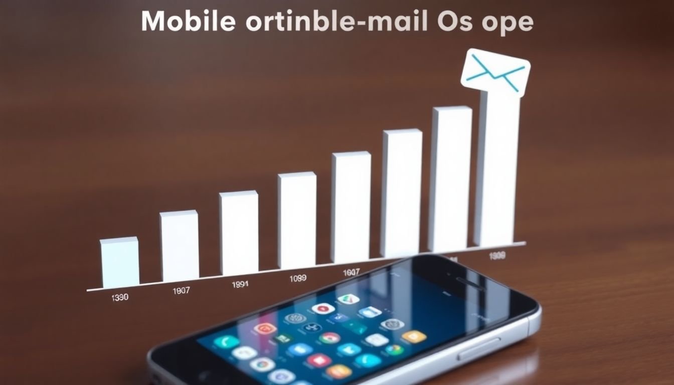
In the dynamic digital landscape of today, the significance of mobile-friendly emails cannot be overstated. The shift in user behavior towards mobile devices has been nothing short of seismic. According to recent studies, over 50% of all emails are now opened on mobile devices, a figure that has been steadily rising over the past decade. This shift has profound implications for email marketing strategies, as it underscores the need for emails to be optimized for smaller screens.
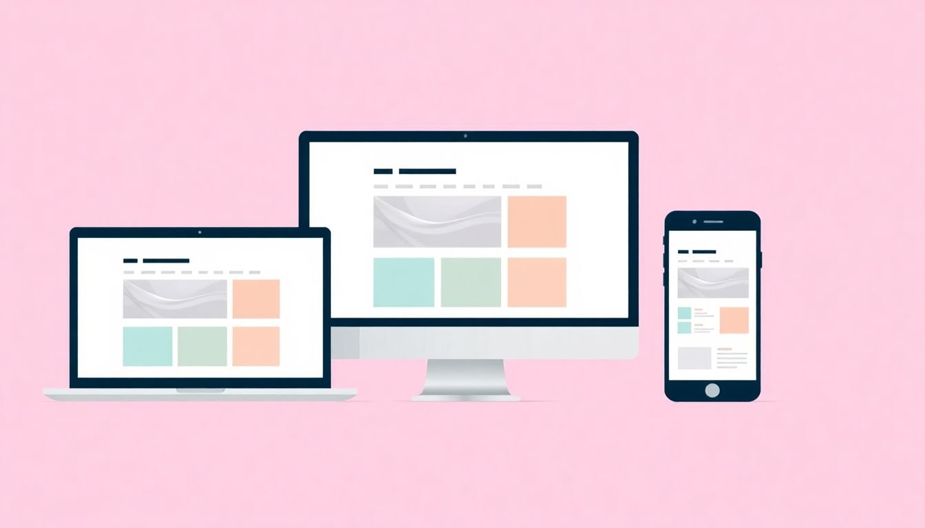
The concept of responsive design has emerged as a critical factor in this context. Responsive design ensures that emails adapt to the size of the device they are viewed on, providing an optimal viewing experience regardless of whether the email is opened on a desktop, tablet, or smartphone. This is achieved through a combination of flexible layouts, scalable images, and media queries that detect the size of the device’s screen.
There are several compelling reasons why responsive design is crucial for email engagement. Firstly, it enhances the user experience by making emails easier to read and navigate on smaller screens. This can significantly increase the likelihood of users engaging with the content, whether that means clicking through to a website, making a purchase, or simply reading the email’s content.
Secondly, responsive design can help to improve email deliverability. Email clients, such as Gmail and Apple Mail, are increasingly prioritizing mobile-friendly emails in their inboxes. Emails that are not optimized for mobile devices may be penalized, leading to reduced visibility and engagement.
Lastly, responsive design can provide valuable insights into user behavior. By tracking how users interact with emails on different devices, marketers can gain a deeper understanding of their audience and tailor their strategies accordingly. This can lead to more effective email campaigns and improved return on investment.
In conclusion, the importance of mobile-friendly emails in today’s digital landscape cannot be overstated. As user behavior continues to shift towards mobile devices, responsive design will remain a critical factor in email engagement and success.
The Power of Responsive Design
In the dynamic landscape of digital communication, the power of responsive design has emerged as a game-changer, particularly in the realm of email marketing. Responsive design is not just a buzzword, but a philosophy that ensures your message reaches its destination, regardless of the device or screen size it traverses. It’s like having a chameleon-like email that adapts to its environment, providing an optimal viewing experience every time.
At its core, responsive design is about creating flexible layouts that can adjust and adapt to different screen sizes and orientations. This is achieved through a combination of flexible grids, flexible images, and CSS media queries. When an email is opened on a device with a different screen size or orientation, the responsive design adjusts the layout accordingly, ensuring that the content is always easy to read and navigate.
But why is responsive design so significant in email marketing? The answer lies in the sheer diversity of devices and screen sizes that emails are viewed on today. From desktop computers to smartphones, tablets, and even wearable devices, the list is endless. According to a report by Litmus, over 54% of emails are opened on mobile devices. This means that if your email isn’t responsive, you’re potentially alienating more than half of your audience.
Moreover, responsive design isn’t just about aesthetics. It’s about functionality and user experience. A responsive email ensures that call-to-action buttons are easily clickable, even on small screens. It ensures that images are properly scaled, preventing them from distorting or pixelating. It ensures that text is readable, without the need for excessive zooming or scrolling. In essence, responsive design is about creating emails that are not just visually appealing, but also user-friendly and effective.
So, how can you implement responsive design in your email marketing strategy? Here are a few steps to get you started:
- Use a fluid grid system that adjusts to the width of the device’s screen.
- Ensure that images are flexible and can scale up or down to fit the screen size.
- Use CSS media queries to apply different styles for different screen sizes and orientations.
- Test your emails on a variety of devices and screen sizes to ensure they look and function as intended.
Remember, the goal of responsive design is not just to make your emails look good, but to make them work well, regardless of the device they’re viewed on. By embracing responsive design, you’re not just keeping up with the times, you’re future-proofing your email marketing strategy.

Mobile-First Approach: A New Paradigm
In the ever-evolving digital landscape, the mobile-first approach has emerged as a game-changer, particularly in the realm of email design. Traditionally, designers would create emails for desktop first, then scale down for mobile. However, with the surge in mobile email opens
- now accounting for over 40% of all opens
- the mobile-first approach has become not just an option, but a necessity.
The mobile-first approach is simple yet powerful: design for the smallest screen first, then scale up. This might seem counterintuitive, but it’s a paradigm shift that enhances the overall user experience in several ways. Firstly, it ensures that the most critical information is front and center, as mobile screens have limited real estate. By prioritizing content, you’re guiding the user’s journey, making your email more engaging and less overwhelming.
Moreover, designing for mobile first forces you to focus on simplicity and functionality. Complex designs and heavy images that work well on desktops often fall flat on mobile. A mobile-first approach encourages clean, intuitive layouts that load quickly and are easy to navigate, improving email performance. It also pushes you to optimize calls-to-action (CTAs), ensuring they’re prominent and clickable on smaller screens.
But the benefits don’t stop at user experience. A mobile-first approach can also boost email performance metrics. Mobile-optimized emails have higher open rates, click-through rates, and conversion rates. They’re also less likely to be deleted or marked as spam, as users appreciate emails that respect their screen size and attention span.
In essence, the mobile-first approach is not just about designing for mobile; it’s about designing for the future. As more users engage with emails on their mobile devices, this approach becomes not a choice, but a necessity. It’s a new paradigm that puts the user first, enhancing their experience and improving email performance in the process.
Mastering Email Layout for Mobile
In the ever-evolving digital landscape, mastering email layout for mobile devices has become a paramount concern. With a significant portion of emails now being opened on smartphones and tablets, it’s crucial to ensure that your email design is not just responsive, but also optimized for the unique challenges and opportunities that mobile devices present.
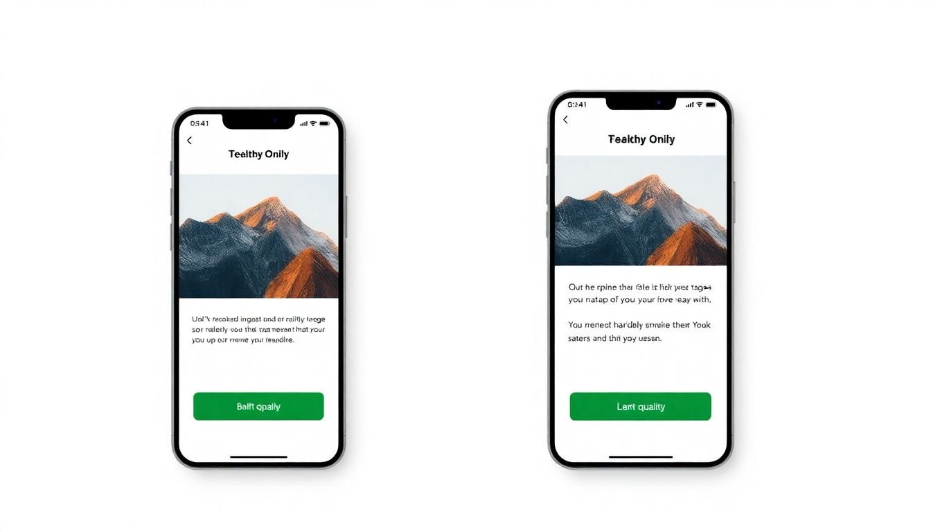
Firstly, let’s delve into the concept of single-column layouts. In the realm of mobile emails, simplicity is key. Single-column layouts ensure that your content is easily digestible, even on smaller screens. They eliminate the need for horizontal scrolling and allow users to simply scroll down to navigate through your email. This layout also ensures that your call-to-action (CTA) buttons are prominently displayed and easily accessible.
Speaking of buttons, touch-friendly designs are a must in mobile email layouts. Remember, users on mobile devices are interacting with your email using their fingers, not a mouse. Therefore, buttons should be large enough (around 44×44 pixels) and spaced appropriately to accommodate the average finger size. Also, consider using distinct colors and clear labels to make your buttons stand out.
Now, let’s talk about images. Images can significantly enhance the visual appeal of your emails, but they must be optimized for mobile. Large images can slow down load times, which is a cardinal sin in the world of mobile emails. Ensure that your images are no larger than they need to be, and consider using lazy loading to prioritize the display of above-the-fold content.
In conclusion, mastering email layout for mobile devices is not just about making your emails look good on smaller screens. It’s about understanding user behavior and creating designs that are intuitive, easy to navigate, and engaging. By following these best practices, you can create mobile email layouts that not only look great but also drive action and results.
Crafting Compelling Mobile Email Content
In the realm of digital communication, crafting compelling mobile email content is an art that combines brevity, clarity, and creativity. With over 50% of emails opened on mobile devices, it’s crucial to ensure your content is not just readable, but engaging, on smaller screens.
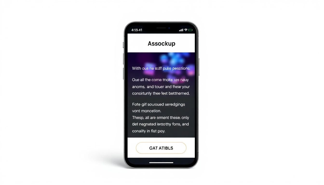
The first brushstroke in this masterpiece is concise copy. In the mobile world, every word counts. Long, winding sentences and paragraphs are like a dense forest obscuring your message. Instead, opt for short, punchy sentences and bullet points to make your content scannable. Remember, your readers are on the go, so make it easy for them to digest your message quickly.
Next, clear calls-to-action (CTAs) are the road signs guiding your readers through your email. They should stand out, be easy to understand, and, most importantly, be easily tappable on a mobile screen. Use buttons rather than links in text, and place them prominently, preferably above the fold (the area visible without scrolling).
Lastly, engaging multimedia elements are the vibrant colors that bring your email to life. High-quality images, GIFs, and even short videos can capture attention and convey your message in a way that text alone cannot. However, be mindful of file sizes to avoid slow loading times that could frustrate your readers.
To sum up, crafting compelling mobile email content is about understanding your audience’s behavior and adapting your content to suit their needs. It’s about respecting their time, guiding them clearly, and engaging them visually. So, go ahead, pick up your virtual paintbrush, and create a masterpiece that will captivate your mobile readers.

Optimizing Email Fonts for Mobile
In the realm of mobile email design, font optimization plays an indispensable role in enhancing readability and user experience. With the majority of emails now being opened on mobile devices, it’s crucial to ensure that your message is not only engaging but also easily digestible on smaller screens.
The first step in optimizing fonts for mobile emails is to understand the ideal font sizes. A general rule of thumb is to use font sizes between 14 to 16 points for body text. This range provides a good balance between readability and screen space. For headings, you can go up to 22 points, but remember, less is often more in mobile design.
When it comes to font styles, simplicity is key. Sans-serif fonts like Arial, Helvetica, or Roboto are generally preferred for their clean, modern look and excellent readability on screens. Serif fonts, while beautiful, can be less legible on mobile devices.
Web-safe fonts are your best friends in ensuring consistent display across devices. These fonts are pre-installed on most systems and browsers, ensuring that your email will look the same regardless of whether it’s viewed on an iPhone, Android, or desktop. Some popular web-safe fonts include Arial, Times New Roman, Courier, and Georgia.
To ensure your fonts display correctly, use CSS to specify your font family, size, and style. Here’s a simple example:
- For body text:
font-family: Arial, sans-serif; font-size: 16px; - For headings:
font-family: Arial, sans-serif; font-size: 22px; font-weight: bold;
Lastly, always test your emails on various mobile devices and browsers to ensure your fonts display as intended. A little effort in font optimization can significantly improve your email’s readability and, ultimately, its effectiveness.
Leveraging Mobile Email Personalization
In the dynamic world of mobile communication, emails have evolved to become more than just messages; they’re personalized experiences. Leveraging mobile email personalization is not just a trend, but a necessity in today’s competitive digital landscape. By tailoring content to individual users, businesses can significantly enhance engagement, drive conversions, and foster customer loyalty.
The power of personalization lies in its ability to make each recipient feel seen, heard, and valued. This is achieved through strategies that go beyond the traditional ‘Hello [First Name]’ approach. Dynamic content is one such strategy. It allows businesses to insert real-time, personalized content into emails based on user behavior, preferences, or past interactions. For instance, an e-commerce platform can use dynamic content to display products recently viewed or left in the cart by a user.
Another powerful strategy is location-based targeting. With the help of geolocation data, businesses can send time-sensitive, location-specific offers or updates. For example, a retail store can send an email promoting an ongoing sale in a particular branch to users located nearby. This not only increases the relevance of the email but also boosts the chances of a conversion.
To leverage these strategies effectively, businesses should follow these steps:
- Collect and analyze user data to understand their preferences and behaviors.
- Segment the audience based on shared characteristics to ensure targeted and relevant communication.
- Use dynamic content blocks and location-based targeting tools to create personalized emails.
- Regularly test and optimize campaigns based on user engagement and feedback.
By doing so, businesses can unlock the full potential of mobile email personalization, creating meaningful connections with users and driving business growth.

Testing and Optimization: The Key to Success
In the dynamic world of mobile email design, success is not a destination but a continuous journey, and the compass that guides this expedition is the duo of testing and optimization. These twin pillars form the bedrock of any effective email marketing strategy, ensuring that every message sent is not just another email, but a tailored, engaging, and high-performing piece of communication.
Testing, the first of our dynamic duo, is the process of validating assumptions and gathering insights to inform decision-making. In mobile email design, this translates to ensuring that our emails not only look stunning on various devices and screen sizes but also drive the desired actions, be it a click, a tap, or a purchase. A/B testing, a popular method, allows us to pit two versions of an email against each other, measuring their performance to determine which one reigns supreme. This could be as simple as testing different subject lines or as complex as comparing entirely different email designs.
-
A/B Testing:
- Compare two versions of an email to see which performs better.
Multivariate Testing:
- Test multiple variables (like subject line, content, CTA) simultaneously to find the best combination.
Usability Testing:
Test the email’s functionality and user experience with real users.
Optimization, the second half of our power couple, is where we take the insights gathered from testing and use them to refine and improve our emails. It’s about learning from our mistakes, celebrating our successes, and always striving to do better. This is where analytics comes into play, providing us with a wealth of data that, when interpreted correctly, can guide our optimization efforts.
Analytics tools allow us to track opens, clicks, conversions, and more, giving us a holistic view of our email’s performance. By understanding these metrics, we can identify trends, spot areas for improvement, and make data-driven decisions to optimize our emails. It’s a cycle of test, learn, and improve, repeated ad infinitum, because in the world of mobile email design, there’s always room for growth.
So, let’s embrace the power of testing and optimization. Let’s test boldly, learn eagerly, and optimize relentlessly. Because in the pursuit of successful mobile email design, the journey is just as important as the destination. And who knows, along the way, we might just set new benchmarks for ourselves and our industry.