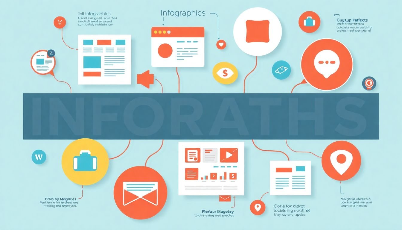
In the dynamic world of digital marketing, the battle for audience attention is fierce. Among the myriad of content types vying for our eyes, one stands out for its unique ability to communicate complex information quickly and engagingly
- infographics. But when is the best time to deploy an infographic in your marketing strategy, and how does it stack up against other content types? Let’s dive into the fascinating world of visual storytelling and explore the ‘whens’ and ‘whys’ of infographics.
Did you know that the human brain processes visuals 60,000 times faster than text? This staggering statistic underscores the power of infographics in today’s content landscape. But here’s the catch
- not every piece of information lends itself to a visual representation. So, how do you know when to use an infographic, and when to opt for a blog post, video, or podcast instead?
As marketers, we’re often faced with the challenge of making complex data or concepts accessible to our audience. This is where the debate between infographics and other content types comes into play. Infographics can simplify intricate information, making it digestible and shareable. But they’re not a one-size-fits-all solution. Sometimes, a detailed blog post or an interactive video might be more suitable for your content marketing strategy.
In this article, we promise to demystify the world of infographics and help you navigate the complex terrain of content types. We’ll explore the unique strengths of infographics, compare them with other content types, and provide practical guidelines on when and why to use them. By the end of this piece, you’ll have a clear understanding of how infographics can bolster your marketing strategy and when to deploy them for maximum impact.
So, are you ready to unlock the full potential of infographics in your content marketing mix? Let’s embark on this visual journey together and discover how to harness the power of infographics to captivate your audience and drive engagement.
Maximizing Engagement and Impact in Your Marketing Strategy
In the dynamic landscape of today’s business world, crafting a compelling marketing strategy is akin to navigating a vibrant, ever-changing cityscape. To maximize engagement and impact, think of your strategy as a well-planned city tour, where each stop is a unique marketing channel, and your audience are the eager tourists. First, understand your audience’s ‘language’ and ‘interests’
- their ‘city map’
- to guide them through your brand’s story. Leverage social media platforms as bustling marketplaces, where conversations flow like the city’s river. Here, authenticity and value are the local currency; engage with your audience, not at them. Email marketing can be your city’s historic district, where personalized, targeted messages resonate like whispered secrets. Content marketing, on the other hand, is the city’s grand library, filled with valuable insights and stories that draw your audience in. SEO is the city’s GPS, ensuring your audience can find you amidst the urban jungle. Lastly, don’t forget the city’s grand events
- webinars, workshops, and live streams
- that bring your audience together, fostering a sense of community. By weaving these channels together, you’ll create a marketing strategy that’s not just engaging, but also impactful, turning your audience into loyal, enthusiastic residents of your brand’s city.

The Power of Visual Storytelling
In the vast landscape of human communication, visual storytelling has emerged as a powerful tool, harnessing the unique way our brains process information. The science behind this lies in the intricate workings of our visual system. Our eyes are constantly scanning our environment, sending a barrage of data to our brain, which processes this visual information at an astonishing rate
- up to 60,000 times faster than text. This is due to the brain’s ability to interpret and understand images in a fraction of the time it takes to decode words. This is why a picture truly can paint a thousand words.
Infographics, as a form of visual storytelling, leverage this cognitive advantage masterfully. They combine images, icons, and minimal text to convey complex information in a digestible, engaging format. Here’s how they do it:
- They simplify complex data into bite-sized chunks, making it easier for our brains to process and retain.
- They use visual hierarchy to guide our eyes through the information, ensuring we don’t miss crucial points.
- They employ storytelling techniques, such as before-and-after comparisons or step-by-step processes, to engage our brains on a deeper level.
In today’s content-driven world, where information is abundant and attention is scarce, visual storytelling has become indispensable. It cuts through the noise, making information more accessible, engaging, and shareable. From social media platforms to corporate reports, visual storytelling is transforming the way we communicate, learn, and understand the world around us. It’s not just about presenting information; it’s about telling stories that resonate, inspire, and inform. After all, as humans, we’ve been telling stories since the dawn of time, and visual storytelling is simply the latest chapter in that ancient art.

Infographics: The Swiss Army Knife of Content
Infographics, much like the iconic Swiss Army Knife, are a versatile tool in the content creator’s belt. They’re not just pretty pictures; they’re powerful visual communication devices that can simplify the complex, summarize the lengthy, and engage audiences in a way that text alone often cannot. Let’s explore their multifaceted nature. Infographics are exceptional at breaking down complex data into digestible chunks. They use a combination of charts, graphs, and illustrations to present information in a clear, concise manner. For instance, a tech company might use an infographic to explain a new algorithm, showing step-by-step processes with simple icons and clear typography. Each element works together to tell a story, making complex concepts accessible to a wider audience. Moreover, infographics are adept at summarizing long-form content. They can distill a lengthy report, article, or research paper into a single, shareable image. This is particularly useful in the finance industry, where detailed information needs to be communicated quickly and effectively. An infographic can show trends, compare data sets, and provide key takeaways, all in a format that’s easy to understand and share. The versatility of infographics extends to their use across various industries. In healthcare, they can illustrate medical procedures, show the progression of a disease, or compare treatment options. In education, they can explain scientific concepts, historical events, or literary devices. Even in marketing, infographics can be used to tell a brand’s story, show product comparisons, or provide tips and tricks. But the true power of infographics lies in their ability to engage audiences. They’re eye-catching, they tell a story, and they provide value. Whether it’s explaining a complex topic, summarizing long-form content, or simply providing interesting information, infographics are a content creator’s secret weapon. They’re the Swiss Army Knife of content, ready to tackle any challenge with a blend of form and function that’s both beautiful and effective.

The Anatomy of an Effective Infographic
Crafting an effective infographic is an art that combines design, data visualization, and storytelling. Let’s delve into the anatomy of a successful infographic, using examples of well-designed pieces to illustrate each key element.
The first step in creating an impactful infographic is to identify the story you want to tell. This could be a comparison, a trend, or a complex process. For instance, the infographic ‘The Evolution of the Web’ by Smashing Magazine tells the story of the internet’s development in a clear, engaging manner.
Once your story is set, it’s time to design the layout. A well-designed infographic should be clean, uncluttered, and easy to navigate. The use of white space, clear typography, and a consistent color scheme are crucial. The ‘Growth of the Internet’ infographic by Domo is an excellent example, using a simple, minimalistic design that allows the data to shine.
Data visualization is the heart of any infographic. It should be accurate, easy to understand, and enhance the story. Charts, graphs, and diagrams are essential tools here. The ‘How the Shapes of Countries Affect Their Economies’ infographic by The Economist uses a unique, shape-based visualization to illustrate its point, making complex data accessible and engaging.
Storytelling is the soul of an infographic. It should guide the viewer through the data, revealing insights and encouraging them to explore further. This could be achieved through a clear hierarchy of information, compelling captions, or even a narrative structure. The ‘The World’s Water’ infographic by National Geographic uses a narrative approach, guiding viewers through the global water cycle with engaging text and visuals.
Lastly, an effective infographic should be accessible. This means using clear, concise language, providing sources for data, and ensuring it’s viewable on various devices and screen sizes. The ‘How to Tie a Tie’ infographic by The Tie Bar is a great example, providing a simple, step-by-step guide with clear, high-quality images.
In conclusion, an effective infographic is a harmonious blend of design, data visualization, and storytelling. By mastering these elements, you can create compelling visual stories that inform, engage, and inspire.

Infographics vs. Blog Posts: The Great Debate
In the vast landscape of digital content, two powerhouses have emerged as the go-to formats for communicating complex ideas: infographics and blog posts. Each has its unique strengths and weaknesses, and the great debate surrounding their use often leaves content creators scratching their heads. Let’s dive into the world of infographics and blog posts, exploring their differences, and when to harness their power for maximum impact.
Infographics, with their vibrant colors and clever use of space, are the visual storytellers of the digital realm. They excel at condensing vast amounts of data into a single, easily digestible image. Infographics are particularly effective at communicating statistical information, trends, and comparisons. A well-designed infographic can make complex data points leap off the screen, engaging readers and making them more likely to share the content. However, they are not without their drawbacks. Infographics can be time-consuming to create, requiring a skilled designer and potentially expensive tools. They also lack the SEO benefits that blog posts enjoy, as search engines struggle to interpret the data within an image.
Blog posts, on the other hand, are the workhorses of content marketing. They provide a platform for in-depth exploration of a topic, allowing writers to delve into the nuances of a subject and provide context and analysis. Blog posts are highly SEO-friendly, with search engines able to crawl and index the text, making them an excellent tool for improving search engine rankings. They also provide an opportunity for reader engagement through comments and social sharing. However, blog posts can be time-consuming to write and require a high level of expertise in the subject matter. They also lack the immediate visual impact of an infographic.
So, when should you use each? Infographics are ideal for presenting data-heavy information in a visually appealing way. They are perfect for quick, shareable content that can be easily understood at a glance. Blog posts, meanwhile, are the tool of choice for in-depth exploration. They are ideal for providing context, analysis, and detailed information on a topic. Consider using both in tandem, with an infographic providing a quick overview of a topic, followed by a blog post delving deeper into the subject. This approach combines the strengths of both formats, providing a comprehensive and engaging user experience.

The Role of Infographics in SEO
In the dynamic landscape of Search Engine Optimization (SEO), infographics have emerged as powerful tools, offering a unique blend of visual appeal and informative content that can significantly boost SEO efforts. Infographics, essentially visual representations of data or information, can increase backlinks, enhance user experience, and reduce bounce rates, thereby improving a website’s search engine rankings.
Firstly, infographics are highly shareable, which can lead to an increase in backlinks. When a high-quality, engaging infographic is published, it encourages other websites to link back to the original source. These backlinks are crucial for SEO as they signal to search engines that the content is valuable and relevant, thereby improving the website’s authority and ranking.
Take, for instance, the case of ‘Visual.ly’, a platform dedicated to infographics. One of their infographics, ‘The Evolution of the Web’, received over 2,000 backlinks from authoritative websites, significantly boosting their SEO.
Secondly, infographics can reduce bounce rates by engaging users and providing valuable information. A well-designed infographic can keep users on the page longer, reducing the bounce rate. Search engines interpret lower bounce rates as a sign of quality content, which can positively impact SEO.
For example, ‘Quick Sprout’ used infographics to reduce their bounce rate by 74%. Their infographic ‘The History of the Web’ not only provided valuable information but also kept users engaged, leading to a significant decrease in bounce rate and an improvement in their search engine rankings.
Lastly, infographics can be optimized for search engines by including relevant keywords in the title, alt tags, and the surrounding text. This can help search engines understand the content of the infographic and improve its visibility in search results.
In conclusion, infographics play a pivotal role in SEO by increasing backlinks, reducing bounce rates, and providing an opportunity for keyword optimization. By incorporating infographics into their content strategy, businesses can enhance their online visibility and improve their search engine rankings.

Infographics and Social Media: A Match Made in Heaven
In the digital age, social media has become the global town square, and infographics have emerged as its most engaging town criers. The marriage of infographics and social media is a match made in heaven, with infographics’ ability to simplify complex data and tell compelling stories resonating deeply with users. According to a study by Venngage, infographics are liked and shared on social media 3x more than any other type of content. Moreover, they generate 650% more engagement than text-based posts alone. This is not surprising, given that our brains process visual content 60,000 times faster than text, making infographics an irresistible force on social media platforms.
Creating shareable infographics is both an art and a science. Here are some tips to help you craft infographics that will set your social media feeds ablaze:
- Know Your Audience: Understand who you’re creating the infographic for. Tailor the design, data, and tone to resonate with your target audience.
- Keep It Simple: Break down complex information into digestible chunks. Use clear, concise text and simple, relevant visuals to tell your story.
- Tell a Story: Infographics should have a narrative arc. Start with a hook, provide context, present data, and end with a call to action or a surprising fact.
- Design Matters: Use a clean, consistent design that aligns with your brand. Ensure your infographic is easy to read and visually appealing.
- Optimize for Social Media: Use the right dimensions for each platform (e.g., 1200 x 628 pixels for Facebook, 1080 x 1080 pixels for Instagram), and include a clear, concise title.
- Promote Your Infographic: Share it on your social media channels, embed it in blog posts, and consider using paid promotion to reach a wider audience.
By following these tips, you’ll be well on your way to creating infographics that not only inform but also inspire engagement and sharing on social media.

Infographics vs. Videos: Moving Pictures vs. Still Frames
In the dynamic world of digital marketing, infographics and videos stand as two powerful visual tools, each with its unique strengths and ideal use cases. Let’s delve into the captivating comparison of infographics vs. videos, and explore how these moving pictures and still frames can complement each other in a comprehensive marketing strategy.
Infographics, with their static nature, excel in presenting complex information in a digestible format. They are like a visual roadmap, guiding the viewer’s eye through a series of interconnected data points, charts, and graphs. Infographics are particularly advantageous when you need to:
- Display large amounts of data in a compact space.
- Simplify complex concepts for easy understanding.
- Create shareable content that can be easily embedded on other websites.
Moreover, infographics are evergreen, requiring no updates once published, making them a cost-effective addition to your content library.
On the other hand, videos bring content to life with motion, sound, and emotion. They are engaging, immersive, and can tell a story like no other medium. Videos shine when you want to:
- Showcase products or services in action.
- Build an emotional connection with your audience.
- Provide step-by-step instructions or demonstrations.
- Reach a wider audience, as videos can be consumed on various platforms.
However, videos require more resources to produce and maintain, and they may not be as accessible to viewers with hearing impairments or slow internet connections.
In a well-rounded marketing strategy, infographics and videos can complement each other beautifully. Infographics can be used to introduce a topic, providing a quick overview, while videos can delve deeper, offering detailed explanations or behind-the-scenes looks. Alternatively, you could create an infographic to summarize the key points of a video, making it more shareable. By combining these two powerful visual tools, you can create a marketing strategy that is both informative and engaging, catering to a wide range of learning styles and preferences.

Measuring the Success of Your Infographic
Measuring the success of your infographic is a crucial step in understanding its impact and reach. Key Performance Indicators (KPIs) serve as your compass, guiding you through the vast expanse of data to focus on what truly matters. Let’s delve into the three primary KPIs for infographics: views, shares, and backlinks.
The first KPI, views, is the most straightforward. It represents the number of times your infographic has been seen. Tracking views helps you understand the initial traction of your content. To track views, you can use tools like Google Analytics, which provides detailed insights into your website traffic. If your infographic is hosted on a third-party platform, they usually provide their own analytics tools.
Shares are the next KPI to consider. They indicate the virality of your infographic, reflecting how many people found it valuable enough to share with their networks. Social media platforms provide built-in sharing buttons, making it easy to track shares. Additionally, tools like AddThis or ShareThis can provide more detailed analytics on shares across various platforms.
Backlinks, the final KPI, are a testament to your infographic’s authority and influence. They represent the number of times other websites link back to your infographic. Backlinks not only drive referral traffic but also boost your search engine rankings. Tools like Ahrefs or SEMrush can help you track and analyze backlinks. They provide detailed reports, including the number of backlinks, the websites linking to you, and the anchor text used.
Once you’ve collected your data, it’s time to analyze. First, compare your KPIs to your initial goals. Did you meet or exceed your targets? Next, analyze the trends over time. Are views, shares, and backlinks increasing, decreasing, or staying stagnant? Understanding these trends can help you refine your strategy for future infographics. Lastly, compare your performance to industry benchmarks. This can provide valuable context and help you identify areas for improvement.
In conclusion, measuring the success of your infographic is not just about the numbers, but also about understanding the story behind those numbers. It’s about learning from your audience, refining your strategy, and creating more impactful content.

Infographics in the Future: Trends and Predictions
In the dynamic landscape of data visualization, infographics are evolving at a staggering pace, with the future promising to be more interactive, animated, and intelligent than ever before. As we delve into the crystal ball of ‘Infographics in the Future: Trends and Predictions’, let’s first explore the emerging trends in infographic design that are set to redefine our visual storytelling experiences.
The first trend that’s making waves is the rise of interactive infographics. Imagine not just consuming data, but engaging with it in real-time. Interactive infographics allow users to filter, sort, and manipulate data, providing a personalized experience. For instance, a climate change infographic could let users toggle between different time periods or geographical locations to witness the impact firsthand. This interactivity fosters a deeper understanding of complex data sets and makes learning fun and immersive.
Closely following suit are animated infographics. These aren’t just static images anymore; they’re dynamic narratives that unfold before our eyes. Animations can highlight changes over time, illustrate complex processes, or simply add a touch of playfulness to otherwise dry data. Picture an animated infographic about the human body, where organs pulsate with life, and biological processes play out in real-time. It’s like bringing data to life, one frame at a time.
But the real game-changer is the integration of artificial intelligence and machine learning into infographic design. AI can analyze vast amounts of data and generate insights that humans might miss, making infographics not just visual aids, but intelligent tools. Machine learning can adapt infographics based on user behavior, providing a tailored experience for each viewer. For example, an AI-powered infographic could learn from your browsing history and present you with data that’s most relevant to you. This level of personalization is set to revolutionize how we interact with data.
In conclusion, the future of infographics is bright, bold, and brimming with possibilities. As we step into this new era of data visualization, we’re not just looking at pretty pictures; we’re exploring a world where data tells its own story, in the most engaging and intelligent ways imaginable.
FAQ
What are infographics and how do they differ from other content types?
When is the best time to use infographics in my marketing strategy?
How do infographics improve SEO and drive traffic?
What are some popular types of infographics for marketing purposes?
- Statistical infographics: Used to present and compare data, often featuring charts, graphs, and icons.
- Timeline infographics: Ideal for showcasing historical data, evolution, or step-by-step processes.
- Comparative infographics: Great for comparing and contrasting different products, services, or ideas.
- Hierarchical infographics: Used to display information in a pyramid or tree-like structure, perfect for showing levels or categories.
- List-based infographics: Perfect for presenting top lists, tips, or how-to guides in a visually appealing way.