
Table of Contents
Have you ever wondered what makes some infographics spread like wildfire, while others barely spark a flicker of interest? Welcome to the fascinating world of viral infographics! In this comprehensive guide, we’re going to delve into the anatomy of these digital darlings, revealing the design techniques that turn ordinary data into extraordinary content sharing phenomena. So, grab your thinking caps and let’s embark on this visual journey together.
You might be thinking, ‘What’s the big deal about infographics? They’re just charts and graphs, right?’ Wrong! Infographics are powerful storytelling tools that can simplify complex information, engage audiences, and even go viral. In fact, according to a study by MDG Advertising, infographics are liked and shared on social media 3x more than other types of content. But here’s the catch: not all infographics are created equal. Some languish in obscurity, while others become internet sensations. The difference? Design.
In this article, we promise to demystify the art of creating viral infographics. We’ll explore the science behind what makes an infographic share-worthy, from layout and color to storytelling and interactivity. We’ll also share real-life examples of infographics that have set the internet ablaze, and analyze what made them so irresistible. By the end of this piece, you’ll have a solid understanding of how to craft your own viral infographic, ready to take the digital world by storm.
But before we dive in, let’s address a common pain point: ‘I’m not a designer. Can I still create a viral infographic?’ Absolutely! While having design skills certainly helps, it’s not a prerequisite for creating a compelling infographic. This article is designed to empower everyone, from seasoned designers to data enthusiasts, to create share-worthy visual content. So, whether you’re a marketing pro looking to boost engagement or a data nerd eager to share your findings, stick around. You’re about to learn the secrets to creating infographics that don’t just inform, but inspire.
Unveiling the Blueprint: Crafting Viral Infographics with Design Techniques for Maximum Engagement
In the digital age, information overload is a constant challenge. Amidst this deluge, infographics have emerged as a powerful tool, distilling complex data into visually engaging, easily digestible nuggets. But how do we craft these visual masterpieces to ensure they don’t just inform, but captivate and spread like wildfire? The answer lies in understanding and applying design techniques that maximize engagement. This isn’t about mere aesthetics; it’s about strategic storytelling, using color, layout, typography, and imagery to guide the eye and spark curiosity. It’s about simplicity, ensuring the message is clear and uncluttered. It’s about emotion, evoking feelings that resonate and inspire sharing. It’s about understanding your audience, tailoring the design to their needs and preferences. It’s about testing and refining, learning from what works and what doesn’t. In essence, crafting viral infographics is an art and a science, a blend of creativity and data-driven decision making. So, let’s roll up our sleeves, dive into the design blueprint, and create infographics that not only inform but engage, inspire, and spread.
The Viral Code: Understanding What Makes Infographics Share-Worthy
In the digital age, infographics have emerged as powerful tools for communicating complex information in an engaging and digestible format. But what makes some infographics go viral while others fade into obscurity? The answer lies in understanding the psychology behind viral content. Let’s delve into the elements that make infographics share-worthy, exploring the role of curiosity, emotion, and value in driving engagement.
The first key ingredient is curiosity. Infographics that spark curiosity are more likely to be shared. This could be achieved by posing a question in the title, using intriguing visuals, or revealing surprising facts. For instance, an infographic titled ‘Did You Know? 10 Surprising Facts About Sharks’ is likely to pique curiosity and encourage shares.
Emotion is another powerful driver of shareability. Infographics that evoke strong emotions, whether it’s joy, laughter, surprise, or outrage, tend to be shared more. This is because emotions make us feel more connected to the content and others who share our feelings. For example, an infographic showing the impact of climate change on wildlife might evoke sadness and anger, prompting shares to raise awareness.
Value is also crucial. Infographics that provide unique, useful, or entertaining information are more likely to be shared. This could be a step-by-step guide, a fascinating fact, or a humorous take on a serious topic. For instance, an infographic explaining how to make a simple recipe in five steps provides value to the viewer and is more likely to be shared.
To create share-worthy infographics, consider the following steps:
- Spark curiosity with your title and visuals
- Evoke strong emotions through your content and design
- Provide unique, useful, or entertaining value to your audience
- Make your infographic easy to share on social media platforms
By understanding and incorporating these elements, you can create infographics that are not only informative but also share-worthy, helping your content to go viral.

Storytelling with Data: The Power of Narrative in Infographics
Storytelling with data, particularly in infographic design, is an art that transforms raw numbers into engaging, understandable, and memorable narratives. Infographics are not merely visual representations of data; they are visual stories that captivate audiences and convey complex information in an accessible manner. The power of narrative in infographics lies in its ability to evoke emotions, inspire actions, and foster connections with the viewer.
To structure data into a compelling narrative, one must first understand the story they want to tell. This involves identifying the key message, target audience, and the emotional response desired. Once the narrative arc is established, the data can be organized to support it. This could mean highlighting specific trends, comparing datasets, or illustrating changes over time.
Here are some steps to create a narrative-driven infographic:
- Identify the Key Message: What is the single most important takeaway you want viewers to understand?
- Know Your Audience: Who are they? What do they care about? What will resonate with them?
- Choose Your Data: Select data that supports your narrative and engages your audience.
- Structure Your Data: Organize your data in a way that tells a story. This could be chronological, comparative, or thematic.
- Design for Emotion: Use color, typography, and imagery to evoke the desired emotional response.
- Test and Refine: Show your infographic to others and gather feedback. Refine your design based on their input.
Remember, the goal is not just to present data, but to create an emotional connection with the viewer. A well-crafted narrative can make complex data not only understandable, but also unforgettable. So, go ahead, pick up your data brush, and start painting your story.
Less is More: The Art of Simplifying Complex Data
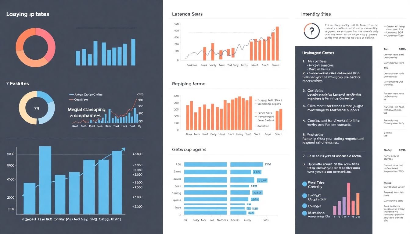
In the vast expanse of data-driven worlds, there lies a paradox: the more complex the data, the simpler its representation should be. This is where the adage ‘Less is More’ comes into play, guiding us through the intricate landscape of data visualization. The art of simplifying complex data is not merely about dumbing down information, but rather, it’s about distilling the essence of intricate datasets into digestible, easy-to-understand visuals.
Minimalism, a philosophy that celebrates simplicity and subtraction, plays a pivotal role in infographic design. It’s about stripping away the unnecessary, leaving only the essential elements that tell the story. This approach doesn’t just make data more accessible; it also makes it more impactful. By paring down visual clutter, minimalism allows the data to take center stage, drawing the viewer’s eye to the most important insights.
To achieve this, designers employ a range of techniques. First, they identify the core message or ‘so what’ of the data. This step is crucial as it provides a north star, guiding all subsequent design decisions. Next, they simplify the data itself, breaking it down into its most basic components. This could involve aggregating data to show trends over time, or using averages to represent large datasets. Another technique is to use clear, concise labels and titles, ensuring that the data is self-explanatory.
Minimalism also extends to the design elements themselves. A restrained color palette, clean lines, and plenty of white space all contribute to a sense of order and clarity. The use of simple, iconic symbols and shapes can also help to convey complex ideas quickly and effectively. Moreover, minimalist design often relies on a grid system, which provides a structure for the data, making it feel organized and easy to navigate.
However, simplifying complex data is not about oversimplification. It’s about finding the balance between complexity and clarity. It’s about understanding that ‘less’ doesn’t mean ‘dumbing down’, but rather, it means ‘making accessible’. In the end, the art of simplifying complex data is not just about design; it’s about empathy. It’s about understanding that not everyone speaks the language of data, and that’s okay. It’s about meeting people where they are and helping them to understand the world a little better, one simple, elegant infographic at a time.
Color Me Intrigued: The Psychology of Color in Infographic Design
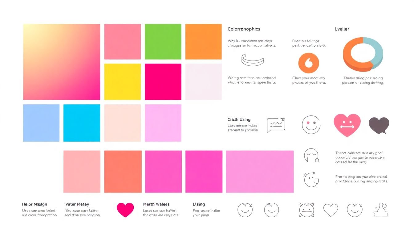
In the vibrant tapestry of infographic design, color is not merely an aesthetic choice; it’s a powerful tool that can captivate, inform, and guide viewers through a visual narrative. The psychology of color is a fascinating realm that explores how hues can evoke emotions, influence perception, and enhance data comprehension. Let’s delve into this chromatic world and uncover how to harness the power of color in infographic design.
Firstly, color has the remarkable ability to evoke emotions and set the tone of an infographic. Different colors stimulate various feelings and responses. For instance, blue is often associated with trust, calmness, and stability, making it a popular choice for corporate designs. Red, on the other hand, is energetic, passionate, and can even stimulate appetite, hence its prevalence in fast food branding. When designing infographics, consider the desired emotional response and choose colors that resonate with that sentiment.
Secondly, color can be a potent tool for guiding the viewer’s eye through an infographic. Our brains are wired to respond to contrast and brightness, so using contrasting colors can draw attention to key points or data. For example, using a bright yellow to highlight a crucial statistic against a cool blue background can make it stand out. Similarly, using a gradient or color spectrum can lead the eye along a path, telling a visual story.
Lastly, color can significantly enhance data comprehension in infographics. By using color-coding, viewers can quickly understand and compare data. For instance, in a map showing crime rates, using different shades of green to represent safety and red to indicate danger allows viewers to instantly grasp the information. However, it’s crucial to use color-coding consistently and avoid using too many colors, as this can overwhelm the viewer and hinder understanding.
In conclusion, the psychology of color in infographic design is a complex and engaging field. By understanding how color evokes emotions, guides the eye, and enhances data comprehension, designers can create compelling, informative, and visually appealing infographics. So, go ahead, let your creativity run wild, and color your infographics with purpose and intent.

Icon-ography: The Power of Visual Cues in Infographic Design
In the realm of infographic design, icons serve as the unsung heroes, often the first visual cues that capture our attention and guide us through a sea of information. They are the visual language that transcends cultural and linguistic barriers, making infographics universally accessible and engaging. Icons, when used judiciously, can significantly enhance understanding, add visual interest, and reinforce the narrative of an infographic. Let’s delve into the power of these visual cues and explore how to harness them effectively.
Firstly, icons enhance understanding by simplifying complex concepts. They distill intricate ideas into their most basic, recognizable forms. For instance, a lightbulb icon instantly conveys the idea of an idea or a thought, while a magnifying glass represents the act of searching. By using such icons, we can quickly communicate these concepts without relying heavily on text, making infographics more accessible to a wider audience.
Secondly, icons add visual interest by breaking up text-heavy sections and creating a dynamic visual hierarchy. They provide a visual break, allowing the reader’s eye to rest and refocus. Moreover, icons can be used to create patterns and repetitions that guide the reader’s eye through the infographic, creating a sense of rhythm and flow. For example, using the same style of icon throughout an infographic can create a cohesive visual language that ties the entire piece together.
Lastly, icons reinforce the narrative by supporting and amplifying the message of the infographic. They can be used to illustrate data points, highlight key takeaways, or even tell a story in their own right. For instance, a series of icons can be used to illustrate a process or a timeline, providing a visual narrative that complements the textual content. By reinforcing the narrative, icons help to create a more memorable and impactful infographic.
In conclusion, icons are powerful tools in infographic design, capable of enhancing understanding, adding visual interest, and reinforcing the narrative. By using them strategically and creatively, designers can create infographics that are not only informative but also engaging and memorable. So, the next time you’re designing an infographic, don’t overlook the power of these visual cues. They just might be the key to creating a truly impactful piece of visual communication.
Layout Matters: Designing Infographics for Maximum Engagement
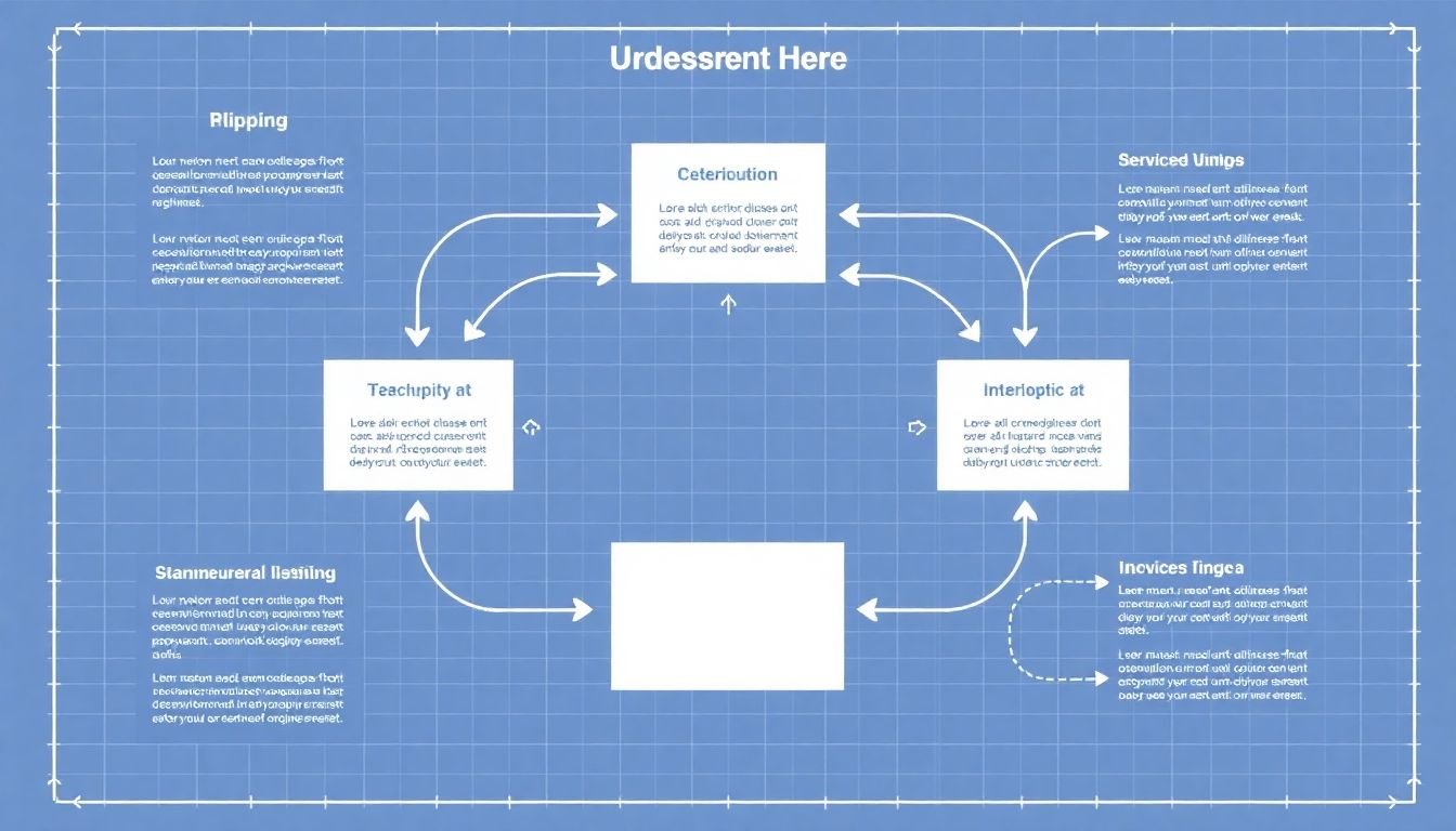
In the realm of visual communication, layout design is not just an aesthetic choice, but a powerful tool to guide viewers and maximize engagement, especially in infographics. Imagine your infographic as a city map, where the layout dictates the journey your viewers will take. The first principle to consider is space, the silent design element that breathes life into your infographic. Just as a crowded street can overwhelm pedestrians, an overcrowded infographic can confuse viewers. Use white space generously to separate elements, allowing each piece of information to shine and draw attention. This not only makes your infographic more aesthetically pleasing but also helps viewers process information more effectively.
Hierarchy, the second principle, is like the traffic lights of your infographic, guiding viewers on where to start and where to go next. It’s achieved through size, color, and placement. Start with the most important information, the ‘green light’ of your infographic, and make it stand out. This could be a striking title, a key statistic, or a compelling visual. Gradually decrease the prominence of subsequent information, creating a visual hierarchy that leads viewers through the content.
Flow, the final principle, is the invisible thread that connects each element, guiding viewers like a gentle current. It’s created through the strategic placement of elements, encouraging the eye to move in a specific direction. This could be a ‘Z’ pattern, where the eye starts at the top left, moves across to the right, then down to the bottom left and across again. Or it could be a ‘F’ pattern, where the eye follows a horizontal line across the top, then down the left side, and finally across the bottom. Understanding these patterns can help you design your infographic in a way that naturally guides viewers through the content, ensuring they don’t get lost along the way.
In essence, layout design in infographics is about creating a visual journey that engages viewers and communicates your message effectively. It’s about using space, hierarchy, and flow to tell a story, one that viewers can easily follow and remember.
The Anatomy of a Viral Infographic: Best Practices for Design and Content
Crafting a viral infographic is an art that combines compelling content with intuitive design. Let’s delve into the best practices that can help your infographic spread like wildfire.
The first step is to identify a captivating topic that resonates with a wide audience. It should be timely, relevant, and address a curiosity or need for information. Once you’ve nailed down your subject, it’s time to gather data. Ensure your sources are credible and that the information is accurate and up-to-date.
Now, let’s talk design. A viral infographic should be visually appealing and easy to understand at a glance. Use a clean, simple layout with plenty of white space. A consistent color scheme and typography can help guide the viewer’s eye through the information. Remember, less is more; don’t clutter your design with too many elements.
When it comes to visuals, use high-quality images, icons, or charts that illustrate your data effectively. Infographics are all about communicating complex information simply, so choose visuals that do the heavy lifting. Consider using a mix of visual styles to keep viewers engaged.
Storytelling is key in a viral infographic. The data should flow logically, guiding the viewer through a narrative. Use headings, subheadings, and captions to break up the information and provide context. Consider using a hierarchical structure to prioritize information.
Lastly, make your infographic shareable. Include your brand or source at the bottom, and consider adding social media buttons to encourage sharing. And don’t forget to optimize it for different platforms and devices.
In essence, creating a viral infographic is about balancing compelling content with intuitive design. It’s about telling a story that resonates with people and presenting it in a way that’s easy to understand and share. So, go forth and create something that will captivate the world!
Case Studies: Analyzing Viral Infographics for Design Inspiration
In the dynamic world of digital communication, infographics have emerged as a powerful tool to convey complex information in an engaging and easily digestible format. By analyzing successful viral infographics, we can uncover the secrets behind their share-worthy nature and apply these insights to future design projects. Let’s delve into the world of viral infographics and explore what makes them tick.
The first step in our analysis is to identify the common traits of viral infographics. A prominent feature is their ability to simplify complex data into a visually appealing narrative. Take, for instance, the infographic ‘The Evolution of the Web’ by Medium. It traces the history of the internet in a single, scrollable image, making a complex topic accessible and engaging.
Another key aspect is the use of storytelling. Viral infographics often weave a compelling narrative that draws the viewer in and keeps them engaged. A prime example is ‘The Story of Stuff’ by Annie Leonard, which uses a simple, linear narrative to explore the lifecycle of consumer goods, making a serious issue relatable and shareable.
Design techniques also play a crucial role. Viral infographics often employ a clean, uncluttered design that allows the information to shine. The use of color, typography, and whitespace is critical. Consider ‘The History of the World in 6 Minutes’ by TED-Ed. Its simple, bold design and clever use of color make it both informative and visually striking.
Lastly, viral infographics often tap into current trends or timely topics. ‘The Periodic Table of Elements’ by Compound Interest is a great example. By combining a timeless topic with a modern, interactive design, it appeals to both science enthusiasts and casual browsers.
In conclusion, analyzing viral infographics provides a wealth of inspiration for future design projects. By understanding what makes these infographics share-worthy, we can apply these principles to create engaging, informative, and visually appealing content that resonates with audiences.
FAQ
What makes an infographic go viral?
How can I make my infographic design engaging?
What role does storytelling play in viral infographics?
How can I simplify complex data for an infographic?
What are some effective ways to encourage content sharing?
- Make your infographic easy to share by including social media buttons and a ‘Share This’ call-to-action.
- Use a compelling headline that clearly communicates the infographic’s value and encourages clicks.
- Tell your audience why they should care about the information and why they should share it.
- Consider using a ‘Top of the Fold’ design, where the most important information is visible without scrolling, to encourage initial engagement and sharing.
How can I optimize my infographic for different platforms?
- Use a vertical layout for Pinterest and Instagram, and a horizontal layout for Facebook and Twitter.
- Keep the file size small for quick loading times on mobile devices.
- Use high-resolution images and graphics that are easy to read even when the infographic is small.
- Consider creating a shorter, teaser version of your infographic for social media, with a link to the full version on your website.
How can I measure the success of my viral infographic?
How can I repurpose my infographic for different formats?
- Turn it into a blog post or article by adding text to explain the visuals.
- Create a SlideShare presentation to reach a professional audience.
- Turn it into an animated video or GIF to engage viewers on social media.
- Break it down into a series of social media posts, each focusing on one key point.