Table of Contents
Have you ever wondered why some websites seem to magically draw you in, while others feel about as welcoming as a blank screen? The difference lies in the intricate dance between web design and psychology, a field that’s as fascinating as it is crucial for businesses aiming to convert casual visitors into loyal customers. Welcome to ‘The Psychology of Web Design: How to Create Websites That Convert’, where we’re going to delve into the captivating world of user experience (UX) and conversion optimization, and explore how understanding the human mind can transform your web design strategy.
Agree with me when I say, first impressions matter. In fact, according to a study by Microsoft, it takes about 150 milliseconds for users to form their first impression of your website. That’s less time than it takes to blink! Now, promise me you won’t let those precious milliseconds slip away without making them count. In this article, we’re going to equip you with the knowledge and tools to create websites that not only look stunning but also speak to your users on a psychological level, guiding them gently (and effectively) towards that all-important ‘convert’ button.
Before we dive into the nitty-gritty, let’s consider this: what if you could increase your website’s conversion rate by a staggering 36%? That’s the power of understanding and applying web design psychology, as demonstrated by a case study by VWO. Imagine what that could mean for your business
- more customers, more revenue, and more opportunities to make a real difference in your industry. Intrigued? You should be!
So, what can you expect to gain from this article? Well, we’ll start by exploring the fascinating world of cognitive biases and how they influence our decision-making processes online. We’ll then delve into the science behind color theory, typography, and layout, and discuss how these elements can be used to create a compelling user experience. We’ll also explore the art of persuasion, looking at how persuasive design techniques can nudge users towards taking action. And, of course, we’ll provide plenty of real-world examples and practical tips to help you apply these principles to your own web design projects.
But this isn’t just about theory. We’ll also discuss the importance of testing and iteration, and how tools like A/B testing can help you refine your design and improve your conversion rates over time. After all, the best web design is a work in progress, continually evolving to meet the needs and expectations of its users.
So, are you ready to harness the power of psychology to create websites that truly connect with your audience? Then buckle up, because we’re about to embark on an exciting journey into the fascinating world of web design psychology. Let’s get started!
Unveiling the Science Behind Successful Web Design
In the dynamic realm of digital communication, web design has evolved into a complex science, where aesthetics and functionality intertwine to create compelling online experiences. Successful web design is not merely about creating visually appealing interfaces; it’s about understanding and applying principles from various disciplines, including psychology, neuroscience, and computer science. At its core, it’s about understanding user behavior and creating intuitive, efficient, and engaging digital environments. This involves a deep dive into user experience (UX) and user interface (UI) design, where every element, from color schemes to button placements, is meticulously chosen to guide users seamlessly through the website. Usability testing, accessibility considerations, and responsive design are also integral parts of this scientific approach, ensuring that websites are not only beautiful but also user-friendly and accessible to all. Moreover, the science of web design extends to the back-end, involving coding languages, databases, and server management, all working harmoniously to ensure the website’s performance and security. It’s a symphony of disciplines, each playing its part to create a successful web design that not only looks good but also works perfectly.

The Power of First Impressions
In the digital age, first impressions are formed at lightning speed. Within a mere 50 milliseconds, users form their initial impression of a website, a blink of an eye that can significantly impact their decision to stay or leave. This swift judgment is governed by the psychology of perception, where our brains process vast amounts of information to create a cohesive understanding of our surroundings. When it comes to websites, this process is no different.
The power of first impressions lies in the trifecta of visual appeal, simplicity, and relevance. Visual appeal, the first domino to fall, is the initial attraction that draws users in. It’s the vibrant colors, the captivating images, and the elegant typography that catch the eye and pique curiosity. A visually appealing website is like a welcoming smile, inviting users to explore further.
Simplicity, the second domino, is the ease with which users can navigate and understand the website. It’s the clean layout, the intuitive navigation menu, and the clear calls-to-action that guide users through the site. A simple website is like a well-lit path, making the journey enjoyable and stress-free.
Relevance, the final domino, is the connection users feel with the website’s content. It’s the information that resonates with their interests, the products that align with their needs, and the tone that speaks to their preferences. A relevant website is like a kindred spirit, making users feel seen and understood.
To harness the power of first impressions, consider the following steps:
- Prioritize visual appeal with high-quality images, engaging colors, and attractive typography.
- Embrace simplicity with a clean layout, intuitive navigation, and clear calls-to-action.
- Ensure relevance by understanding your audience and tailoring your content to their interests and needs.
By doing so, you can capture users’ attention in the crucial first 50 milliseconds and encourage them to stay, transforming a fleeting first impression into a lasting connection.
Understanding User Behavior with Cognitive Biases
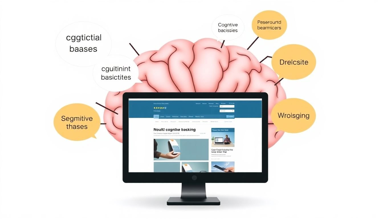
In the vast landscape of web design, understanding user behavior is akin to navigating with a map, and cognitive biases serve as the signposts that guide our journey. Cognitive biases, such as confirmation bias, anchoring, and the mere-exposure effect, are systematic patterns of deviation from rationality or objectivity, and they significantly influence how users interact with and perceive the digital world.
The confirmation bias, for instance, is our tendency to favor information that confirms our previously held beliefs or expectations. This bias can be leveraged by web designers to create a personalized user experience. By using algorithms to predict and display content that aligns with a user’s browsing history or preferences, designers can create a sense of familiarity and relevance, making the user more likely to engage with the site.
Anchoring, another powerful cognitive bias, refers to our inclination to rely too heavily on initial ‘anchors’ or reference points when making decisions. In the context of web design, this bias can be exploited to influence user decisions. For example, displaying the original price of a product alongside its sale price can make the discount seem more significant, encouraging users to make a purchase.
The mere-exposure effect, which posits that we tend to develop a preference for things merely because we are familiar with them, can also be harnessed to enhance user experience. By consistently using a recognizable logo, color scheme, or layout, designers can foster a sense of familiarity and trust, making users more likely to return to the site.
However, it’s crucial to use these biases ethically and responsibly. While they can enhance user experience and conversions, they can also manipulate users into making decisions that aren’t in their best interest. Therefore, it’s essential to strike a balance between leveraging these biases and maintaining transparency and integrity in web design.

The Impact of Color Psychology on Web Design
In the vibrant tapestry of web design, color psychology plays an indispensable role, weaving emotions and reactions into every pixel. Colors, much like words, communicate without uttering a sound. They possess the power to evoke joy, instill trust, or stir anxiety, all within a blink of an eye. This psychological impact is a result of cultural associations, personal experiences, and physiological responses to light and hue.
Take, for instance, the color blue. It’s often associated with trust, stability, and calmness, making it a favorite among corporations and social media platforms. On the other hand, red, with its intense energy, is frequently used to grab attention and stimulate appetite, hence its prevalence in fast food logos and clearance sales. Green, meanwhile, symbolizes growth, nature, and health, making it a popular choice for organic products and environmental causes.
To harness the power of color psychology in web design, consider the following steps:
- Understand Your Audience: Different cultures and age groups respond to colors differently. Research your target audience to ensure your color choices resonate with them.
- Define Your Brand: Colors should reflect your brand’s personality and values. Consistency in color scheme helps build brand recognition.
- Use Color Theory: Complementary, analogous, and triadic color schemes can create harmonious designs. Experiment with tints, shades, and tones to create depth and contrast.
- Test and Refine: A/B testing can help you understand how different colors impact user behavior. Don’t be afraid to refine your color scheme based on user feedback.
By understanding and applying these principles, you can create web designs that not only look stunning but also evoke the right emotions and drive user actions.
Navigating Users with Visual Hierarchy
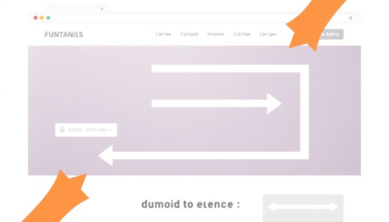
In the vast landscape of web design, one crucial concept that often goes unnoticed but significantly impacts user experience is visual hierarchy. This invisible map, when artfully crafted, guides users seamlessly through a website, enhancing usability and boosting conversions. Visual hierarchy is the order in which our eyes perceive visual elements, and it’s primarily governed by four key principles: size, color, contrast, and proximity.
The first principle, size, is a powerful tool in drawing attention. Larger elements naturally grab our eyes first, making them perfect for highlighting important content or calls-to-action. For instance, a prominent ‘Sign Up’ button will immediately catch a user’s eye, guiding them towards the desired action.
Color and contrast are equally potent in steering users. Vibrant, contrasting colors can create focal points, while subtle hues and low contrast can recede into the background. For example, a bright, contrasting ‘Buy Now’ button will stand out against a muted background, drawing users’ attention and encouraging them to click.
Proximity, the final principle, groups related elements together, creating a sense of unity and association. Users naturally assume that items close together are related, making proximity an effective way to guide them through content. For instance, grouping related links or buttons together helps users understand their relationship and makes the website easier to navigate.
To create a clear path for users, consider the following steps:
- Identify the most important elements on your page, such as calls-to-action or key content.
- Use size, color, and contrast to make these elements stand out.
- Group related elements together using proximity.
- Ensure there’s a clear, logical flow from one element to the next, guiding users through the page.
By mastering these principles, you can create a visual hierarchy that not only improves user experience but also increases the likelihood of conversions.
The Art of Persuasion: Copywriting for Conversions
In the dynamic realm of digital marketing, the art of persuasion, or copywriting, plays an indispensable role in converting casual browsers into engaged users. The psychology behind persuasive copywriting is a fascinating blend of understanding human behavior and crafting language that resonates with the audience. Let’s delve into the key elements that make copy compelling and drive users to take desired actions on a website.
The first brushstroke in this masterpiece is the headline. A compelling headline is not just about grabbing attention, but also about promising a reward. It should be clear, concise, and compelling enough to make users want to dive deeper. Think of it as the first step in a dance, setting the tone for the entire experience.
Next, we move on to the body of the text. Persuasive language is not about being manipulative, but about understanding and addressing the user’s needs, desires, and pain points. It’s about speaking their language, using words that evoke emotions and create a connection. This is where you weave a story that resonates, using vivid descriptions, social proof, and benefits-oriented language.
However, even the most beautifully crafted copy is futile without a clear call-to-action (CTA). A CTA is the hand that reaches out, inviting the user to take the next step. It should be prominent, persuasive, and specific. Think of it as the grand finale of the dance, the moment when the user is invited to join in.
To illustrate, let’s consider a simple example:
- Instead of ‘Click here’, use ‘Discover your personalized recommendations now’.
- Instead of ‘Buy now’, use ‘Own this limited edition piece today’.
- Instead of ‘Sign up’, use ‘Join our community of savvy investors’.
Each of these CTAs paints a picture, evokes an emotion, and makes the user feel like they’re part of something bigger. That’s the power of persuasive copywriting.
In conclusion, the art of persuasion in copywriting is not about tricking users into taking action, but about understanding them, speaking to them, and guiding them towards a decision that benefits both parties. It’s about creating a conversation, not a sales pitch. And like any art form, it’s a skill that improves with practice. So, go ahead, pick up your pen, and start crafting your masterpiece.

The Role of Trust in Web Design
Trust, a fundamental psychological factor, plays a pivotal role in web design, influencing users’ behavior and conversions. Users are more likely to engage with, and ultimately trust, a website that exudes credibility, authority, and security. These elements, when seamlessly integrated into a design, foster a sense of reliability and confidence, encouraging users to explore further and take desired actions.
The first pillar of trust, credibility, can be established through various design elements. A clean, professional layout (
- consistent typography,
- adequate white space,
- clear hierarchy of information
) signals that the website is well-maintained and legitimate. High-quality, relevant images and videos (
- of products,
- team members,
- clients or customers
) also contribute to perceived credibility. Moreover, displaying awards, certifications, or positive reviews (
- from reputable sources
) can significantly boost credibility.
Authority, the second trust-building factor, can be cultivated through demonstrating expertise and leadership. This can be achieved by (
- sharing insightful blog posts or articles,
- hosting webinars or workshops,
- showcasing thought leadership pieces
). Incorporating trust seals, such as security badges or certifications (
- e.g., SSL, Norton Secured, etc.
), also signals authority and commitment to user safety.
Lastly, security is paramount in building trust. Design elements that reassure users of their safety include (
- clear calls-to-action for secure checkout,
- visible security seals,
- transparent privacy policies
). Implementing secure, encrypted connections (
- indicated by ‘https’ in the URL
) is also crucial. By incorporating these elements, web designers can create trustworthy, high-converting websites that users feel safe and confident engaging with.
The Psychology Behind Mobile-First Design
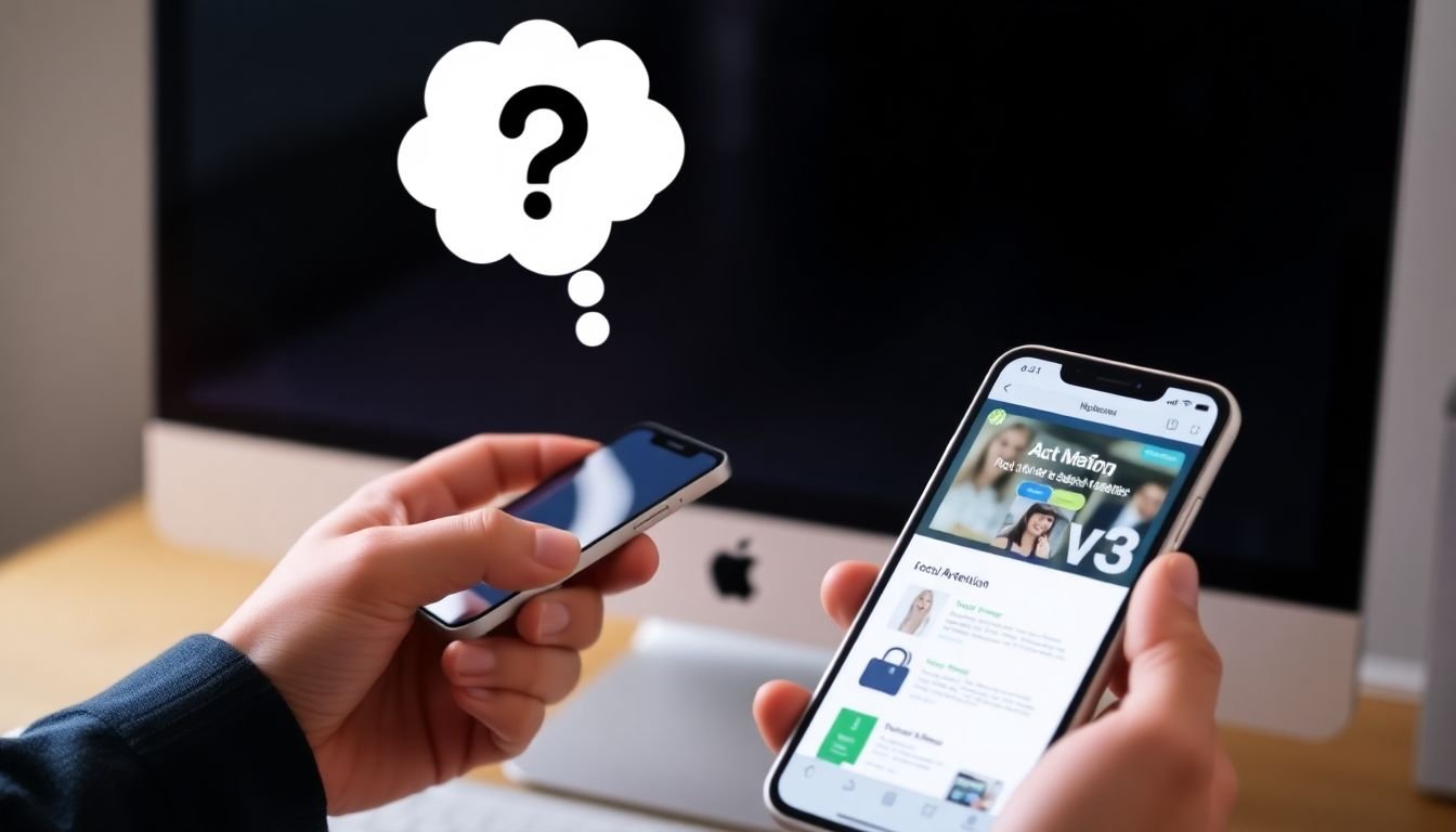
In the digital landscape, the proliferation of mobile devices has undeniably shifted the paradigm of web design. The concept of ‘mobile-first’ design, initially proposed by Ethan Marcotte, has evolved from a mere responsive approach to a strategic philosophy that prioritizes the unique challenges and opportunities presented by mobile devices. Understanding the psychology behind mobile-first design is not just about shrinking desktop designs to fit smaller screens; it’s about comprehending and leveraging the distinct user behavior on mobile to inform web design decisions that enhance user experience and drive conversions across all platforms.
The primary challenge in mobile-first design lies in the constraints of the small screen. Space is limited, and users are often on the go, multitasking, or distracted. Therefore, the design must be intuitive, simple, and focused on the core functionality. This necessitates a user-centered approach, where understanding user behavior is paramount. For instance, users on mobile tend to scan content vertically, so designing with this behavior in mind can significantly improve readability and engagement.
Moreover, mobile users are often driven by immediate needs and quick access to information. They expect websites to load swiftly and provide seamless navigation. Thus, optimizing page speed and simplifying navigation menus are crucial aspects of mobile-first design. This can be achieved through techniques like lazy loading, image optimization, and using clear, concise language in menus.
Another key aspect is the integration of touchscreen functionality. Buttons and links should be appropriately sized for fingers, and interactive elements should provide clear visual feedback. This not only enhances usability but also creates a more engaging user experience.
However, the opportunities presented by mobile-first design extend beyond just improving user experience. By understanding and catering to mobile user behavior, designers can also boost conversions. For example, using location services can provide personalized content, while integrating mobile payment options can streamline the checkout process.
In conclusion, the psychology behind mobile-first design is complex and multifaceted, encompassing everything from understanding user behavior to leveraging the unique capabilities of mobile devices. By embracing this psychology, designers can create not just responsive, but adaptive and engaging digital experiences that transcend platforms and drive meaningful results.
The Importance of Personalization in Web Design
In the digital landscape, where users are inundated with a plethora of websites vying for their attention, personalization has emerged as a powerful tool to differentiate and elevate the user experience. The psychological benefits of personalization in web design are manifold, transforming the way users interact with and perceive a website. By tailoring content, layout, and functionality to individual users, web designers can create a unique, engaging, and meaningful experience that resonates with each visitor.
The human brain is wired to respond positively to personalization. It triggers a phenomenon known as the ‘Illusion of Control,’ where users feel more in charge and connected to the task at hand. This psychological effect can be harnessed in web design to increase user engagement. For instance, allowing users to customize their homepage layout, choose their preferred color scheme, or select the type of content they wish to see can significantly enhance their involvement with the site.
Personalization also plays a pivotal role in driving conversions. When users feel that a website is tailored to their needs and preferences, they are more likely to trust the brand and take desired actions, such as making a purchase or signing up for a service. This is because personalization fosters a sense of familiarity and rapport, making users feel valued and understood. Moreover, by providing relevant and targeted content, personalization can guide users through the sales funnel more effectively.
To achieve these benefits, web designers can employ various strategies. One approach is to use data analytics to understand user behavior and preferences, then use this information to dynamically adjust the website’s content and layout. Another strategy is to implement user profiles, allowing users to save their preferences and receive personalized recommendations. Additionally, A/B testing can be used to compare the performance of personalized and non-personalized versions of a website, providing valuable insights into the impact of personalization.
In conclusion, personalization is not just a buzzword in web design; it is a powerful tool that can significantly enhance user experience, increase engagement, and drive conversions. By understanding and leveraging the psychological benefits of personalization, web designers can create websites that are not only functional and aesthetically pleasing but also emotionally resonant and deeply engaging.
The Psychology of Friction in Web Design
In the dynamic realm of web design, the concept of friction often goes unnoticed yet significantly impacts user experience and conversions. Friction, in this context, refers to any obstacle that hinders users from seamlessly navigating and interacting with a website. It’s the digital equivalent of a bumpy road that slows down progress and can even cause users to abandon their journey altogether.
The most common culprits of friction in web design are often the most overlooked. Unnecessary steps in the checkout process, confusing navigation menus, and poor usability features can all contribute to a frustrating user experience. For instance, a study by the Baymard Institute found that 21% of cart abandonments are due to a too-long or complicated checkout process.
To reduce friction and enhance user flow, consider the following practical tips:
- Simplify Navigation: Ensure your website’s navigation is intuitive and easy to understand. Use clear labels and logical hierarchies to help users find what they’re looking for quickly.
- Streamline Checkout: Minimize the number of steps in your checkout process. Consider offering guest checkout options and auto-fill features to reduce manual data entry.
- Optimize Usability: Ensure your website is responsive and accessible on all devices. Use clear calls-to-action and provide helpful tooltips to guide users.
- Test and Iterate: Regularly test your website with real users and gather feedback. Use this feedback to continually improve and reduce friction points.
By understanding and addressing friction in web design, we can create smoother, more enjoyable user experiences that ultimately drive conversions and build customer loyalty.