Table of Contents
In the digital age, where information is both abundant and fleeting, how do you ensure your content stands out, engages, and drives action? Welcome to the world of infographics, a powerful visual storytelling tool that has become an indispensable asset in the realm of content marketing and lead generation. But why are infographics so effective, and how can you harness their power to boost your marketing efforts? Let’s dive in and explore the fascinating role of infographics in today’s content marketing landscape and discover how they can help you generate more leads than ever before.
First, let’s agree on one thing: in today’s fast-paced, always-connected world, our attention spans are shorter than ever. According to a study by Microsoft, the average attention span has dropped to a mere eight seconds, shorter than that of a goldfish. This means that if your content doesn’t grab attention immediately, it’s likely to be overlooked. This is where infographics come in. They combine striking visuals, concise text, and engaging design to communicate complex information quickly and effectively, making them an ideal tool for capturing and maintaining audience attention.
Now, let’s make a promise. By the end of this article, you’ll understand the science behind why infographics work, how to create compelling infographics that resonate with your audience, and most importantly, how to leverage them to generate more leads for your business. We’ll explore real-life examples, share expert insights, and provide practical tips that you can start implementing right away.
But before we get into the nitty-gritty, let’s take a sneak peek at what’s in store. We’ll kick things off by debunking some common myths about infographics and exploring the neuroscience behind why our brains love visuals. Then, we’ll delve into the world of content marketing, discussing how infographics can enhance your content strategy, boost SEO, and increase social sharing. Next, we’ll turn our attention to lead generation, examining how infographics can nurture leads, build trust, and ultimately drive conversions. Finally, we’ll wrap things up with a step-by-step guide on creating and optimizing infographics for maximum impact.
So, are you ready to revolutionize your content marketing and lead generation strategies with the power of infographics? Let’s get started!
Harnessing the Power of Infographics for Content Marketing and Lead Generation
In the digital age, where information overload is the norm, infographics have emerged as a powerful tool for content marketing and lead generation. These visual representations of data and information allow us to harness the power of both sight and mind, making complex concepts easily digestible and shareable. By combining compelling visuals with concise, engaging text, infographics can tell a story, illustrate a process, or compare data in a way that captivates audiences and encourages them to interact with your brand. For content marketing, they serve as a magnet, drawing readers in and keeping them engaged, thereby increasing the likelihood of shares and backlinks. Moreover, infographics can be a goldmine for lead generation. By offering valuable, insightful content, you can attract potential customers to your website, where they can be nurtured through your sales funnel. They also provide an opportunity to include calls-to-action, guiding viewers towards your desired outcome, whether that’s signing up for a newsletter, downloading an eBook, or scheduling a consultation. In essence, infographics are not just about pretty pictures; they’re about strategic communication that drives action and results. So, why not leverage this powerful tool to make your content marketing and lead generation efforts more effective and engaging?

The Visual Appeal of Infographics
In the vast expanse of the digital world, where information is abundant and attention is scarce, infographics have emerged as a powerful tool to captivate our minds and simplify complex data. But why are infographics so effective? The answer lies in the intricate dance of psychology and design that occurs within our brains when we encounter these visual masterpieces.
The human brain processes visuals 60,000 times faster than text, a fact that infographics exploit to their advantage. By presenting information in a visual format, infographics bypass the slow, deliberate process of reading and instead tap into our brain’s rapid, intuitive visual processing system. This not only grabs our attention but also makes the information more accessible and engaging.
Color, design, and layout are the three musketeers of infographic creation, each playing a crucial role in crafting compelling visual stories. Color, for instance, is not just an aesthetic choice but a powerful tool that can evoke emotions, convey meaning, and guide the viewer’s eye. A well-chosen color palette can make an infographic pop, drawing the viewer in and setting the tone for the information to follow.
Design, too, is a critical component. Clean, simple designs allow the data to shine, while more intricate designs can add depth and intrigue. Effective use of typography, white space, and visual hierarchy can guide the viewer’s eye through the infographic, ensuring they absorb the intended message.
Layout, the final piece of the puzzle, determines how the information is organized and presented. A well-designed layout can make complex data easy to understand, using visual elements like charts, graphs, and icons to break down information into digestible chunks. It’s like a visual roadmap, leading the viewer through the data and ensuring they don’t get lost along the way.
In essence, infographics are not just about pretty pictures. They are a carefully crafted blend of psychology, design, and data, created to engage our brains and make complex information accessible. And in a world where information overload is the norm, that’s a powerful tool indeed.
Infographics and Content Marketing: A Perfect Match
In the dynamic world of content marketing, infographics have emerged as a powerful tool, offering a perfect blend of visual storytelling and data-driven insights. They are not just another pretty picture; infographics are a strategic content format that can simplify complex information, engage audiences, and drive results. Let’s delve into how infographics fit into the content marketing landscape and explore their role in storytelling, data simplification, and content engagement. Infographics, by their very nature, are storytellers. They weave a narrative using a combination of charts, graphs, and images, making data not just comprehensible, but also compelling. Take, for instance, the ‘History of the Web’ infographic by Smashing Magazine. It traces the evolution of the internet in a single, scrollable image, making a complex topic accessible and engaging. Another key role of infographics is their ability to simplify complex data. They break down information into digestible chunks, making it easier for audiences to understand and retain. A great example is the ‘How the iPhone Was Made’ infographic by Business Insider. It simplifies the intricate manufacturing process into a step-by-step visual guide, making it fascinating and easy to follow. Infographics also play a significant role in improving content engagement. They are highly shareable, with visual content being 40 times more likely to be shared on social media than other types of content. Moreover, infographics can increase web traffic and time spent on a page. For example, the ‘State of the Internet’ infographic by Akamai Technologies receives thousands of shares and backlinks each year, driving significant traffic to their site. To leverage infographics in your content marketing strategy, consider the following steps:
- Identify complex or data-heavy topics that would benefit from visual simplification.
- Choose a compelling narrative or angle to make the data engaging and shareable.
- Work with a skilled designer to create a visually appealing and easy-to-understand infographic.
- Promote your infographic through your content channels, and encourage sharing.
Infographics are more than just a pretty face in the content marketing world. They are a powerful tool that can transform complex data into engaging, shareable stories. By incorporating infographics into your content marketing strategy, you can enhance your storytelling, simplify complex data, and improve content engagement.
The Science Behind Infographic Effectiveness
In the digital age, infographics have emerged as a powerful tool in content marketing, transforming complex data into engaging, easily digestible visuals. But what lies beneath their captivating surfaces? Let’s delve into the science behind infographic effectiveness, exploring the research and studies that validate their impact.
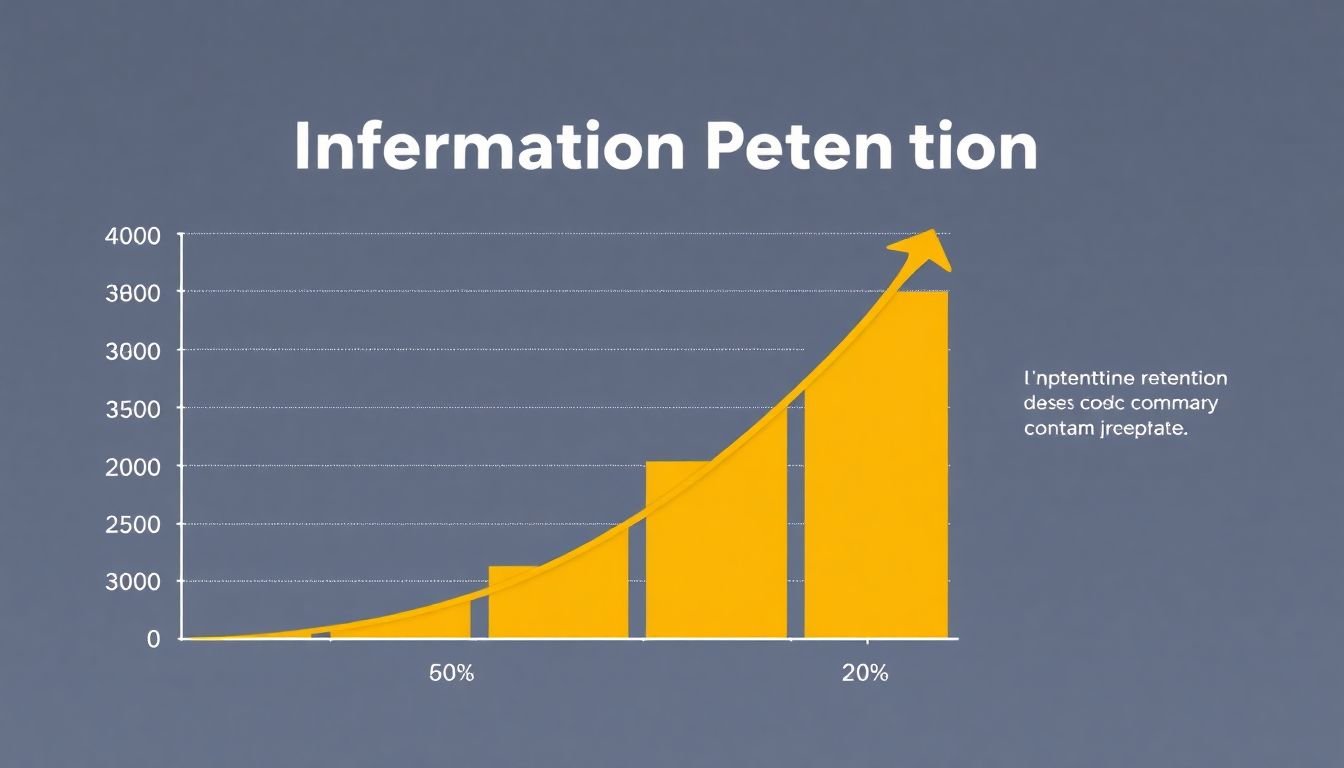
Infographics excel in enhancing information retention, a key factor in effective communication. A study published in the Journal of Visual Communication in Medicine found that participants retained 80% of information when it was presented in an infographic, compared to just 20% when presented in text form alone. This is attributed to the dual-coding theory, which posits that our brains process visual and verbal information through separate channels, leading to improved memory when both are engaged.
Processing speed is another area where infographics shine. Our brains can interpret visual content 60,000 times faster than text, according to research by MIT. This is due to the way our brains are wired; we’re hardwired to process visual information quickly and efficiently. Infographics leverage this strength, breaking down complex data into simple, scannable visuals that our brains can process at lightning speed.
Lastly, let’s consider shareability, a critical aspect in content marketing. Infographics are highly shareable, thanks to their engaging nature and the fact that they’re easy to understand at a glance. A study by AnsonAlex found that infographics were liked and shared on social media 3x more than other any other type of content. This increased visibility not only boosts brand awareness but also drives traffic to your website.
In conclusion, the science behind infographic effectiveness is robust and compelling. From enhancing information retention to speeding up processing, and boosting shareability, infographics are a potent tool in any content marketer’s arsenal. So, the next time you’re grappling with a data-heavy topic, consider an infographic
- your audience’s brains will thank you!
Infographics and SEO: A Powerful Duo
In the dynamic world of digital marketing, infographics and SEO have emerged as a powerful duo that can significantly enhance your online visibility and engagement. Infographics, with their visual appeal and ability to simplify complex data, are not just eye-catching but also SEO powerhouses. Let’s delve into how these two powerhouses can boost your SEO efforts.
Firstly, infographics are a goldmine for backlinks. High-quality, informative infographics have the potential to attract natural, organic backlinks from other websites. When these sites link back to your content, they’re essentially vouching for your site’s credibility and relevance, which is a significant ranking factor for search engines. Moreover, infographics can drive referral traffic from these backlinks, increasing your site’s visibility and reach.
Infographics also play a pivotal role in user engagement, another crucial factor for SEO. They make complex data easily digestible, encouraging users to spend more time on your site, reducing bounce rates, and increasing the likelihood of sharing your content. Search engines, like Google, consider user engagement signals when ranking websites, so the more engaging your content, the higher you’re likely to rank.
Now, let’s discuss how to optimize infographics for search engines. Firstly, ensure your infographic is embedded in a relevant, high-quality blog post or article. This provides context for the infographic and helps search engines understand what it’s about. Secondly, include relevant keywords in your infographic’s title, caption, and surrounding text. This helps search engines understand the content of your infographic and improves its visibility in image search results. Lastly, make sure your infographic has a descriptive file name and alt text, both of which should include your target keyword. This helps search engines understand what your infographic is about and improves its visibility in image search results. In conclusion, infographics are not just a great way to present data, but also a powerful tool for boosting your SEO efforts.
Infographics in Lead Generation: Converting Visitors into Leads
Infographics, those vibrant visual representations of data, are not just eye-catching, but powerful tools in lead generation. They can convert casual visitors into leads by providing valuable information in an engaging format. Here’s how you can leverage infographics to generate leads, along with some successful real-life examples.
Gated Content and Lead Magnets:
Infographics can be used as lead magnets or gated content. A lead magnet is an incentive offered to potential customers in exchange for their contact information. By placing an infographic behind a form, you encourage visitors to exchange their details to access the content. For instance, HubSpot used an infographic titled ‘The State of Inbound’ as a lead magnet. They offered it in exchange for visitors’ email addresses, generating a significant number of leads.
Lead Nurturing:
Infographics can also be used to nurture leads. Once a visitor has converted into a lead, you can continue to provide valuable content to build trust and move them through the sales funnel. For example, Marketo used a series of infographics to educate their leads about marketing automation. This not only provided value but also positioned Marketo as a thought leader in the industry.
Strategies for Effective Lead Generation with Infographics:
Relevance:
- Ensure the infographic’s topic is relevant to your target audience. It should address their pain points or interests.
Design:
- The infographic should be visually appealing and easy to understand. Use high-quality images, clear typography, and a logical flow of information.
Promotion:
- Don’t just create an infographic and hope visitors will find it. Promote it on your website, social media, email newsletters, and other relevant platforms.
Call to Action (CTA):
Include a clear CTA in your infographic. This could be a button encouraging visitors to download the infographic, sign up for a newsletter, or learn more about your product/service.
Creating Engaging Infographics: Best Practices
Creating engaging infographics is an art that combines data, design, and storytelling. Let’s dive into the best practices to craft infographics that captivate audiences and convey complex information effectively.
Data Selection:
The first step is choosing the right data. It should be relevant, accurate, and tell a story. Avoid overwhelming viewers with too much information. Instead, focus on key points that support your narrative. Always verify your data sources to ensure credibility.
Design Principles:
- Infographics should be visually appealing and easy to understand. Here are some design principles to keep in mind:
Simplicity:
- Use a clean, uncluttered layout. White space is your friend.
Consistency:
- Maintain a consistent color scheme, typography, and style throughout.
Hierarchy:
- Organize information in a logical order, with the most important data at the top.
Visual Hierarchy:
Use size, color, and placement to guide viewers’ eyes through the infographic.
Storytelling:
- Infographics aren’t just about data; they’re about telling a story. Here’s how to weave a narrative into your design:
Identify the main message:
- What’s the key takeaway you want viewers to understand?
Create a narrative arc:
- Arrange data in a way that builds towards this message, like a story.
Use visuals to support the story:
Charts, graphs, icons, and images should all serve the narrative.
Tools for Creation:
- There are numerous tools to help you create infographics, from beginner-friendly to advanced. Some popular options include:
Canva:
- A user-friendly design platform with drag-and-drop functionality and numerous templates.
Piktochart:
- Offers a variety of templates and allows for easy customization.
Tableau:
- A powerful data visualization tool for more complex infographics.
Adobe Illustrator:
A professional vector graphics editor for advanced users.
Testing and Refinement:
Once you’ve created your infographic, test it on your target audience. Gather feedback and make refinements as needed. The best infographics are those that engage viewers and effectively communicate their message.
Measuring the Success of Infographic Campaigns
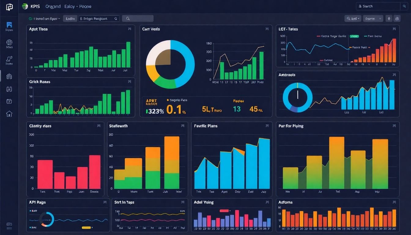
Measuring the success of an infographic campaign is a crucial step in understanding its impact and improving future efforts. Key Performance Indicators (KPIs) serve as our compass, guiding us towards a comprehensive analysis of the campaign’s performance. Let’s delve into the key metrics to track and how to interpret them for continuous improvement.
The first step is to identify the primary objectives of your infographic campaign. Are you aiming to increase brand awareness, drive traffic to your website, or generate leads? Once you’ve established your goals, you can select the most relevant KPIs.
One of the most fundamental KPIs is the number of shares. This metric indicates the virality of your infographic and its potential to reach a wider audience. To analyze this, track the number of shares across various social media platforms and compare it to your initial targets.
Another vital KPI is the amount of traffic driven to your website. This can be measured using tools like Google Analytics. A significant increase in traffic from the infographic’s publication can indicate its success in attracting new visitors to your site.
Engagement metrics, such as likes, comments, and reposts, also provide valuable insights. These interactions show that your audience is not only consuming the content but also reacting to it, indicating its resonance with your target audience.
To interpret these metrics, compare them to your initial benchmarks and industry standards. If your campaign falls short, consider what might have gone wrong. Was the infographic design not appealing enough? Was the content not relevant to your audience? Use these insights to refine your strategy for future campaigns.
Moreover, consider using A/B testing to compare the performance of different infographic designs or content types. This can help you understand what works best with your audience and optimize your future campaigns accordingly.
In conclusion, measuring the success of an infographic campaign is an iterative process that involves setting clear objectives, tracking relevant KPIs, analyzing the data, and continually refining your strategy. By doing so, you can ensure that your infographic campaigns not only engage your audience but also drive meaningful results for your business.
Infographic Trends to Watch in 2023
As we step into 2023, the infographic landscape is set to evolve, driven by advancements in technology, shifting audience behaviors, and a renewed focus on storytelling. Let’s explore some of the key trends that are poised to shape the world of infographics this year.
The first trend to watch is the rise of interactive and animated infographics. In a world where audiences crave engagement, static infographics may no longer cut it. Interactive elements like tooltips, filters, and sliders can help users explore data at their own pace, while animations can bring data to life, making complex information more digestible.
Another trend to note is the growing importance of storytelling. Infographics are no longer just about presenting data; they’re about telling a story. This could be a narrative about a company’s journey, an explanation of a complex process, or an exploration of a societal issue. By weaving data into a compelling narrative, infographics can engage audiences on a deeper level.
In terms of design, minimalism is expected to continue its reign. Clean, simple designs allow data to take center stage, making infographics more accessible and easier to understand. This doesn’t mean sacrificing creativity, though. Expect to see more experimentation with typography, color, and unique data visualizations.
Finally, let’s talk about data. With the increasing availability of data, infographics have the potential to tell more nuanced and detailed stories. However, this also means that data verification and accuracy will be more important than ever. As creators, it’s our responsibility to ensure that our infographics are not just engaging, but also truthful and reliable.
In conclusion, 2023 promises to be an exciting year for infographics. By embracing these trends, we can create more engaging, effective, and meaningful infographics that truly inform and inspire.
FAQ
What are infographics and how do they fit into content marketing?
How do infographics aid in lead generation?
- attract and engage audiences, increasing the likelihood of shares and referrals
- establish thought leadership and credibility, positioning your brand as an authority in your industry
- encourage social media engagement and backlinks, improving SEO and driving more organic traffic to your site
- provide valuable content for lead magnets, such as downloadable guides or eBooks, in exchange for contact information
What makes an infographic effective for content marketing and lead generation?
- Relevant and valuable content that addresses a specific pain point or answers a pressing question
- Engaging and visually appealing design that aligns with your brand’s aesthetics
- Clear and concise information architecture, with a logical flow that guides viewers through the content
- Optimized for search engines and social media platforms to maximize reach and engagement
- Incorporation of calls-to-action (CTAs) that encourage viewers to take the next step, such as visiting your website or downloading a related resource
What are some popular types of infographics for content marketing?
- Statistical infographics: Ideal for presenting survey results, market trends, or other numerical data
- Process infographics: Perfect for explaining step-by-step procedures, workflows, or how-to guides
- Comparative infographics: Great for showcasing differences between products, services, or concepts
- Timeline infographics: Excellent for illustrating historical events, evolution of ideas, or progress over time
- Hierarchical infographics: Useful for displaying categorizations, rankings, or tiered structures
- Interactive infographics: Engaging and dynamic, allowing users to explore data or customize their experience
How can I ensure my infographic is accessible to all audiences?
- Use alt text for images to describe the content for visually impaired users
- Provide text alternatives for charts and graphs, using data tables or detailed captions
- Choose high-contrast colors and fonts for better readability
- Ensure sufficient color contrast to accommodate users with color blindness
- Make sure your infographic is responsive and optimized for various screen sizes and devices
- Test your infographic with assistive technologies, such as screen readers, to identify and address any accessibility barriers
How can I repurpose an infographic to maximize its reach and impact?
- Break down the infographic into smaller, shareable images for social media platforms
- Create a blog post or article based on the infographic’s content, embedding the visual and providing additional context
- Turn the infographic into an animated video or GIF to capture attention on social media or email newsletters
- Create an interactive version of the infographic using online tools or platforms
- Translate the infographic into different languages to reach global audiences
- Update the infographic with fresh data or insights to keep it relevant and timely
How can I measure the success of my infographic in content marketing and lead generation?
- Reach and engagement: Number of shares, likes, comments, and views on social media platforms, as well as website traffic generated by the infographic
- Backlinks: The number of high-quality websites that link back to your infographic, indicating its value and authority
- Lead generation: Conversion rates for CTAs, such as form submissions, email sign-ups, or downloads of related resources
- SEO impact: Changes in search engine rankings, organic traffic, and domain authority as a result of the infographic’s backlinks and engagement
- User feedback: Comments, reviews, or surveys that provide insights into users’ preferences, understanding, and satisfaction with the infographic