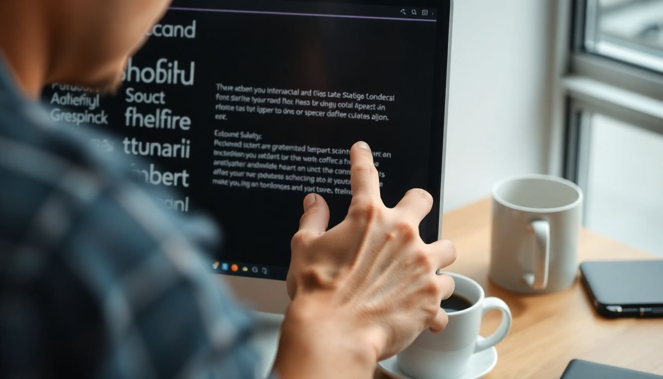
Have you ever found yourself drawn to a particular book or poster, only to realize that it was the typography that initially caught your eye? Typography, the art and technique of arranging type, is often the unsung hero of graphic design, yet it plays a pivotal role in effective visual communication. In this comprehensive article, we delve into the intricate world of typography and its indispensable role in graphic design, exploring how mastering this craft can elevate your designs and make them more impactful.
Agree with us when we say that typography is not just about choosing a font and calling it a day. It’s a powerful tool that can evoke emotions, convey messages, and even influence our perception of a brand. According to a study by MIT, people can identify a brand by its typography alone in just 100 milliseconds. This underscores the importance of typography in graphic design, making it a critical aspect that designers cannot afford to overlook.
Now, you might be wondering, ‘What can I gain from understanding typography better?’ Well, buckle up, because we’re about to promise you a journey that will transform the way you approach graphic design. By the end of this article, you’ll be equipped with a deeper understanding of typography, its history, and its various styles. You’ll learn how to choose the right font for your design, how to pair fonts effectively, and how to use typography to guide your audience’s eye through your design. We’ll also explore the psychology behind typography and how it can influence our emotions and actions.
But wait, there’s more! We’ll also provide you with practical tips and tricks, along with real-life examples and case studies to illustrate our points. Whether you’re a seasoned designer looking to refine your skills or a beginner eager to learn, this article is your key to unlocking the full potential of typography in your graphic design journey. So, are you ready to dive in and let typography take center stage in your designs? Let’s get started!
Mastering the Art of Visual Communication through Type
In the vast landscape of visual communication, typography stands as a powerful tool, capable of evoking emotions, conveying messages, and guiding the viewer’s eye. Mastering the art of visual communication through type is an exhilarating journey that transcends mere letter arrangement. It’s about understanding the personality of fonts, their historical context, and how they interact with one another and their surroundings. Imagine each font as a unique character in a grand play, each with its own voice, mood, and story to tell. A skilled typographer is a director, orchestrating this ensemble cast to create a compelling narrative that resonates with the audience. This art form is not just about choosing the right font; it’s about understanding the rhythm of words, the balance of white space, and the harmony of color. It’s about creating a visual symphony that sings in unison with the content. So, let’s embark on this adventure, exploring the rich tapestry of typefaces, their cultural significance, and their role in shaping our visual world. After all, every letter, every word, every line is an opportunity to tell a story, to evoke a feeling, to communicate effectively. And that, dear reader, is the true magic of mastering the art of visual communication through type.

The Power of First Impressions
In the vast landscape of visual communication, typography stands as a powerful tool that can make or break a first impression. The way text is presented—through font choice, size, and style—can significantly influence how viewers perceive and interpret the content. This process, often unconscious, is akin to a silent conversation between the design and the viewer, where typography sets the tone and guides the narrative.
Consider, for instance, the difference between a bold, large font and a delicate, small one. The former commands attention, exuding confidence and importance, much like a charismatic speaker addressing a crowd. It’s a visual shout, demanding to be noticed. On the other hand, a small, subtle font whispers, inviting the viewer to lean in, to explore the content with intimacy. It’s a quiet, personal conversation, perfect for delicate or detailed information.
Font style also plays a crucial role in this initial perception. Serif fonts, with their small lines at the ends of characters, evoke tradition and formality. They’re like the wise, old professors of the typography world, respected and reliable. Sans-serif fonts, clean and simple, are more modern and approachable. They’re the friendly, casual acquaintances, ready for a chat. Script fonts, with their flowing, handwritten style, add a personal, artistic touch. They’re the creative types, full of personality and flair.
Moreover, the combination of these typography elements can create a symphony of first impressions. A large, bold sans-serif font paired with a delicate, small serif font can convey a sense of strength and approachability, a powerful-yet-approachable dynamic. The possibilities are endless, limited only by the designer’s imagination and the viewer’s perception.
In essence, typography is not just about making text legible; it’s about making it engaging, about setting the stage for the content to shine. It’s about creating a first impression that lasts, guiding the viewer’s interpretation and leaving a lasting impact. After all, as the old adage goes, ‘You never get a second chance to make a first impression.’ And in the world of design, typography is often the first face we show.

The Hierarchy of Type
In the vast landscape of design, typography stands as a powerful tool, guiding the viewer’s eye through a composition with precision and grace. At the heart of this guidance lies the concept of typographic hierarchy, a system that organizes and prioritizes information, ensuring that the most important elements leap off the page, while supporting details remain accessible yet unobtrusive. This hierarchy is not a rigid, top-down structure, but a dynamic, fluid relationship that evolves with each design, creating a logical flow that invites exploration and understanding.
The architect of this hierarchy is a toolbox of typographic elements, each with the power to elevate or demote information. Size, the most intuitive of these tools, operates on a simple principle: bigger is bolder, smaller is subtler. A colossal headline commands attention, while a diminutive caption whispers asides. Weight, or thickness of stroke, also plays a significant role. Bold, heavy letters assert dominance, while thin, delicate ones recede into the background. The style of a font, its unique character and personality, can also influence its position in the hierarchy. A classic, serious font might be reserved for the most important information, while a playful, decorative one could be used to add visual interest to less critical details.
Color, the final tool in this toolbox, is perhaps the most versatile. It can amplify the effects of size, weight, and style, or it can create a hierarchy all its own. A vibrant, attention-grabbing hue can elevate a piece of information, while a muted, neutral one can demote it. Contrasting colors can create a stark, dramatic hierarchy, while complementary colors can create a more subtle, nuanced one. The possibilities are endless, limited only by the designer’s imagination and the needs of the project.
To create a clear visual hierarchy, a designer might follow these steps:
- Identify the most important information and make it the largest, boldest, and most prominent.
- Use size, weight, style, and color to create a clear progression from most to least important.
- Consider the flow of the design, guiding the viewer’s eye from one piece of information to the next.
- Test and refine the hierarchy, ensuring that it is clear, logical, and effective.
In the end, the hierarchy of type is not just about making some things bigger and others smaller. It’s about creating a conversation, a dance between the viewer and the design. It’s about guiding, inviting, and engaging, all with the subtle, powerful language of typography.

The Art of Legibility and Readability
The art of legibility and readability is a delicate balance that every designer, writer, and publisher must master. Legibility, the ease with which individual letters can be distinguished, is the first step in ensuring that your text can be read. Imagine trying to decipher a sign written in a font where the letters all run together
- it’s a frustrating experience, and one that can be avoided by choosing a font with distinct, well-spaced letters.
However, legibility alone is not enough. Readability, the ease with which a block of text can be read, is equally important. This is where factors like line spacing and line length come into play. Too much or too little space between lines can make text difficult to read, as can lines that are too long. Think of a newspaper column versus a single, long paragraph
- the former is much easier to read.
So, how can we achieve this balance? Let’s break it down:
- Font Choice: Opt for fonts with distinct, well-spaced letters. Serif fonts like Times New Roman are often considered more readable than sans-serif fonts, but this can depend on the context and personal preference.
- Line Spacing: The space between lines of text, known as leading, can greatly impact readability. A good rule of thumb is to use 1.5 to 2 times the size of the font for body text.
- Line Length: The length of a line of text, known as measure, also affects readability. A good measure is considered to be between 45 to 75 characters, or around 10 to 12 words per line.
By considering these factors, we can create text that is both legible and readable, making it a pleasure to read rather than a chore.

The Impact of Font Personality
In the vast landscape of design, one often overlooked yet powerful tool is the humble font. Fonts, much like human personalities, possess distinct characteristics that evoke unique emotions and convey specific messages. This phenomenon, often referred to as ‘font personality,’ is a critical aspect of visual communication that can significantly impact the success of a design.
The impact of font personality is profound and multifaceted. Different fonts can evoke a range of emotions, from the playful and whimsical to the serious and professional. For instance, the bold, chunky letters of ‘Impact’ exude strength and confidence, while the elegant, flowing script of ‘Great Vibes’ conveys a sense of creativity and individuality. Similarly, the clean, minimalist lines of ‘Helvetica’ suggest simplicity and efficiency, while the ornate, decorative flourishes of ‘Black Chancery’ evoke a sense of history and tradition.
Choosing a font that aligns with the desired tone and branding of a design is, therefore, not just an aesthetic decision, but a strategic one. It’s akin to selecting the right voice or tone for a story, as it sets the mood and guides the reader’s interpretation of the content. For example, a font with a playful, hand-drawn style might be perfect for a children’s book, while a sleek, modern font would be more suitable for a tech startup’s website.
Moreover, font personality can also influence the perceived credibility and trustworthiness of a design. A study by the Missouri University of Science and Technology found that people make subconscious judgments about a website’s credibility based on its font, with certain fonts being perceived as more trustworthy than others.
In conclusion, the impact of font personality is undeniable and far-reaching. It’s a powerful tool that designers can use to evoke specific emotions, convey distinct messages, and enhance the overall effectiveness of their designs. Therefore, the next time you’re choosing a font, consider not just its aesthetic appeal, but also its personality, and how it aligns with your desired tone and branding.

The Role of White Space
In the realm of typography, the role of white space, often overlooked, is as significant as the letters themselves. White space, or negative space, is the area around and between elements on a page that is left blank. It’s the unsung hero that breathes life into typography, enhancing its impact and guiding the reader’s eye.
The primary role of white space is to improve readability. Ample white space allows the reader’s eye to easily scan and distinguish between different elements on the page. It provides a visual break, reducing eye strain and making the text more inviting. Think of it as the pauses in a conversation that give your words meaning and impact.
White space also creates contrast, making key elements stand out. By isolating important text or images, white space draws the reader’s attention to them. It’s like a spotlight on a stage, highlighting the main act. This strategic use of white space can guide the reader’s focus, ensuring they notice and engage with the most important information.
Moreover, white space can emphasize key elements by providing a sense of hierarchy. By adjusting the amount of white space around different elements, you can create a visual hierarchy, signaling to the reader what’s most important. This is particularly useful in headings, subheadings, and body text, where varying levels of white space can create a clear, intuitive structure.
In essence, white space is not empty or wasted space. It’s a powerful tool that, when used strategically, can enhance the impact of typography, improve readability, create contrast, and emphasize key elements. It’s the silent partner that makes typography shine.

The Power of Contrast
In the vast canvas of visual communication, one of the most potent tools at our disposal is contrast. When it comes to typography, contrast isn’t just about making text stand out; it’s about guiding the viewer’s eye, creating hierarchy, and sparking interest. Let’s delve into the power of contrast, exploring how font sizes, weights, and styles can transform a design.
The first step in harnessing the power of contrast is understanding that our eyes are naturally drawn to differences. This is where font size comes into play. By using larger fonts, we can emphasize important elements, drawing the viewer’s attention like a beacon in the night. Conversely, smaller fonts can be used to subtly guide the eye, creating a sense of importance without being overbearing.
Font weight is another powerful tool in our contrast toolbox. Bold fonts command attention, their thick strokes demanding to be noticed. They’re perfect for headings, calls to action, or any element you want to shout from the rooftops. On the other hand, thin fonts can create a sense of elegance and subtlety, ideal for supporting text or delicate details.
But contrast isn’t just about size and weight; it’s also about style. Mixing serif and sans-serif fonts, for instance, can create a striking contrast that adds visual interest. Imagine a bold, serif heading paired with a clean, sans-serif body text
- it’s a match made in design heaven.
However, with great power comes great responsibility. Contrast should be used strategically, like a master chef adding a pinch of salt to a dish. Too much contrast can be overwhelming, while too little can leave your design feeling flat. The key is to use contrast to guide the viewer’s eye, creating a visual journey that tells a story.
Think of it like a dance
- each element has its role, its rhythm. The large, bold heading leads, drawing the eye in. The smaller, lighter text supports, guiding the viewer through the design. The varied font styles add a touch of flair, a unique twist that makes the dance truly memorable.
So, the next time you’re designing, remember the power of contrast. Use it wisely, use it well, and watch as your designs come to life, one contrast at a time.

The Art of Combining Fonts
The art of combining fonts is a delicate dance of balance and harmony, much like a well-choreographed pas de deux in the world of typography. Font pairing, the process of selecting and combining different typefaces, is a crucial aspect of graphic design that can elevate a design from ordinary to extraordinary. But how does one achieve this harmonious balance? Let’s delve into the principles of font pairing and explore the different approaches to combining fonts effectively.
The first step in font pairing is understanding the basics of typography. Fonts, or typefaces, can be broadly categorized into three groups: serif, sans-serif, and display. Serif fonts, like Times New Roman, have small lines attached to the ends of their strokes, which make them easier to read in long blocks of text. Sans-serif fonts, such as Arial or Helvetica, have clean, simple lines without the serifs, making them highly versatile and modern. Display fonts are often highly stylized and are used for headings or emphasis.
Now that we have a basic understanding of font types, let’s explore the different approaches to font pairing.
- Contrasting Fonts: One approach is to use fonts that are starkly different from each other. This can create a strong visual contrast and draw attention to the text. For example, pairing a bold, heavy serif font with a light, thin sans-serif font can create a dynamic tension in your design.
- Complementary Fonts: Another approach is to use fonts that share similar characteristics but have distinct differences. This creates a sense of unity and harmony in your design. For instance, pairing two fonts from the same family but with different weights or styles can create a cohesive look.
When combining fonts, it’s essential to consider the mood and tone you want to convey. A playful, whimsical design might call for a hand-drawn, script font paired with a clean, modern sans-serif. A formal, elegant design might require a classic serif font paired with a sophisticated, elegant sans-serif.
Remember, the key to effective font pairing is balance. Too many fonts can clutter a design, while too few can make it feel monotonous. Aim for two to four fonts in a design, using them strategically to create hierarchy and emphasis.
In conclusion, the art of combining fonts is a skill that takes practice and patience. But with a basic understanding of typography and a willingness to experiment, anyone can create harmonious, balanced designs that sing with typographic harmony.

The Influence of Cultural and Historical Context
Typography, the art and technique of arranging type, is not merely about selecting a font for its aesthetic appeal. It’s a powerful tool that can evoke cultural and historical references, significantly influencing the viewer’s interpretation of a design. The choice of a font can transport the viewer to a specific time period, geographical location, or cultural context, creating a rich narrative around the design.
Consider, for instance, the font ‘Old English’. Its ornate, medieval-inspired design immediately evokes images of ancient manuscripts, castles, and knights. Using this font in a modern design for a fantasy novel or a medieval-themed restaurant can instantly set the tone and create a specific cultural and historical context. However, using the same font in a design for a tech startup might confuse or mislead the viewer, as it doesn’t align with the intended context.
Understanding the cultural and historical context of a font is, therefore, crucial before using it in a design. This understanding can help designers make informed decisions that enhance the design’s message and avoid potential misunderstandings or misinterpretations. Here are some steps to consider:
- Research the origin and history of the font. When was it created? What was the cultural and historical context at that time?
- Consider the cultural and historical context of the design itself. Does the font align with the intended message and audience?
- Think about the potential interpretations of the font. Could it have unintended connotations or associations?
By following these steps, designers can harness the power of typography to create designs that are not only aesthetically pleasing but also culturally and historically resonant.

The Future of Typography in Graphic Design
In the ever-evolving landscape of graphic design, typography stands as a beacon of change, continually reshaped by emerging trends and technological advancements. The future of typography is not just about creating beautiful letters, but about crafting dynamic, responsive, and interactive typefaces that can adapt to a myriad of digital platforms and user experiences.
The advent of advanced design software has opened up new avenues for typographic exploration. Tools like Adobe’s variable fonts, for instance, allow designers to create single, highly flexible font files that can adapt to different weights, widths, and even include stylistic alternates. This means a single font can now offer a vast range of design possibilities, making it easier to maintain consistency across projects while still allowing for creativity.
Responsive design, another key trend, is transforming typography from a static art form into a dynamic, adaptive one. With responsive design, typefaces can now adjust their size, style, and even layout in real-time, depending on the device or screen size they’re viewed on. This ensures that typography remains legible, engaging, and effective, regardless of the platform.
Moreover, the intersection of typography and user experience (UX) is giving rise to innovative design solutions. Interactive typography, for example, uses animation and motion to create engaging, immersive experiences. Meanwhile, accessibility considerations are driving the development of new, highly readable typefaces designed specifically for digital platforms.
In conclusion, the future of typography in graphic design is not just about aesthetics, but about functionality, adaptability, and user-centric design. As technology continues to advance, we can expect to see typography become even more integrated into our digital lives, shaping not just how we read, but how we interact with the world around us.
FAQ
What is typography and why is it crucial in graphic design?
How do typefaces influence the overall design and message?
What is the role of typography in branding?
How does typography impact readability and legibility?
What is the importance of typographic hierarchy in graphic design?
How does typography influence the layout and composition of a design?
What are some typographic techniques used to create emphasis and contrast?
- Changing font size, weight, or style to create hierarchy and contrast.
- Using all caps, italics, or underlining to emphasize certain words or phrases.
- Employing color, either as the primary color or in combination with other elements, to create visual interest and draw attention.
- Manipulating letter spacing (tracking) and word spacing (kerning) to create unique effects and emphasize specific words or letters.
- Using special characters, symbols, or ligatures to add visual interest and create emphasis.