Have you ever marveled at a beautifully designed magazine spread, or been captivated by a seamless, intuitive website? Chances are, you’ve been unconsciously appreciating the art of layout design. But what exactly makes a layout effective, and how can we apply these principles to both print and web design? Today, we’re diving into the fascinating world of layout design, exploring its fundamental principles, and equipping you with the tools to create stunning, functional designs across both print and digital platforms.
Agree with us when we say that layout design is the backbone of any visual medium. It’s the silent storyteller that guides our eyes, influences our emotions, and ultimately shapes our experience. But here’s the thing: layout design isn’t just about making something look pretty. It’s about understanding and manipulating space, balance, hierarchy, and flow to communicate a message or tell a story. And the best part? These principles are universal, transcending the boundaries of print and web design.
Now, you might be thinking, ‘That sounds great, but where do I start?’ Or perhaps, ‘I’m a web designer, why should I care about print design?’ Well, let us promise you this: by the end of this article, you’ll not only understand the core principles of layout design but also see how they interconnect and translate between print and web. You’ll learn how to create layouts that engage, inform, and inspire, regardless of the medium.
According to a study by Adobe, 85% of consumers believe that a company’s visual content has the power to influence their purchasing decisions. That’s a staggering statistic that underscores the importance of layout design. But here’s the kicker: with so much visual noise out there, it’s not just about creating any design
- it’s about creating the right design. And that’s where understanding layout design principles comes in.
So, are you ready to take your design skills to the next level? To learn how to create layouts that captivate, engage, and convert? Then stick around, because in the following sections, we’ll be exploring the fascinating world of layout design, from the ground up. We’ll delve into the fundamentals, provide practical tips, and even throw in some real-world examples to illustrate our points. So, grab a cup of coffee, get comfortable, and let’s embark on this design adventure together.
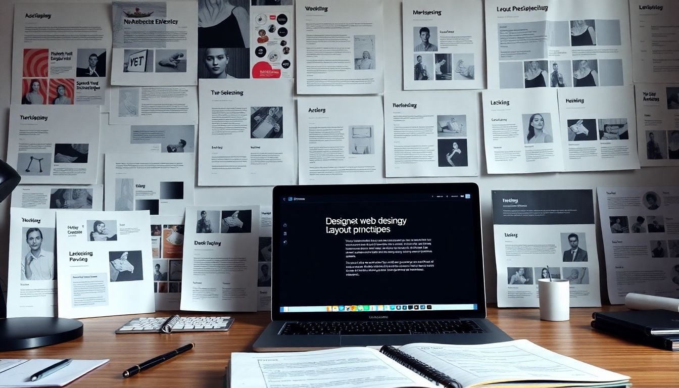
Unveiling the Fundamentals of Layout Design Across Platforms
In the ever-evolving digital landscape, layout design has emerged as a cornerstone of user experience, transcending the boundaries of individual platforms to become a universal language of visual communication. Unveiling the fundamentals of layout design across platforms is akin to unlocking a secret code that enables us to create harmonious, intuitive, and engaging digital spaces. Whether we’re crafting responsive websites, designing mobile applications, or curating content for social media platforms, the principles of layout design remain constant, guiding us like a lighthouse in the vast sea of digital design. From the humble grid system to the dynamic world of responsive design, each element of layout design tells a story, whispering to the user, ‘I understand your needs, and I’m here to serve you.’ As we delve into the fundamentals, we’ll explore the art of balancing form and function, the dance of positive and negative space, and the magic of creating layouts that adapt and evolve with their environment. So, let’s embark on this journey, armed with curiosity and an open mind, ready to unveil the fundamentals of layout design across platforms.

The Building Blocks of Layout Design
Layout design, the architectural blueprint of visual communication, is built upon a few fundamental elements that transcend mediums, applying as seamlessly to print as they do to web design. Let’s delve into these building blocks, starting with the skeleton of any design: the grid.
The grid is the invisible framework that organizes content, providing structure and harmony. In print, it’s the underlying matrix that dictates column widths and gutter sizes. On the web, it’s the CSS Grid or Flexbox that arranges elements in a responsive, two-dimensional layout. For instance, a newspaper’s broadsheet follows a grid, as does a website’s responsive design, ensuring content is neatly arranged and easily navigable.
Alignment, the second pillar of layout design, is about positioning elements along an axis. It creates a visual hierarchy, guiding the eye through the design. In print, it’s about lining up text and images along a baseline or margin. On the web, it’s about centering elements both horizontally and vertically. A well-aligned design feels balanced and pleasing to the eye, like a perfectly centered heading or a symmetrically aligned image gallery.
Proximity, the principle of ‘nearness’, is about grouping related elements together. It’s about creating visual clusters that suggest relationships. In print, it’s about placing related text and images close together. On the web, it’s about using containers to group elements. For example, a product listing on an e-commerce site uses proximity to group related items together.
Lastly, white space, or negative space, is the unsung hero of layout design. It’s the space between elements, the pauses in a visual conversation. In print, it’s the margins, gutters, and space around images. On the web, it’s the padding, margins, and space around elements. White space gives elements room to breathe, preventing clutter and enhancing readability. It’s the difference between a cramped, confusing layout and a clean, inviting one.
These elements, when used thoughtfully, create layouts that are not just functional, but also engaging and intuitive. They are the building blocks that turn a blank page or screen into a compelling visual experience.

Understanding the Grid System
Understanding the Grid System
In the realm of design, whether it’s print or digital, the grid system is a fundamental tool that brings order, harmony, and balance to visual compositions. A grid system is essentially a structured pattern of horizontal and vertical lines that organizes content into manageable sections, much like a city’s street plan.
Grids serve multiple purposes. Firstly, they provide a framework that guides the eye, leading viewers through the design in a logical and engaging manner. Secondly, they ensure consistency and unity across a project, making it easier to manage and scale. Lastly, grids allow designers to create layouts that are responsive and adaptable to different screen sizes and orientations.
There are several types of grid systems, each with its unique applications. The most common is the column-based grid, which divides the layout into equal-width columns. This type is widely used in web design, as it allows for flexible, fluid layouts that can adjust to different screen resolutions.
Another type is the modular scale grid, which uses a mathematical ratio to determine the size of its modules. This grid is particularly useful in print design, as it ensures that all elements are proportionate and balanced.
To create and use a grid system effectively, follow these steps:
- Identify the content and its hierarchy. This will help you determine the number of columns and rows needed.
- Choose a grid type that suits your project’s needs. Consider the medium (print or web) and the content’s complexity.
- Set the grid’s gutter (the space between columns or rows) and module width (the width of each column).
- Sketch or wireframe the layout, placing content into the grid’s modules.
- Refine and adjust the grid as needed, ensuring that it accommodates all content and maintains a balanced, harmonious design.

The Role of Hierarchy in Layout Design
In the intricate dance of layout design, establishing a visual hierarchy is akin to setting the stage for a captivating performance. It’s the silent director that guides users’ eyes through the design, ensuring they notice the most important elements first and navigate the space intuitively. Visual hierarchy is the secret sauce that transforms a mere collection of visual elements into a cohesive, engaging, and user-friendly design.
The secret to creating a compelling visual hierarchy lies in mastering a few key strategies. Size, color, contrast, and placement are the four musketeers of this design technique, each bringing a unique power to the table.
Let’s start with size. Think of it as the volume control of your design. Larger elements naturally grab attention, so use size to emphasize the most important information. This could be a headline, a call-to-action button, or a key piece of content. But remember, size isn’t just about making things bigger; it’s also about making things smaller. Subtle differences in size can create a sense of order and importance.
Color and contrast are the next dynamic duo. They work together to create visual interest and draw the eye. Bold, vibrant colors and high contrast can make an element pop, while muted tones and low contrast can make an element recede. Use this to your advantage to create a sense of priority. For example, a bright red call-to-action button will stand out against a neutral background, encouraging users to click.
Placement is the final piece of the puzzle. Where you place an element on the page can significantly impact its perceived importance. The ‘above the fold’ area, for instance, is prime real estate, as it’s the first thing users see. Similarly, placing an element in the center creates a focal point, drawing the eye in. Think of placement as the stage director, positioning elements to create a natural flow and guide users through the design.
To create a strong visual hierarchy, consider these steps:
- Identify the most important elements in your design.
- Use size to emphasize these elements, making them larger than supporting content.
- Employ color and contrast to create visual interest and draw the eye to key elements.
- Use placement to create a natural flow and guide users through the design.
Remember, the goal is to create a sense of order and priority, making it easy for users to understand what they should focus on first. With a well-established visual hierarchy, you’ll create a design that’s not just visually appealing, but also intuitive and user-friendly.

Layout Design for Print: The Power of Tactile Experience
In the digital age, the tangible allure of print often gets overshadowed, but for those who appreciate the art of print layout design, the power of a tactile experience is undeniable. Unlike digital platforms, print design is bound by physical constraints that, when mastered, can elevate a piece from ordinary to extraordinary. Let’s delve into the unique aspects of print layout design that make it such a compelling medium. The journey begins with the choice of paper size. This might seem like a mundane decision, but it’s the foundation upon which your design will rest. A4 might be the standard, but consider the impact of an oversized poster or the intimacy of a pocket-sized brochure. Each size tells a story, sets a tone, and influences how your audience interacts with your design. Bleed is another critical aspect that often goes unnoticed until it’s done wrong. It’s the area of your design that extends beyond the trim edge, ensuring no unsightly white borders appear on your final piece. Getting bleed right is a technical challenge, but it’s a crucial one. It’s the difference between a professional, polished finish and an amateurish, sloppy one. But the real magic of print lies in its tactility. Glossy or matte, textured or smooth, the feel of paper under our fingertips is a sensory experience that digital platforms can’t replicate. A thick, luxurious stock can convey prestige, while a recycled paper can communicate eco-friendliness. The tactile experience is a powerful tool in your design arsenal, one that can evoke emotions and create connections with your audience. So, how can you harness these elements to create compelling print designs? Here are some steps to consider:
- Understand your audience and choose a paper size that resonates with them.
- Consider the bleed carefully, ensuring it’s consistent across all pages and edges.
- Experiment with different paper stocks and finishes to enhance the tactile experience.
- Think about how these tactile elements can reinforce your design’s message and branding.
Print layout design is a complex dance of technical precision and creative expression. But when done right, it results in a piece that’s not just seen, but felt, understood, and remembered. So, embrace the power of print, and let your designs tell a tactile tale.

Responsive Design: Adapting Layouts for Web
In the ever-evolving digital landscape, responsive design has emerged as a cornerstone of modern web development. This approach ensures that websites adapt seamlessly to various screen sizes and devices, providing an optimal viewing experience for users. The importance of responsive design lies in its ability to cater to the diverse range of devices and browsers that access the internet today, from desktop computers to smartphones and tablets.
At its core, responsive design is about creating flexible, adaptive layouts that can adjust their dimensions and content to fit different screen sizes. This is achieved through a combination of flexible grids, flexible images, and CSS media queries. Flexible grids, such as those created with CSS Flexbox or Grid, allow elements to resize and rearrange based on the available space. Flexible images, on the other hand, ensure that images scale proportionally to their containers, preventing them from distorting or breaking the layout.
CSS media queries play a pivotal role in responsive design. They allow developers to apply different styles based on the characteristics of the user’s device, such as its width, height, and resolution. By using media queries, developers can create breakpoints that trigger changes in the layout at specific screen sizes. For instance, a layout might display three columns on a desktop but switch to a single column on a mobile device.
To create a responsive design, follow these steps:
- Start with a mobile-first approach, designing for the smallest screen sizes first and then progressively enhancing the layout for larger screens.
- Use a flexible grid system to create a foundation for your layout that can adapt to different screen sizes.
- Ensure that all images and other media are flexible, scaling proportionally to their containers.
- Use CSS media queries to create breakpoints that trigger changes in the layout at specific screen sizes.
- Test your design on a variety of devices and browsers to ensure that it adapts correctly.
By following these techniques, you can create responsive layouts that provide a consistent and engaging user experience across all devices.

Layout Design Patterns: Learning from the Past
In the ever-evolving landscape of design, it’s crucial to look back at the tried-and-true layout design patterns that have stood the test of time. These patterns, born from the print era, have transcended into the digital age, proving their relevance and adaptability in today’s print and web design. Let’s delve into some of these classic patterns and explore how they can be innovated upon in the contemporary design scene.
The grid system, for instance, is a timeless layout design pattern that organizes content into a series of rows and columns. It’s been around since the days of print design, but it’s far from obsolete. In the digital realm, responsive design has breathed new life into the grid system. It allows for fluid, adaptive layouts that respond to different screen sizes and devices. This innovation has made the grid system more versatile than ever, enabling designers to create layouts that are both functional and visually appealing.
Another classic pattern is the use of white space. In print design, white space was used to create balance and hierarchy. In web design, it’s equally important for readability and user experience. However, the digital age has brought about new ways to utilize white space. For example, the ‘card’ layout, popularized by platforms like Pinterest and Twitter, uses white space to create distinct, scannable sections of content.
As we look to the future, there’s no doubt that these classic layout design patterns will continue to evolve. Augmented reality (AR) and virtual reality (VR) are poised to revolutionize the way we design and experience layouts. As these technologies become more mainstream, designers will need to adapt classic patterns to fit these new mediums. Perhaps we’ll see the grid system reimagined as a 3D structure, or white space used to create immersive, interactive experiences.
In conclusion, learning from the past is not about replication, but about adaptation and innovation. By understanding and building upon classic layout design patterns, we can create designs that are not only visually stunning but also functional and user-friendly. So, let’s embrace the past, but let’s not be afraid to push its boundaries and create something new.

The Art of Storytelling through Layout Design
In the vast canvas of digital design, layout design often takes a backseat to more flashy elements like typography and color. However, it’s the unsung hero that can weave a compelling narrative, guiding users through a journey as engaging as any well-crafted plot. This art of storytelling through layout design is a subtle yet powerful tool that every designer should master.
The layout, much like the stage in a play, sets the scene and controls the pace of the story. It’s the director, guiding the user’s eye from one element to the next, creating a visual narrative that can evoke emotions, convey information, and even influence behavior. A well-designed layout can make a user feel at ease, create a sense of urgency, or instill a sense of wonder.
So, how does one create an engaging, story-driven layout? Let’s dive into some tips:
- Understand Your Audience and Your Story: Before you start sketching, understand who you’re designing for and what story you want to tell. The layout should reflect the user’s needs and the narrative’s tone.
- Use Hierarchy to Create a Flow: Just like a good story, a layout should have a clear beginning, middle, and end. Use size, placement, and white space to create a visual hierarchy that guides the user’s eye through the content.
- Embrace White Space: White space, or negative space, is your friend. It gives elements room to breathe and draws attention to the important bits. Think of it as the pauses in a conversation that give words meaning.
- Use Grids and Alignment: Grids provide structure and alignment gives a sense of order. They help create a consistent rhythm that makes the layout feel cohesive and easy to navigate.
- Experiment with Layout Shapes: The shape of your layout can influence the story. A long, horizontal layout can create a sense of calm and tranquility, while a vertical layout can convey a sense of urgency or drama.
- Test and Refine: No layout is perfect on the first try. Test your design with real users, gather feedback, and refine your layout based on their input.
In the end, the art of storytelling through layout design is about more than just arranging elements on a page. It’s about understanding your audience, crafting a narrative, and using the tools at your disposal to create an experience that resonates. So, go forth, designers, and let your layouts tell a thousand stories.

Layout Design for Accessibility: Designing for All
In the digital landscape, accessibility is not just a buzzword, but a fundamental right that ensures all users, regardless of their abilities, can navigate and interact with websites and applications. Accessible design is not about creating a separate experience for users with disabilities; it’s about designing for all, ensuring that everyone can access and use digital content effectively. This inclusive approach not only benefits users with permanent or temporary disabilities but also improves the overall user experience, making it more intuitive and user-friendly for everyone.
To create layouts that cater to users with different needs and abilities, designers and developers can follow several strategies. Firstly, understanding the diverse range of user needs is crucial. This includes users with visual, auditory, physical, speech, cognitive, and neurological disabilities. Each of these groups may require different design considerations to ensure accessibility.
One key strategy is to follow the Web Content Accessibility Guidelines (WCAG). These guidelines provide a comprehensive set of recommendations that cover a wide range of accessibility issues. Some of the key areas include:
- Providing alternative text for images to aid screen readers.
- Using sufficient color contrast for better visibility.
- Ensuring all functionality can be accessed via a keyboard for users with motor impairments.
- Providing captions and transcripts for multimedia content.
- Designing for different devices and situations, such as mobile or low bandwidth environments.
Another important aspect is to test the design with real users, including those with diverse abilities. This can provide valuable insights and help identify areas for improvement. Additionally, using semantic HTML and ARIA (Accessible Rich Internet Applications) roles and properties can help assistive technologies understand and interact with the content more effectively.
In conclusion, designing for accessibility is not just about compliance, but about creating a better, more inclusive digital experience for all users. By understanding and implementing these strategies, we can create layouts that cater to the diverse needs and abilities of our users, making the digital world a more accessible and enjoyable place for everyone.

The Future of Layout Design: Emerging Trends
In the ever-evolving landscape of design, the future of layout design is not just about aesthetics, but about creating immersive, interactive, and intuitive user experiences. One emerging trend is the rise of micro-interactions, which are small, single-purpose animations or feedback that respond to user actions. These subtle yet powerful elements can significantly enhance user engagement and satisfaction. For instance, a simple ‘like’ button that animates when clicked can make the user feel more connected to the platform. Designers should start incorporating these micro-interactions into their layouts to create more dynamic and responsive designs.
The concept of static layouts is also becoming a thing of the past. Dynamic layouts, which adapt to different screen sizes and user behaviors, are increasingly important in our multi-device world. This trend is driven by the need for responsive design, which ensures that websites and apps look and function well on various devices, from smartphones to smartwatches. Designers should familiarize themselves with responsive design principles and tools to stay ahead of this trend.
Augmented Reality (AR) is another game-changer in layout design. AR overlays digital information and virtual elements onto the real world, creating unique and engaging user experiences. For example, an AR app could allow users to virtually try on clothes or visualize how a piece of furniture would look in their home. Designers should start exploring AR technologies and consider how they can integrate AR into their layouts to create more immersive and interactive experiences.
To prepare for these changes, designers should:
- Stay updated with the latest design trends and technologies.
- Experiment with micro-interactions, dynamic layouts, and AR in their projects.
- Continuously learn and adapt their skills to meet the demands of the future.